Rate my handwriting

✨ Upload a sample of your handwriting, and our 🤖 AI will give you
the scoop on
what's awesome
and what could use a
little improving.
It's just for fun - and totally free! Try now 🚀
(You can also check out today's 👑 Leaderboard 👇)

The Penpal
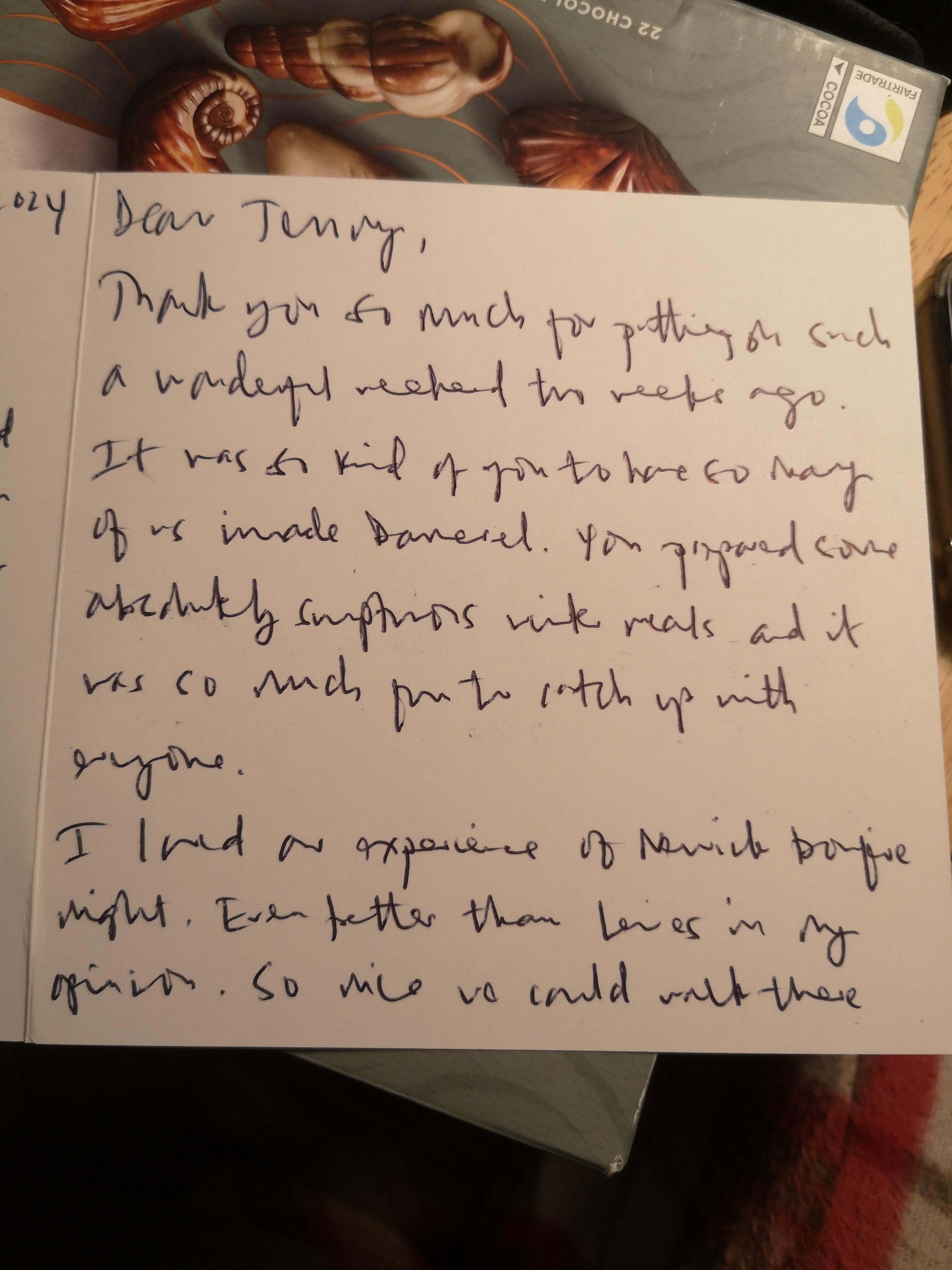
This friendly and legible cursive suggests a warm and generous personality. Maintaining a consistent baseline and refining letter formation would enhance legibility.
This is a connected, casual cursive style with a good flow. The size of the letters varies slightly, creating a natural, expressive feel. The lowercase 'e' often dips below the baseline and is unlooped, such as in the word 'weekend', adding a distinctive touch. The rounded, looping 'g' in words like 'ago' indicates warmth and generosity.
The moderate slant suggests someone balanced and emotionally aware. The slightly irregular spacing between words might hint at someone who values personal space. The consistent pressure throughout the letter implies a stable and steady personality. This person likely expresses themselves openly and honestly, enjoys socializing, and is genuinely interested in the well-being of others.
To enhance legibility, concentrate on keeping the baseline consistent. While the flowing style is pleasing, ensure that ascenders and descenders don't overlap between lines. The word 'opinion' is a prime example where the 'o' is squished under the descender from the previous line. A bit more attention to letter formation, especially the 'n' which can look like a 'u' (as seen in 'on'), would greatly improve clarity. However, maintain the lively variance in letter sizes to preserve the script's unique expressiveness.
Legibility
Expressiveness
Consistency
Overall
Leaderboard for Monday, 20 October 2025
| 31 | The Literary Luminary |
54
|
| 32 | The Botanical Biographer |
53
|
| 33 | The Elegant Chronicler |
53
|
| 34 | The Joyful Welcomer |
52
|
| 35 | The Pragmatic Notetaker |
52
|
| 36 | The Student's Script |
52
|
| 37 | The Cursive Commander |
52
|
| 38 | The Contemplative Poet |
52
|
| 39 | The Studious Botanist |
51
|
| 40 | The Diligent Student |
51
|
| 41 | The Doodler's Chronicle |
50
|
| 42 | The Clinical Cursive |
50
|
| 43 | The Decisive One |
50
|
| 44 | The Considerate Communicator |
50
|
| 45 | The Yearning Heart |
49
|
| 46 | The Pensive Annotator |
46
|
| 47 | The Cool Player |
46
|