Rate my handwriting

✨ Upload a sample of your handwriting, and our 🤖 AI will give you
the scoop on
what's awesome
and what could use a
little improving.
It's just for fun - and totally free! Try now 🚀
(You can also check out today's 👑 Leaderboard 👇)

The Emphatic Explainer
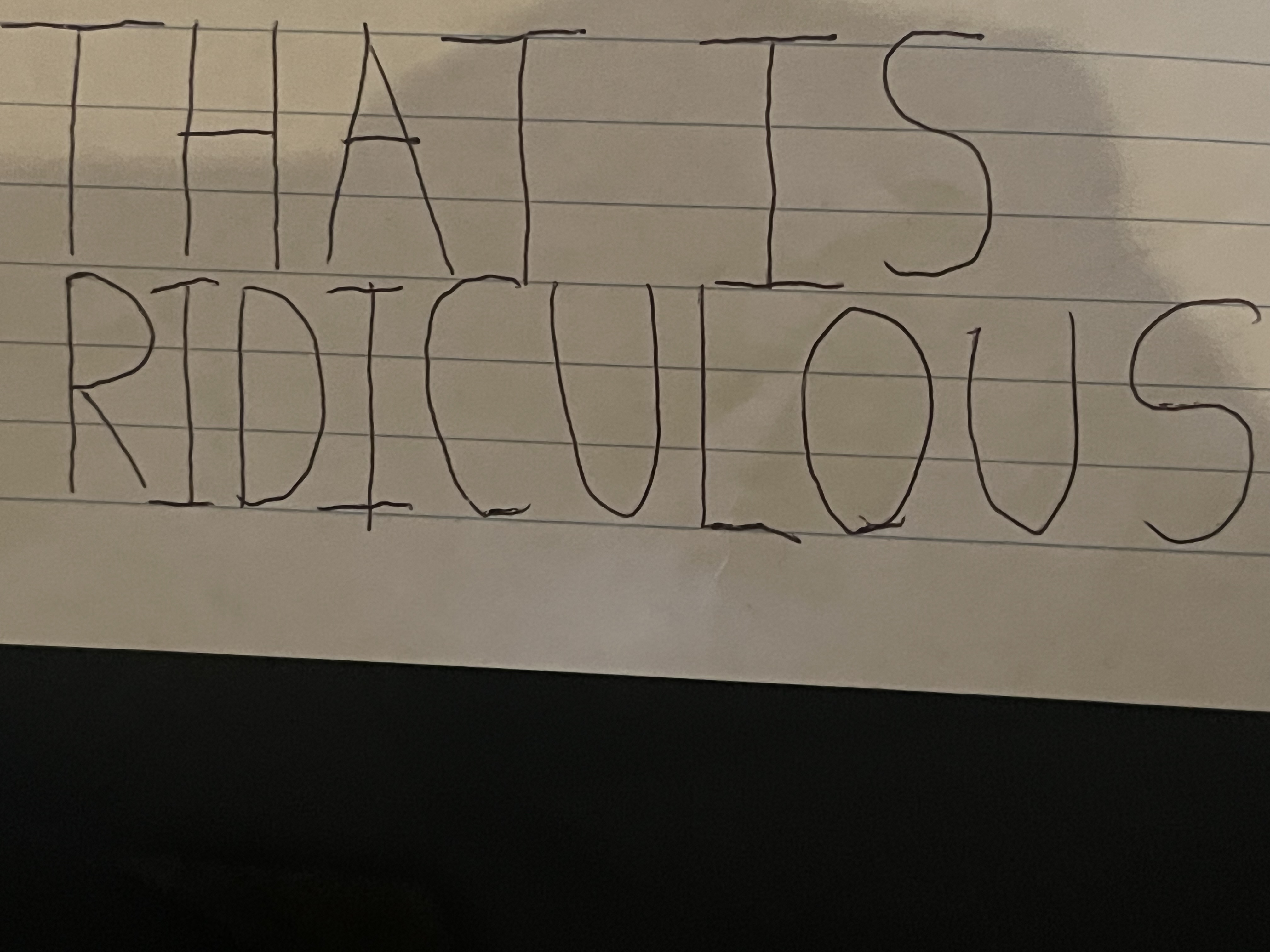
This handwriting is generally neat and legible, indicating confidence, directness, and a desire for clarity. Minor improvements to the baseline and letterforms could enhance its overall appeal.
The handwriting sample, featuring the phrase "THAT IS RIDICULOUS", showcases a distinctive style. The capital letters are noticeably larger than the lowercase letters, indicating a desire for emphasis and clarity. The letters themselves are generally consistent in height and width, such as the repeated "I" and the rounded "O". The pointed tops of the "A" and "T" reveal a direct and efficient nature. The overall appearance is neat and legible, despite the quickness of the writing.
This handwriting suggests a personality that is confident, assertive, and perhaps a tad impatient. The large, clear lettering points to a person who likes to make their point understood, and the quick strokes suggest someone who values efficiency and doesn't like to waste time. The consistency in letter formation indicates a preference for order and structure, while the pointed letters might reveal a hint of impulsiveness or a sharp wit. The emphasis on clarity suggests a desire to communicate effectively and avoid misunderstandings.
While generally legible, some minor improvements could enhance the aesthetic appeal. The lowercase "u" in "ridiculous" could be more defined to avoid confusion with a "v". Additionally, the baseline could be more consistent, as some letters appear to float slightly above or below the line. Focusing on maintaining an even baseline and paying closer attention to the shape of each letter, particularly the lowercase letters, would elevate this handwriting to the next level.
Legibility
Expressiveness
Consistency
Overall
Leaderboard for Wednesday, 29 October 2025
| 61 | The Serene Hand |
53
|
| 62 | The Pragmatic Note-Taker |
53
|
| 63 | The Pragmatic Pen |
53
|
| 64 | The Dutiful Student |
52
|
| 65 | The Diligent Student |
52
|
| 66 | The Bold Capitalist |
52
|
| 67 | The Historian's Quill |
52
|
| 68 | The Typist |
50
|
| 69 | The Architect's Blueprint |
47
|