Rate my handwriting

✨ Upload a sample of your handwriting, and our 🤖 AI will give you
the scoop on
what's awesome
and what could use a
little improving.
It's just for fun - and totally free! Try now 🚀
(You can also check out today's 👑 Leaderboard 👇)

The Utility Maximizer
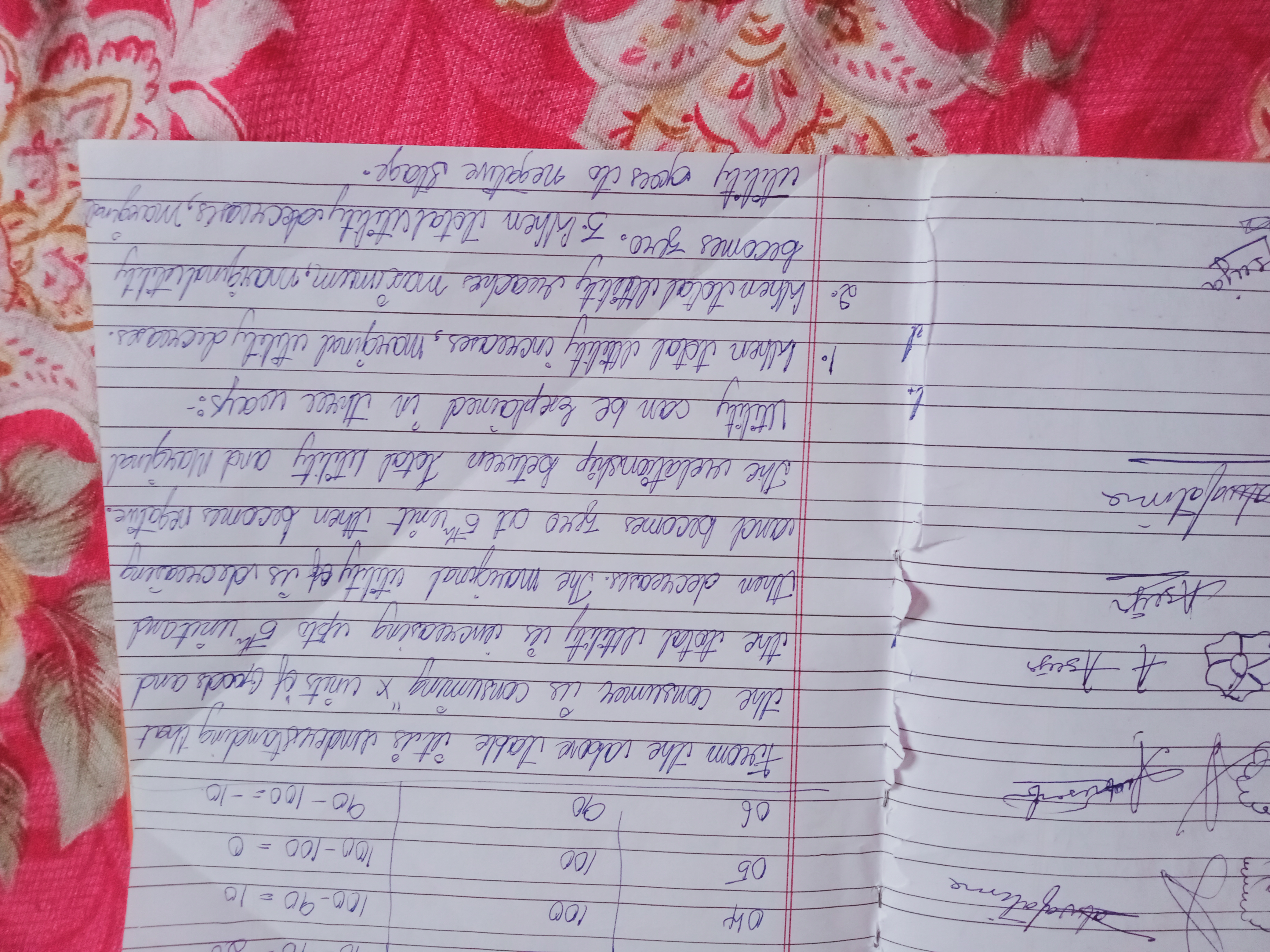
This handwriting indicates a practical, analytical mind with a focus on efficiency, but could benefit from greater attention to consistency and spacing for improved legibility.
This handwriting sample is characterized by a connected, slightly right-slanted style with variable letter sizes and spacing. The script flows fairly smoothly, with a tendency towards rounded forms as seen in the word 'utility'. The writing maintains a reasonable level of legibility, though the inconsistent slant and spacing could create challenges with longer texts. The overall impression is one of informality and a focus on conveying information rather than aesthetic presentation.
This handwriting suggests a personality that values practicality and efficiency. The emphasis on content over form, mirrored in the straightforward approach to writing, implies a direct and analytical mind. The inconsistent slant could hint at some flexibility and adaptability in the writer's thinking. The connected letters and generally smooth flow suggest a good ability to synthesize information and make connections between ideas, as evidenced by the explanation of 'total utility' and 'marginal utility'.
To enhance legibility and create a more polished impression, focus on maintaining a consistent slant and letter size throughout the writing. Paying closer attention to the spacing between words and lines will also improve readability. Practicing consistent letter formations, particularly for commonly used letters like 'a', 'e', and 't', can add to the overall neatness and clarity of the script.
Legibility
Expressiveness
Consistency
Overall
Leaderboard for Sunday, 26 October 2025
| 1 | The Pristine Penman |
76
|
| 2 | The Determined Diarist |
75
|
| 3 | The Flowing Quill |
74
|
| 4 | Geometric Author |
73
|
| 5 | The Diligent Dreamer |
73
|
| 6 | The Pragmatic Planner |
73
|
| 7 | The Student |
73
|
| 8 | The Curator's Script |
72
|
| 9 | The Pragmatist's Script |
72
|
| 10 | The Eloquent Calligrapher |
71
|
| 11 | The Organized Storyteller |
69
|
| 12 | The Flowing Hand |
68
|
| 13 | The Flowing Quill |
68
|
| 14 | The Looping Luminary |
68
|
| 15 | The Acrobatic Pen |
67
|
| 16 | The Agile Acrobat |
67
|
| 17 | The Unassuming Hand |
66
|
| 18 | The Studious Student |
65
|
| 19 | The Classicist's Quill |
65
|
| 20 | The Optimistic Artist |
65
|
| 21 | The Efficient Note-Taker |
64
|
| 22 | The Minimalist's Mark |
64
|
| 23 | The Flowing Font |
63
|
| 24 | Diligent Student |
63
|
| 25 | The Liberty Lover's Cursive |
61
|
| 26 | The Loop Whisperer |
61
|
| 27 | Zen Strokes |
60
|
| 28 | The Congratulatory Cursive |
60
|
| 29 | The Typist's Touch |
59
|
| 30 | The Signature Stylist |
59
|