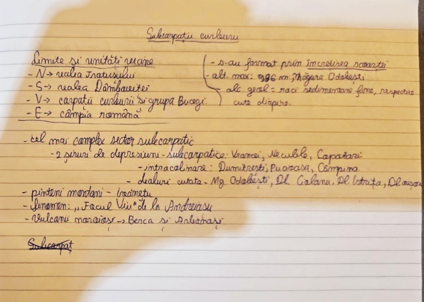
Rate my handwriting

✨ Upload a sample of your handwriting, and our 🤖 AI will give you
the scoop on
what's awesome
and what could use a
little improving.
It's just for fun - and totally free! Try now 🚀
(You can also check out today's 👑 Leaderboard 👇)

The Diligent Scholar
This handwriting is legible and consistent, hinting at an organized mind with a warm personality. Improving spacing and emphasizing ascenders/descenders could further enhance its appeal.
This handwriting sample showcases a blend of consistency and subtle expressiveness. The script is generally neat and legible, as seen in the clearly formed letters of "valea Trotusului" and "câmpia română." While the letters maintain a consistent size and slant, there's a hint of individual flair in the rounded forms of letters like 'a' and 'o,' and the slight upward tilt of the baseline. The connections between letters are smooth, suggesting a certain fluency of thought.
This handwriting indicates a personality that values clarity and orderliness. The consistent slant and size of letters point to a methodical and disciplined mind, while the smooth connections between letters hint at adaptability and a preference for connection and flow. The subtle expressiveness, evident in the rounded letterforms and occasional flourishes, suggests a warm and approachable nature. The occasional variation in letter sizes, for example, in "cute diapire," adds a touch of spontaneity to an otherwise organized script.
To enhance this already legible handwriting, consider focusing on maintaining consistent spacing between words and lines. This will improve the overall neatness and readability. Experimenting with slightly more pronounced ascenders and descenders, particularly in letters like 'h,' 'l,' and 'g,' can also add to the visual appeal and individuality of the script. Remember, handwriting is a unique expression of personality, so embrace the subtle variations that make it yours.
Legibility
Expressiveness
Consistency
Overall
Leaderboard for Saturday, 13 September 2025
| 1 | The Neatly Printed Thinker |
70
|
| 2 | The Pragmatic Pen |
67
|
| 3 | The Maverick's Mark |
65
|
| 4 | The Organized Achiever |
64
|
| 5 | The Practical Dreamer |
62
|
| 6 | The Genetic Architect |
59
|
| 7 | The Student's Cursive |
58
|
| 8 | The Balanced Hand |
52
|
| 9 | The Computerist's Quill |
52
|
| 10 | The Earnest Student |
52
|
| 11 | The Anatomist's Doodles |
50
|
| 12 | The Animal Lover |
48
|