Rate my handwriting

✨ Upload a sample of your handwriting, and our 🤖 AI will give you
the scoop on
what's awesome
and what could use a
little improving.
It's just for fun - and totally free! Try now 🚀
(You can also check out today's 👑 Leaderboard 👇)
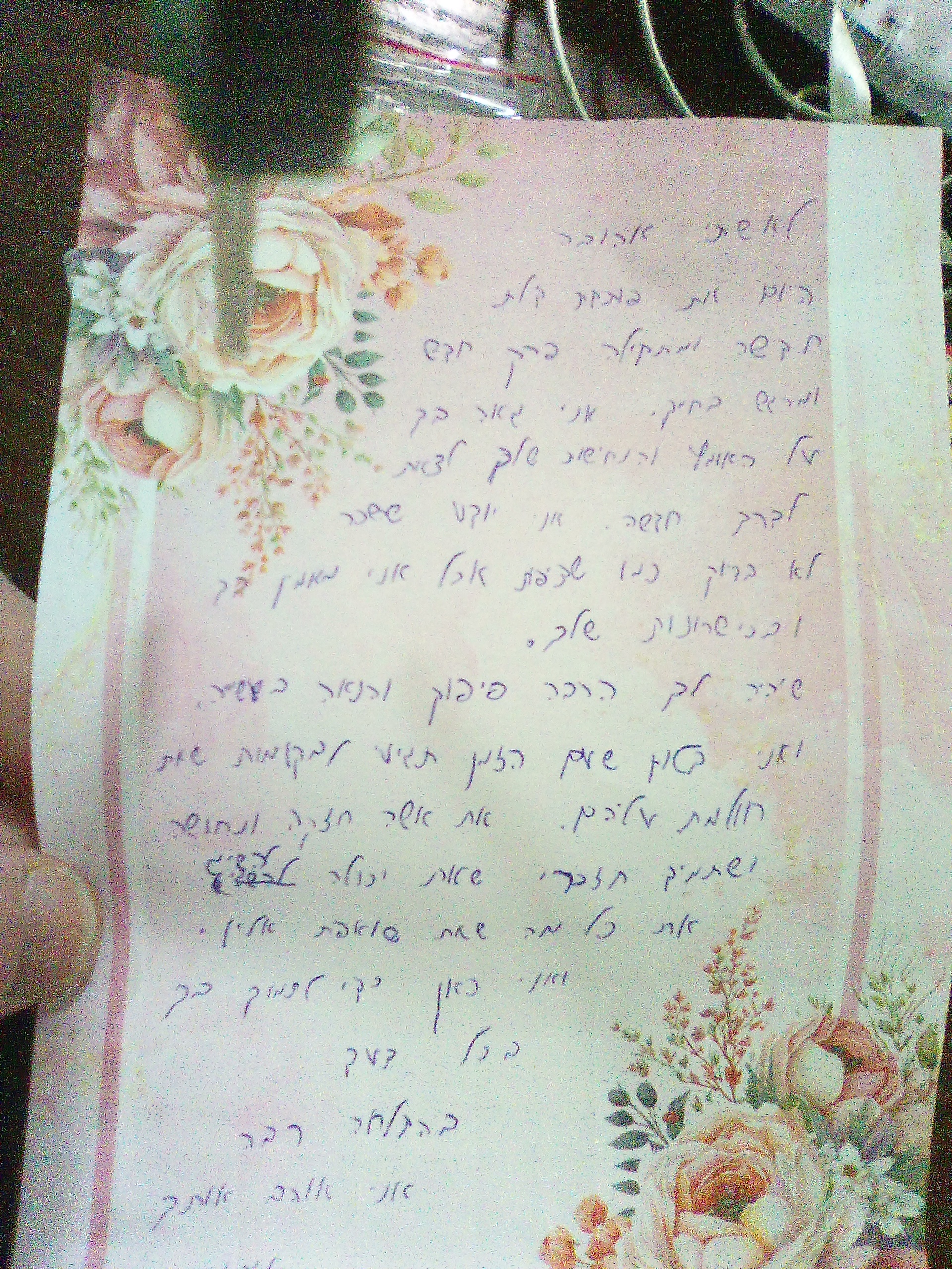
The Lyrical Penman
This charming handwriting displays a blend of sensitivity and expressiveness, suggesting a warm, dependable, and creative personality. A few minor tweaks could enhance legibility and refine the overall presentation.
The handwriting in this sample dances across the page with an airy lightness, reminiscent of a gentle breeze rustling through leaves. Words like "טוב" and "יפה" flow together seamlessly, their rounded forms creating a sense of fluidity and grace. The letters themselves are of moderate size, neither cramped nor sprawling, with an appealing consistency in their slant and spacing. While there's a clear rightward tilt, suggesting a forward-thinking nature, the overall impression is one of calm and measured contemplation, much like the deliberate strokes that form each character.
This lyrical script speaks to a personality that is both sensitive and expressive. The rounded letters hint at a warm and approachable nature, while the consistent slant implies a certain dependability. The gentle curves and delicate flourishes suggest a love of beauty and an appreciation for the finer things in life. The slightly upward slant of the lines conveys optimism and a positive outlook, hinting at a person who approaches life with enthusiasm and a thirst for new experiences. The writer is likely someone who enjoys creative pursuits and finds joy in expressing themselves through various artistic mediums.
While this handwriting is generally legible, the connections between letters could be strengthened to further enhance clarity. Focusing on maintaining a consistent baseline for all letters, rather than allowing them to float slightly above or below the line, would improve readability. Additionally, paying attention to the size and proportion of certain letters, especially those that tend to be more elongated or compressed, would bring a greater sense of balance and harmony to the overall composition. Practicing these minor adjustments would elevate this already charming script to a new level of elegance and refinement.
Legibility
Expressiveness
Consistency
Overall
Leaderboard for Saturday, 19 April 2025
| 1 | The Whisperer of the Woods |
70
|
| 2 | The Diligent Doodler |
69
|
| 3 | The Minimalist |
67
|
| 4 | The Tamil Tiger |
58
|
| 5 | The Diligent Scholar |
52
|