Rate my handwriting

✨ Upload a sample of your handwriting, and our 🤖 AI will give you
the scoop on
what's awesome
and what could use a
little improving.
It's just for fun - and totally free! Try now 🚀
(You can also check out today's 👑 Leaderboard 👇)

The Quiet Contemplator
This handwriting suggests a personality that values clarity and introspection, with a hint of creativity waiting to be unleashed.
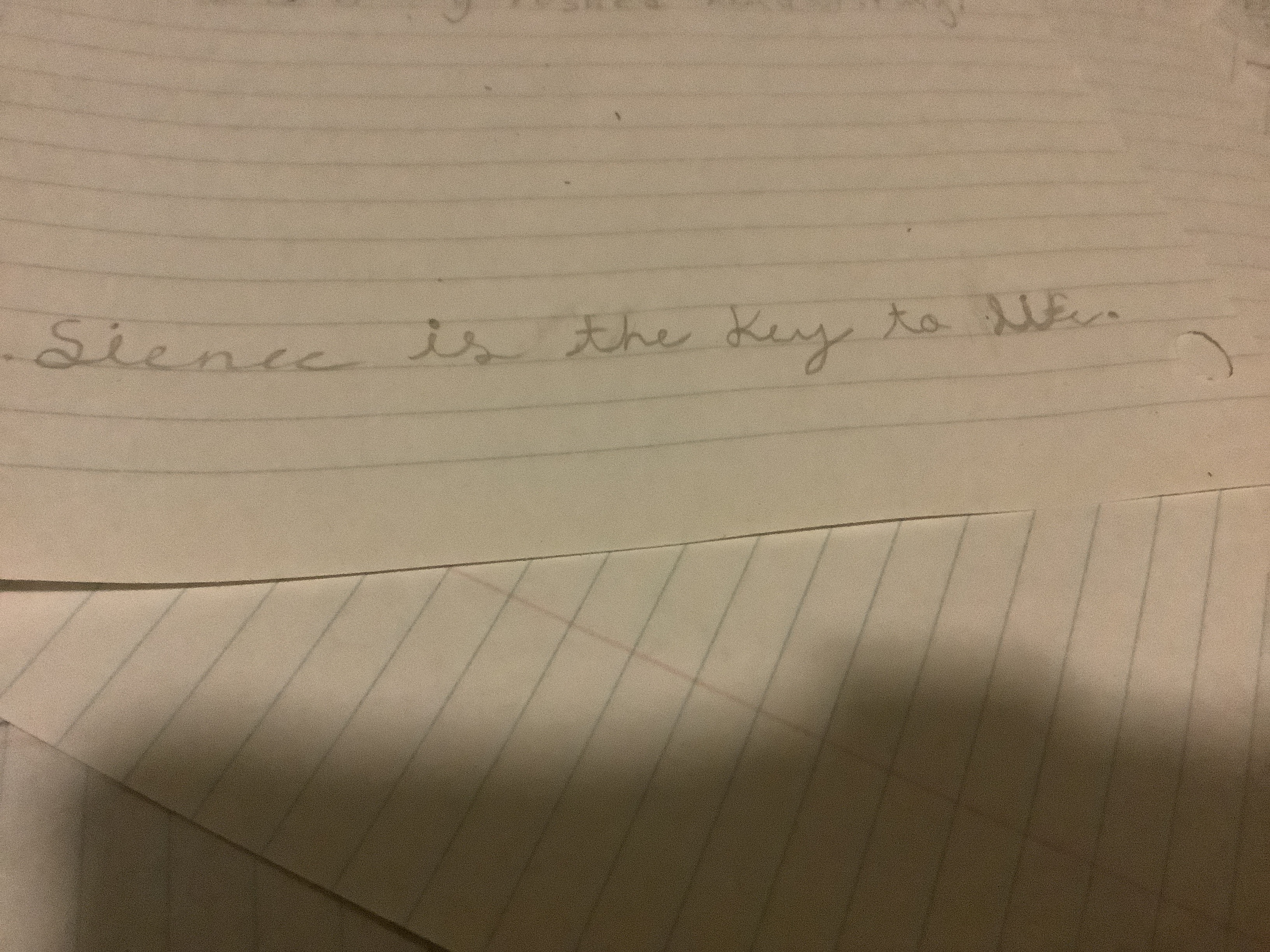
This handwriting sample presents a connected cursive style with moderate slant and a baseline that follows the lines on the page, punctuated by a thoughtful full stop and bracket after the phrase "Silence is the key to it.". The letters are fairly consistent in size and shape, such as the rounded bowls of the 'e's and the extended loops of the 'l' and 'y', and joined together with simple, efficient strokes. Although the writing is generally neat and legible, some variations appear, for example in the slightly larger size of the 'S' in "Silence" and the less pronounced curve of the second 'e' in the same word.
The handwriting suggests a personality that values both clarity and introspection. The connected cursive conveys a desire for fluency and efficiency, while the consistent letter formations imply a methodical approach. The neatness of the script speaks to a respect for order and precision. However, the subtle variations and occasional flourishes, like the looped 'y' in "key", hint at an underlying creativity and individualism that peeks through the ordered exterior. The choice of the maxim "Silence is the key to it" reinforces the impression of a contemplative and introspective mind, one that appreciates the power of quiet reflection.
To further refine this handwriting, focusing on maintaining consistent letter sizes and spacing could enhance its overall impact. Paying attention to the angle of the slant and ensuring it remains uniform throughout the writing would also improve the visual appeal. While the connected cursive contributes to its flowing quality, practicing joining certain letter combinations more smoothly, like the 'ey' in "key", could create even greater elegance and fluency. This would bring an extra touch of polish to an already pleasant and legible hand.
Legibility
Expressiveness
Consistency
Overall