Rate my handwriting

✨ Upload a sample of your handwriting, and our 🤖 AI will give you
the scoop on
what's awesome
and what could use a
little improving.
It's just for fun - and totally free! Try now 🚀
(You can also check out today's 👑 Leaderboard 👇)
The Inquisitive Penman
The handwriting is generally legible but inconsistent, suggesting an informal and friendly nature with room for improvement in neatness and uniformity.
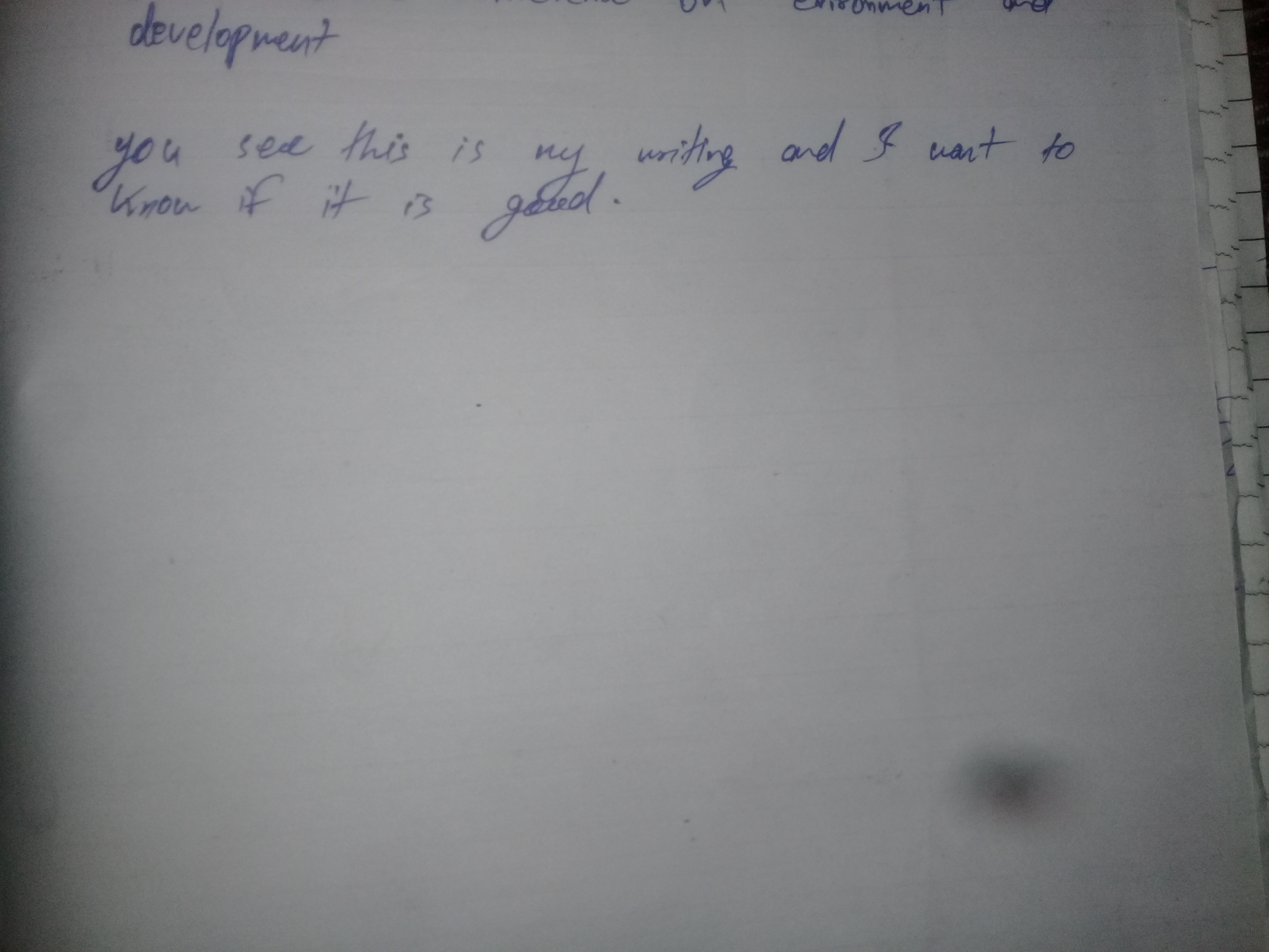
This handwriting sample presents a blend of cursive and print, with a slightly rightward slant. The letters are generally rounded, as seen in the 'y' of 'you' and the 'g' of 'good'. While the script is mostly legible, there's a discernible inconsistency in size and spacing. For example, the word 'writing' appears more compressed compared to 'know if'. This might suggest fluctuating focus or a casual approach to writing.
The rounded letters and connected script could imply a friendly and approachable personality. The inconsistent sizing and spacing may indicate a degree of impulsiveness or a preference for informality. The rightward slant is often associated with a future-oriented perspective and a desire for connection with others, which aligns with the author's request for feedback. The overall impression is one of someone who values communication but isn't overly concerned with strict adherence to perfect penmanship.
To enhance legibility and consistency, consider focusing on maintaining uniform spacing between letters and words. Practicing letter formations, particularly for letters like 'r' and 'n', which appear a bit rushed, can improve overall neatness. Using lined paper can also be helpful as a guide for baseline consistency and size. With a little more discipline and attention to detail, this handwriting can become even more effective and expressive.
Legibility
Expressiveness
Consistency
Overall
Leaderboard for Saturday, 19 April 2025
| 1 | The Whisperer of the Woods |
70
|
| 2 | The Diligent Doodler |
69
|
| 3 | The Minimalist |
67
|
| 4 | The Tamil Tiger |
58
|
| 5 | The Diligent Scholar |
52
|