Rate my handwriting

✨ Upload a sample of your handwriting, and our 🤖 AI will give you
the scoop on
what's awesome
and what could use a
little improving.
It's just for fun - and totally free! Try now 🚀
(You can also check out today's 👑 Leaderboard 👇)

The Pragmatic Penman
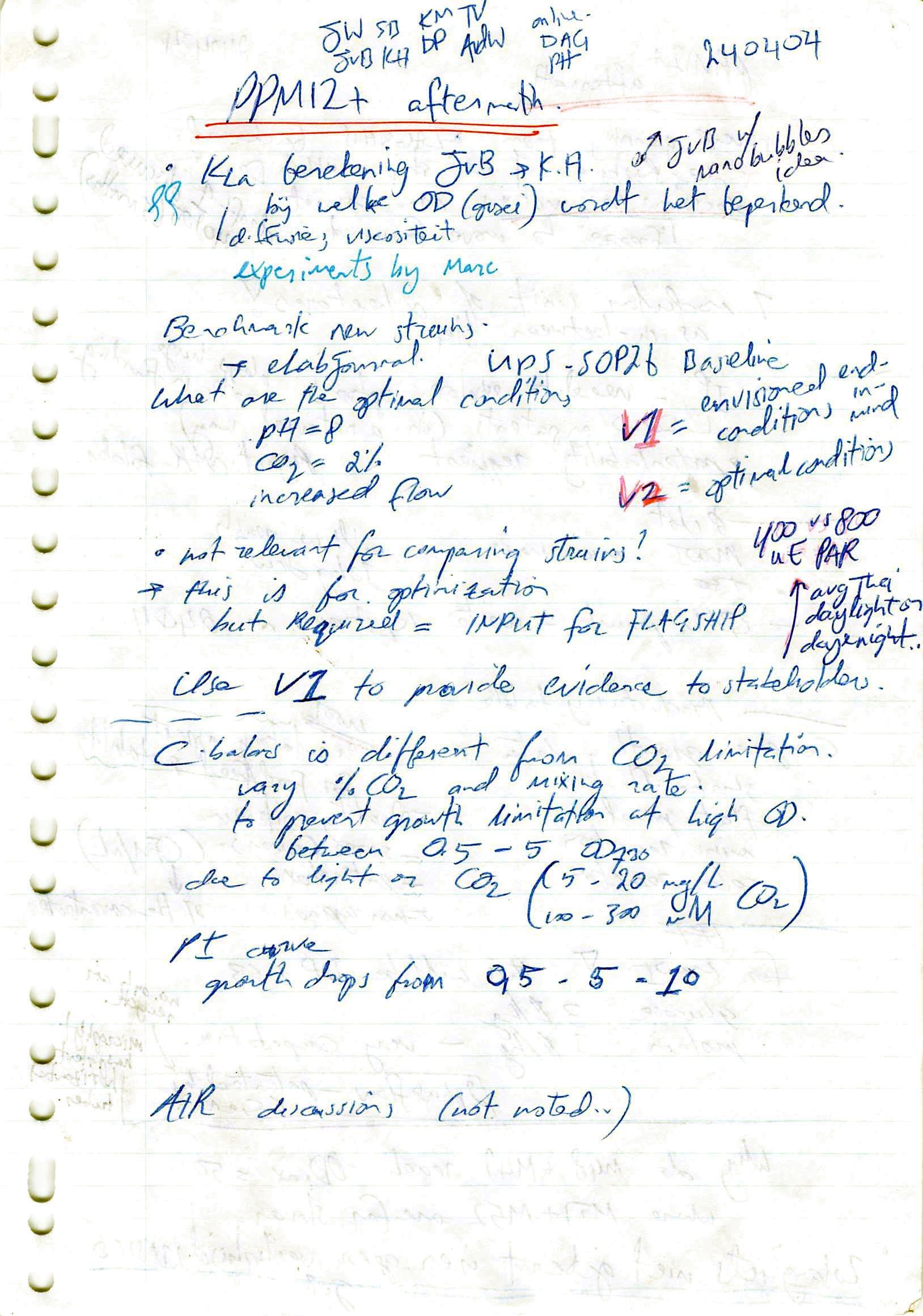
The handwriting displays a practical, efficient style with a connected script and a rightward slant, suggesting a quick and direct personality.
This handwriting sample is a blend of practicality and haste. The script is generally legible, with a connected style and a slight rightward slant. Certain words and phrases, like "PPM12+", stand out due to their larger size and more deliberate strokes, suggesting an emphasis on key concepts. While there's a connectedness within words, a disconnectedness between letters within words, like in "optimal" or "provide," is also evident, implying a focus on individual ideas over a smooth, flowing narrative. Overall, the varying baseline and uneven spacing between words point to a rapid thought process trying to keep pace with the pen.
This handwriting suggests a personality that values efficiency and directness. The writer likely prioritizes getting their thoughts down quickly, as evidenced by the uneven letterforms and spacing. The quick, connected style could suggest an impatience or eagerness to move on to the next idea. The emphasis on keywords, through larger size and more controlled strokes, might reveal a pragmatic nature that values highlighting important concepts. The uneven baseline may reflect adaptability and an ability to adjust to different situations.
While legibility is decent, practicing consistent letterforms and spacing could improve readability and give a more polished impression. Focusing on maintaining a consistent baseline could create a sense of order and calm. While the quick, connected style is a strength in terms of speed, slowing down slightly and focusing on consistent strokes could make the handwriting even more legible and aesthetically pleasing. Finally, paying attention to the size and spacing of all words and phrases, rather than just emphasizing certain keywords, would create a more balanced visual appeal.
Legibility
Expressiveness
Consistency
Overall
Leaderboard for Sunday, 20 April 2025
| 1 | The Whisperer of the Woods |
70
|
| 2 | The Diligent Doodler |
69
|
| 3 | The Minimalist |
67
|
| 4 | The Tamil Tiger |
58
|
| 5 | The Diligent Scholar |
52
|