Rate my handwriting

✨ Upload a sample of your handwriting, and our 🤖 AI will give you
the scoop on
what's awesome
and what could use a
little improving.
It's just for fun - and totally free! Try now 🚀
(You can also check out today's 👑 Leaderboard 👇)
The Practical Penman
This handwriting demonstrates practicality and efficiency, with room for improvement in neatness and control. A touch more deliberation would enhance clarity and aesthetics.
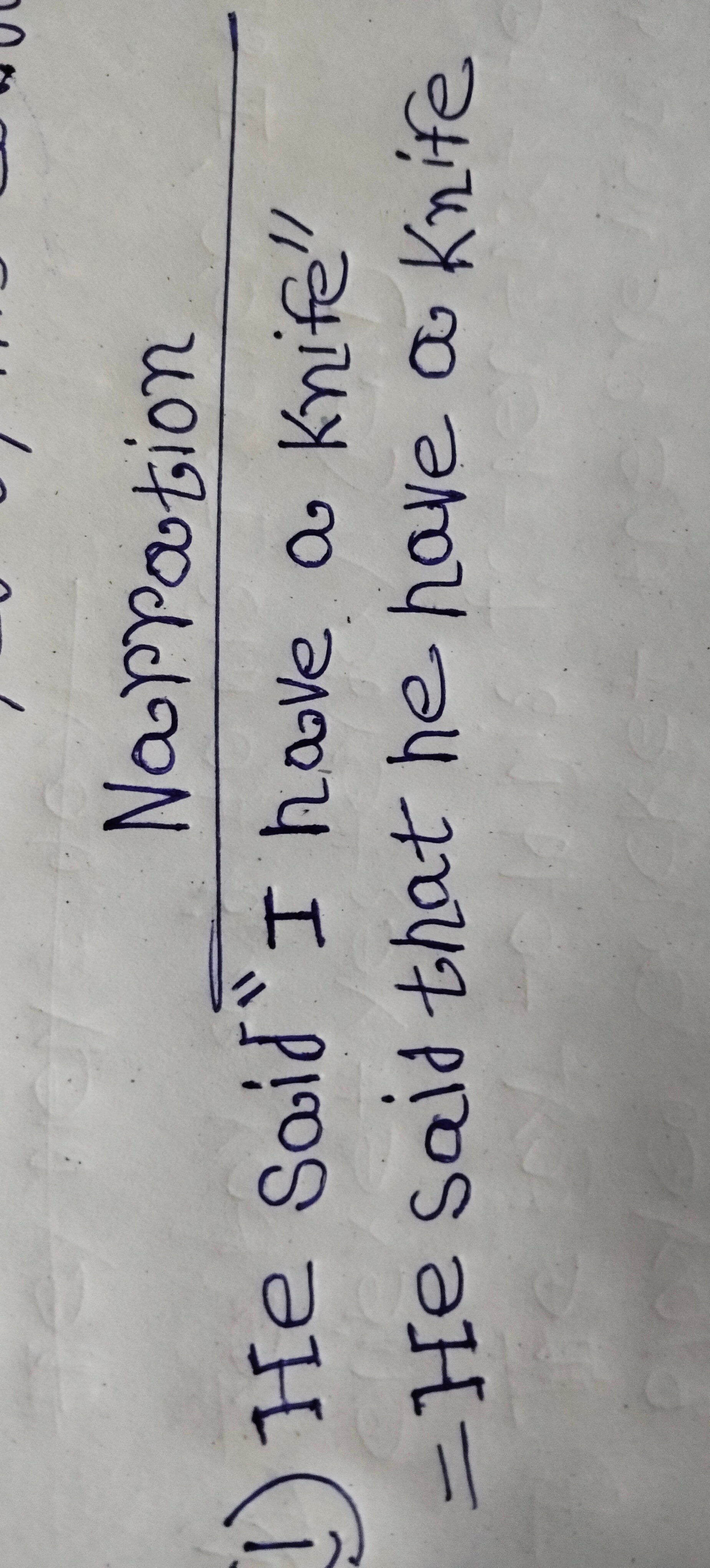
This handwriting sample presents a functional style, characterized by a connectedness between letters. Words like "knife" and "have" demonstrate a rapid, almost hurried execution. The letters are generally consistent in size and slant, although there's a slight rightward tilt. The baseline is fairly straight, although the writing shows a tendency to ascend slightly towards the right side of the page. While the writing is generally legible, the speed of execution impacts its neatness, as seen in the somewhat cramped appearance of certain words like "said".
This handwriting suggests a practical, efficient personality. The connected letters and brisk pace hint at a person who values speed and directness in communication. The slight rightward slant may indicate a forward-thinking and optimistic nature. The emphasis on legibility, despite the speed, suggests a desire for clear communication. While there's a lack of embellishment or flourish, the consistency and proportion reveal a focus on functionality and orderliness.
To improve the overall neatness and legibility, consider slowing down the writing pace slightly. Focusing on consistent spacing between letters and words could also enhance readability. Paying attention to the slant, ensuring a more controlled rightward inclination rather than an upward drift, could improve the visual appeal. Lastly, adding a little more pressure on the downstrokes could create more variation and expressiveness in the writing.
Legibility
Expressiveness
Consistency
Overall
Leaderboard for Thursday, 24 April 2025
| 1 | The Diligent Pupil |
76
|
| 2 | The Methodical Storyteller |
73
|
| 3 | The Determined Penman |
69
|
| 4 | The Hopeful Harvester |
68
|
| 5 | The Expressive Historian |
68
|
| 6 | The Vertical Virtuoso |
68
|
| 7 | The Methodical Mind |
67
|
| 8 | The Considerate Composer |
67
|
| 9 | The Dynamic Designer |
65
|
| 10 | The Democratic Pen |
64
|
| 11 | The Hurried Note-Taker |
64
|
| 12 | The Diligent Pupil |
64
|
| 13 | The Practical Penman |
62
|
| 14 | The Wandering Quill |
62
|
| 15 | The Educator |
59
|
| 16 | The Lyrical Penman |
59
|
| 17 | The Romantic Penman |
58
|
| 18 | The Eager Learner |
58
|
| 19 | The Diligent Scholar |
58
|
| 20 | The Lyrical Penman |
58
|
| 21 | The Methodical Thinker |
57
|
| 22 | The Hesitant Harmonizer |
56
|
| 23 | The Casual Communicator |
55
|
| 24 | The Diligent Documenter |
55
|
| 25 | The Diligent Note-Taker |
54
|
| 26 | The Determined Diver |
53
|
| 27 | The Earnest Enthusiast |
53
|
| 28 | The Skibidi Enthusiast |
52
|
| 29 | The Rhythmic Penman |
52
|
| 30 | The Pragmatic Penman |
52
|