Rate my handwriting

✨ Upload a sample of your handwriting, and our 🤖 AI will give you
the scoop on
what's awesome
and what could use a
little improving.
It's just for fun - and totally free! Try now 🚀
(You can also check out today's 👑 Leaderboard 👇)

The Prestige Penman
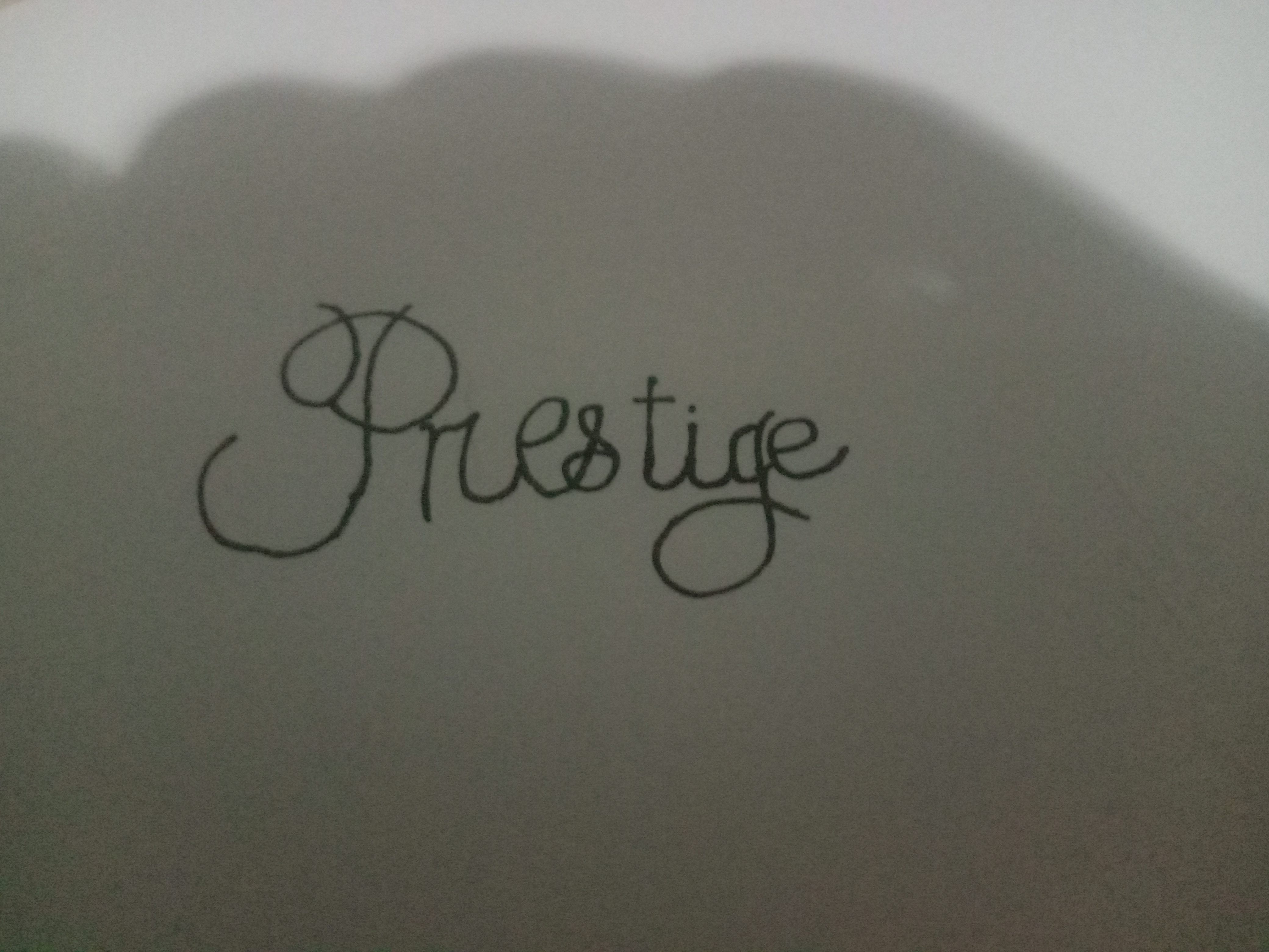
This sample displays a fluent and expressive hand, suggesting a balance between presentation and efficiency. Maintaining a more consistent baseline and letter sizes could further enhance its legibility.
The handwriting sample showcases a distinctive style, marked by a prominent flourish in the initial "P" of "Prestige", extending both above and below the baseline. The letters are interconnected with a smooth, continuous stroke, suggesting a degree of fluency and confidence. While the overall appearance leans towards neatness, there's a hint of informality in the rounded forms and variable letter sizes. The baseline isn't strictly adhered to, with slight undulations throughout the word.
This penmanship hints at a personality that values both presentation and efficiency. The flourish in the "P" indicates a desire to make an impression, while the connected letters and generally consistent slant suggest a focus on practicality and getting things done. The slight variations in letter sizes and baseline could imply a touch of spontaneity or adaptability.
To enhance this handwriting further, consider focusing on maintaining a more consistent baseline. This would add a touch of formality without sacrificing the inherent dynamism. Practicing consistent letter sizes and spacing would further enhance legibility and overall polish. Experimenting with different pen grips or writing surfaces might also yield interesting results, further refining the already expressive qualities of this handwriting.
Legibility
Expressiveness
Consistency
Overall
Leaderboard for Thursday, 03 April 2025
| 1 | The Diligent Scholar |
64
|
| 2 | The Pragmatic Penman |
64
|
| 3 | The Gold Digger |
63
|
| 4 | The Whimsical Wanderer |
63
|
| 5 | The Methodical Maven |
59
|
| 6 | The Lyrical Linguist |
57
|
| 7 | The Dreamer |
56
|