Rate my handwriting

✨ Upload a sample of your handwriting, and our 🤖 AI will give you
the scoop on
what's awesome
and what could use a
little improving.
It's just for fun - and totally free! Try now 🚀
(You can also check out today's 👑 Leaderboard 👇)

The Midnight Penman
This generally legible handwriting suggests a warm, adaptable, and future-oriented personality. Improved consistency in letter sizes and spacing would further enhance its clarity.
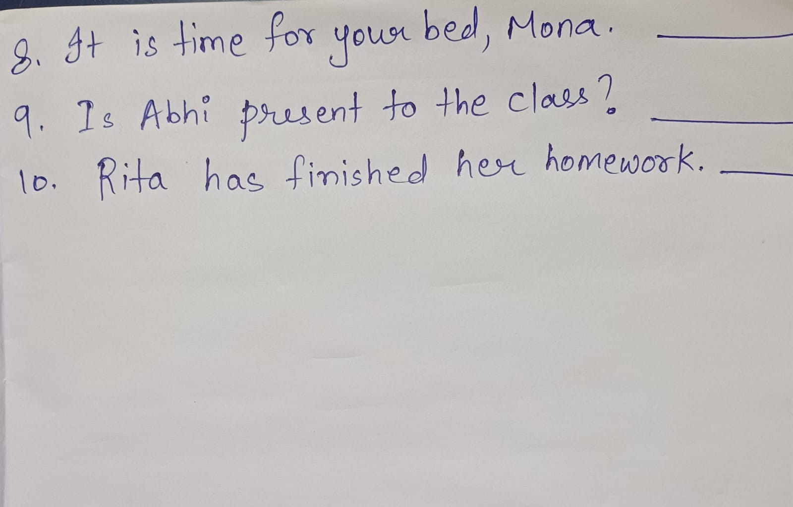
This handwriting is generally legible and consistent, with a slight rightward slant. The rounded letters, such as the 'o' in 'for' and the 'a' in 'Mona', suggest a friendly and approachable nature. The varying heights of letters, like the 't' in 'It' compared to the 'b' in 'bed', add a touch of whimsy to the overall appearance. The baseline is relatively straight, indicating stability and focus, while the occasional flourishes, such as the loop in the 'y' of 'your', hint at a dash of creativity.
The writer is likely someone who values clarity and efficiency, as seen in the neatness and directness of the script. The rounded letters and occasional flourishes suggest a warm and approachable personality, someone who enjoys connecting with others. The slight rightward slant indicates a future-oriented mindset, perhaps someone who is eager to embrace new experiences and ideas. This handwriting exudes an air of optimism and adaptability.
While generally legible, the handwriting could benefit from increased consistency in letter sizes and spacing. Paying attention to the height and width of letters, particularly those with ascenders (like 'h' and 'd') and descenders (like 'g' and 'y'), could enhance readability. Ensuring consistent spacing between words would further improve clarity and create a more polished overall impression.
Legibility
Expressiveness
Consistency
Overall
Leaderboard for Friday, 04 April 2025
| 1 | The Peach-Tree Poet |
76
|
| 2 | The Weary Glazier |
73
|
| 3 | The Botanical Biographer |
67
|
| 4 | The Inquisitive Examiner |
67
|
| 5 | The Whimsical Wanderer |
63
|
| 6 | The Botanical Biographer |
54
|
| 7 | The Determined Dreamer |
50
|