Rate my handwriting

✨ Upload a sample of your handwriting, and our 🤖 AI will give you
the scoop on
what's awesome
and what could use a
little improving.
It's just for fun - and totally free! Try now 🚀
(You can also check out today's 👑 Leaderboard 👇)

The Regional Chronicler
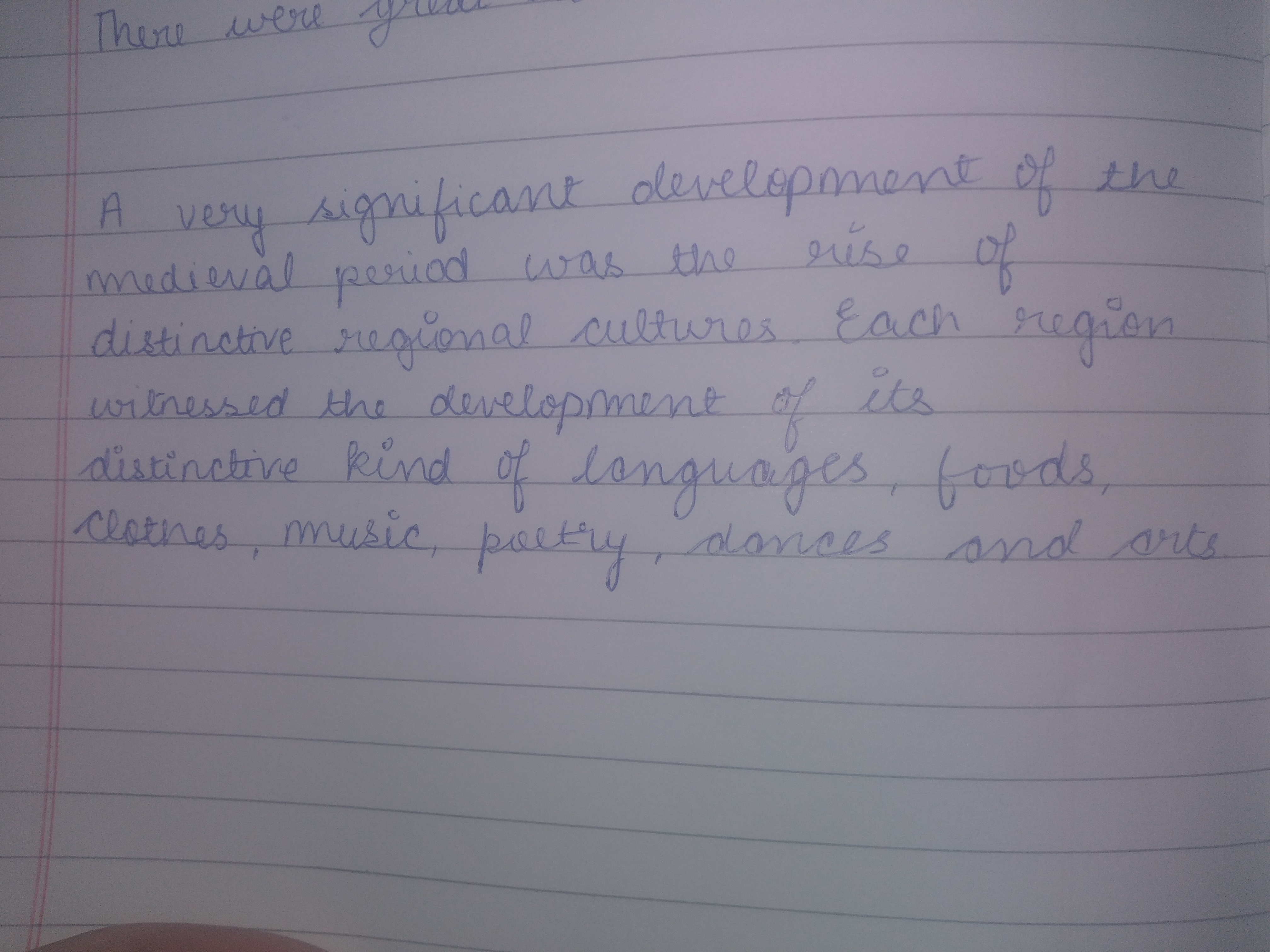
This handwriting indicates a clear and organized writer, with hints of expressiveness and adaptability.
This handwriting sample exhibits a pleasant cursive style, flowing smoothly across the lines. The letters are generally well-formed, with occasional flourishes like the initial 'T' in 'There' or the extended loops of the 'g' in 'significant'. Although there's a good consistency in letter size and shape, the spacing between words and lines can be a bit uneven, suggesting some variability in the pace of writing. The overall impression is one of relaxed neatness, prioritizing clarity without excessive embellishment.
The consistent, legible style hints at a writer who is both organized and communicative. The slightly rightward slant and occasional decorative loops in letters like 'd' and 'f' imply an enthusiasm for expression and a desire to connect with an audience. The variability in spacing suggests that the writer might sometimes prioritize capturing thoughts over meticulous precision, which may reflect spontaneity and adaptability.
To further enhance this already readable hand, consider paying closer attention to the baseline, ensuring all letters sit evenly upon it. Maintaining consistent spacing between words and lines would add a touch of polish. Experimenting with slightly more dynamic letterforms, such as varying the height of ascenders and descenders, could add extra character and expressiveness to the writing without sacrificing legibility.
Legibility
Expressiveness
Consistency
Overall