Rate my handwriting

✨ Upload a sample of your handwriting, and our 🤖 AI will give you
the scoop on
what's awesome
and what could use a
little improving.
It's just for fun - and totally free! Try now 🚀
(You can also check out today's 👑 Leaderboard 👇)
The Romantic Wanderer
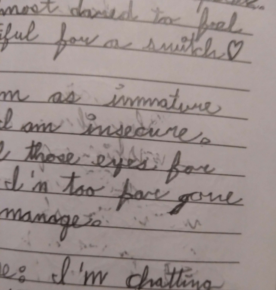
This handwriting is romantic and expressive, suggesting a warm, open personality. Attention to consistent letter sizes and baseline alignment would enhance readability.
This handwriting sample presents a connected, slightly right-slanted cursive style, indicating a moderate writing pace. Words like "dared", "feel", "immature", and "insecure" flow smoothly, with consistent letterforms and spacing. The baseline is relatively straight, although the ends of some lines drift upwards, as seen in "switches" and "gone." The size of the letters varies somewhat, with descenders in words like "gone" appearing slightly elongated. The overall impression is one of controlled informality, with a touch of whimsicality evident in the upward curve of the final 'h' in "switches."
This style suggests someone who is both sentimental and expressive. The connected script points to a desire for connection and fluency of thought. The slight right slant suggests an inclination towards extraversion and emotional responsiveness, as echoed in the romantic context of the words. The occasional upward slant of the lines and varied letter sizes could signify a dash of optimism and a tendency towards fluctuating moods. Words like "insecure" written with the same fluidity as the rest of the text, hint at someone comfortable acknowledging and expressing a full range of emotions.
To enhance legibility, focus on maintaining consistent letter sizes, particularly in words with ascenders and descenders like "feel" and "gone." Pay attention to keeping the baseline straight, avoiding the upward drift at the ends of lines. While the connected script contributes to the handwriting's charm, practicing disconnected letters could improve clarity, especially for words with double letters, like "feel." Finally, adding a bit more space between words would enhance overall readability and make this captivating handwriting style even more polished.
Legibility
Expressiveness
Consistency
Overall
Leaderboard for Sunday, 20 April 2025
| 1 | The Lyrical Linguist |
73
|
| 2 | The Romantic Wanderer |
71
|
| 3 | The Whisperer of the Woods |
70
|
| 4 | The Diligent Doodler |
69
|
| 5 | The Rhythmic Penman |
68
|
| 6 | The Minimalist |
67
|
| 7 | The Diligent Documenter |
67
|
| 8 | The Punctual Penpal |
67
|
| 9 | The Precise Biologist |
66
|
| 10 | The Determined Doer |
66
|
| 11 | The Methodical Biologist |
63
|
| 12 | The Casual Communicator |
62
|
| 13 | The Precise Mathematician |
62
|
| 14 | The Determined Learner |
62
|
| 15 | The Hopeful Harvester |
59
|
| 16 | The Casual Communicator |
59
|
| 17 | The Wandering Poet |
58
|
| 18 | The Tamil Tiger |
58
|
| 19 | The Measured Fox |
57
|
| 20 | The Water Whisperer |
57
|
| 21 | The Wandering Quill |
56
|
| 22 | The Huxleyan Hand |
56
|
| 23 | The Diligent Scholar |
52
|
| 24 | The Pragmatic Planner |
51
|
| 25 | The Casual Communicator |
50
|