Rate my handwriting

✨ Upload a sample of your handwriting, and our 🤖 AI will give you
the scoop on
what's awesome
and what could use a
little improving.
It's just for fun - and totally free! Try now 🚀
(You can also check out today's 👑 Leaderboard 👇)

The Precise Penman
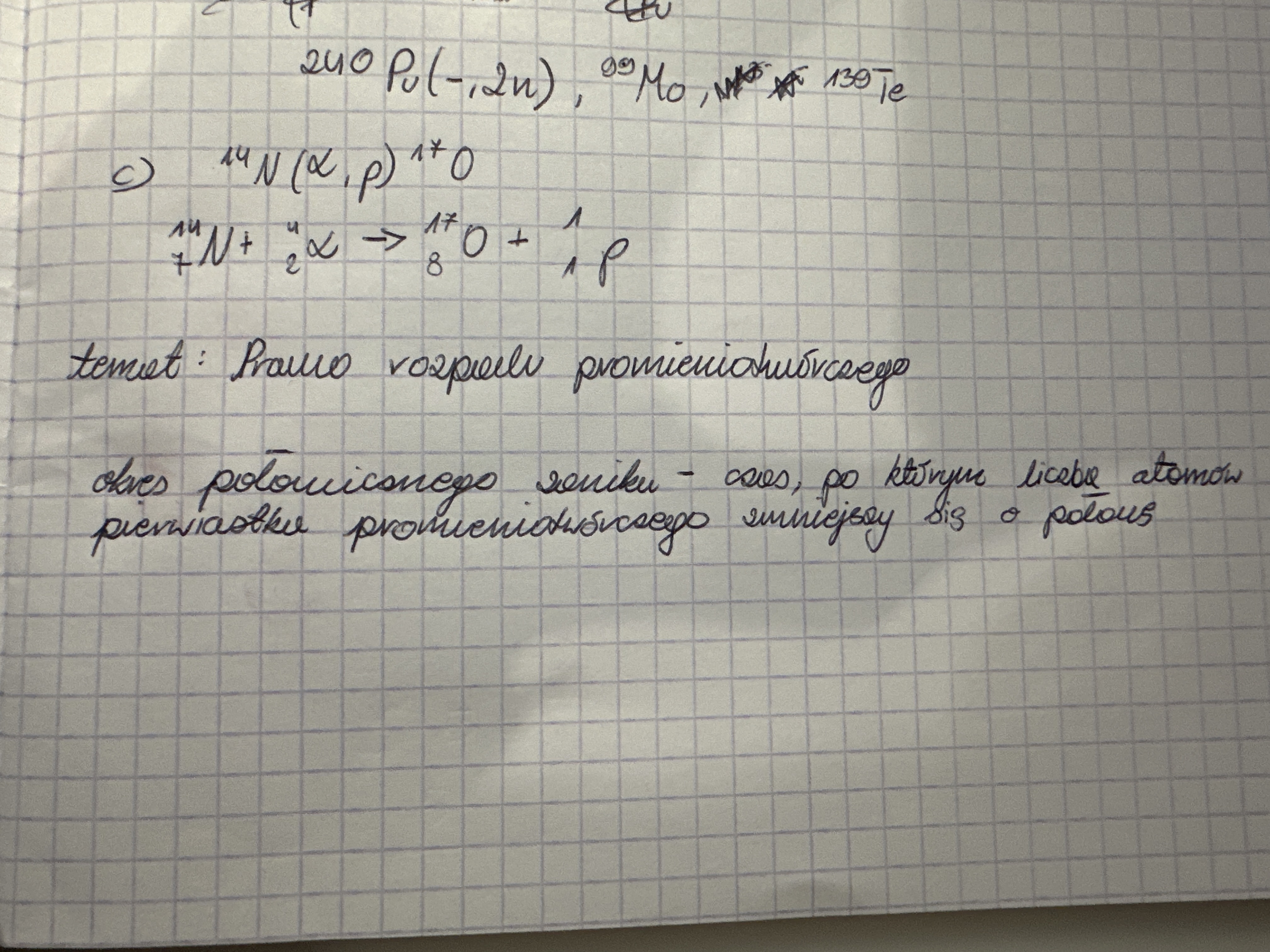
This handwriting suggests an analytical and efficient individual with a pragmatic approach, but minor adjustments to spacing and letter formation could further enhance clarity.
This handwriting sample exhibits a blend of precision and haste. The individual letters are generally well-formed, as seen in the clear formation of "p" and "r" in "rozpad promieniotwórczego." However, the overall flow can appear rushed, indicated by the connectedness of letters within words and the occasional ligatures. The baseline is relatively straight and consistent, reflecting a focused approach. While the script is generally legible, certain abbreviations and superscripts could pose challenges for the untrained eye. There's a pragmatic slant to the left, indicating a results-oriented individual who favours efficiency.
This writer is likely analytical and detail-oriented, given the careful formation of individual letters. The rightward slant and quick pace of the writing suggest a forward-thinking individual, possibly impatient and eager to express themselves or convey information quickly. The consistency of the baseline points to a stable and methodical approach to tasks, but a tendency towards pragmatism might overshadow their more expressive side. They likely favour practicality over embellishment, which mirrors their efficient approach to communication.
While generally legible, the handwriting could benefit from a more deliberate approach to spacing and less focus on joining every letter. Slowing down the writing process slightly and increasing the spacing between words could enhance legibility. Additionally, ensuring clear distinction between superscripts and characters on the baseline would avoid any ambiguity in complex expressions. Embracing more consistent letter heights and sizes, especially in cases like the lowercase "o" and "a," could elevate the neatness of the script, allowing for even more precision.
Legibility
Expressiveness
Consistency
Overall
Leaderboard for Wednesday, 27 November 2024
| 1 | The Flourishing Penman |
77
|
| 2 | The Nimble Fox |
76
|
| 3 | The Methodical Penman |
74
|
| 4 | The Precise Penman |
74
|
| 5 | The Logical Listener |
74
|
| 6 | The Methodical Mathematician |
74
|
| 7 | The Empathetic Advocate |
73
|
| 8 | The Methodical Note-Taker |
73
|
| 9 | The Romantic Penman |
73
|
| 10 | The Geographer |
73
|
| 11 | The Nimble Quill |
73
|
| 12 | The Methodical Mind |
73
|
| 13 | The Nostalgic Penman |
73
|
| 14 | The Playful Penman |
73
|
| 15 | The Precise Ponderer |
71
|
| 16 | The Sensitive Pisces |
68
|
| 17 | The Precise Printer |
68
|
| 18 | The Nimble Quill |
68
|
| 19 | The Determined Theorist |
67
|
| 20 | The Quick Penman |
67
|
| 21 | The Village Voice |
67
|
| 22 | The Polished Penman |
67
|
| 23 | The Nimble Penman |
67
|
| 24 | The Purple Penman |
67
|
| 25 | The Measured Penman |
67
|
| 26 | The Swift Penman |
67
|
| 27 | The Precise Penman |
66
|
| 28 | The Practical Penman |
66
|
| 29 | The Methodical Meal Planner |
66
|
| 30 | The Sleepy Penman |
64
|