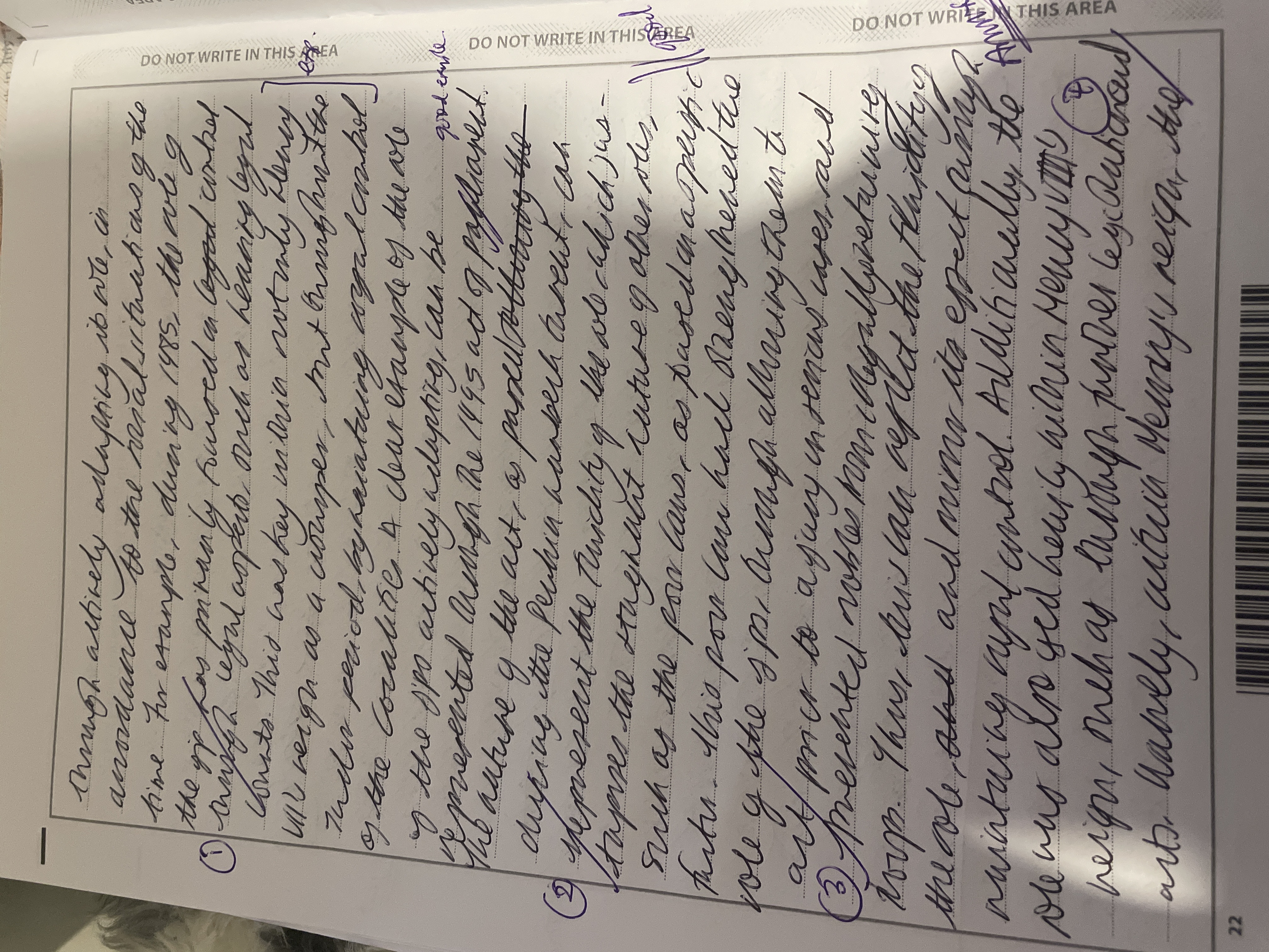
Rate my handwriting

✨ Upload a sample of your handwriting, and our 🤖 AI will give you
the scoop on
what's awesome
and what could use a
little improving.
It's just for fun - and totally free! Try now 🚀
(You can also check out today's 👑 Leaderboard 👇)

The Adaptable Quill
This handwriting is adaptable, energetic, and generally legible, but could benefit from improved consistency and attention to detail.
This handwriting presents a mixed bag, stylistically speaking. The script leans towards cursive, with some printed letters sprinkled in, as seen in the words "accordance" and "example". It's a fairly consistent style, although the slant and spacing can be a little erratic, like in the phrase "actively adapting". The overall effect is readable, if not particularly neat. There's a sense of hurriedness, perhaps efficiency, conveyed in the swift strokes.
The inconsistent slant suggests adaptability, while the mix of cursive and print hints at someone who values both tradition and practicality. The hurriedness might imply impatience or a busy mind, constantly seeking the next challenge. Words like "strengthened" and "maintained" showcase a clear, concise communication style, possibly indicative of a decisive personality.
While generally legible, a few tweaks could elevate this handwriting. Consistent spacing between words and letters, as seen in "good example", would improve readability. Paying attention to the baseline, ensuring words don't float too high or low, will add a touch of neatness. Slowing down just a tad could even out the slant and enhance overall legibility. Finally, embracing either print or cursive consistently could give the writing a more polished appearance.
Legibility
Expressiveness
Consistency
Overall
Leaderboard for Saturday, 19 April 2025
| 1 | The Whisperer of the Woods |
70
|
| 2 | The Diligent Doodler |
69
|
| 3 | The Minimalist |
67
|
| 4 | The Tamil Tiger |
58
|
| 5 | The Diligent Scholar |
52
|