Rate my handwriting

✨ Upload a sample of your handwriting, and our 🤖 AI will give you
the scoop on
what's awesome
and what could use a
little improving.
It's just for fun - and totally free! Try now 🚀
(You can also check out today's 👑 Leaderboard 👇)
The Lyrical Linguist
This handwriting shows a blend of creativity and organization, with a lyrical flow that is both expressive and purposeful. While generally legible, attention to individual letterforms and consistency in size would enhance clarity.
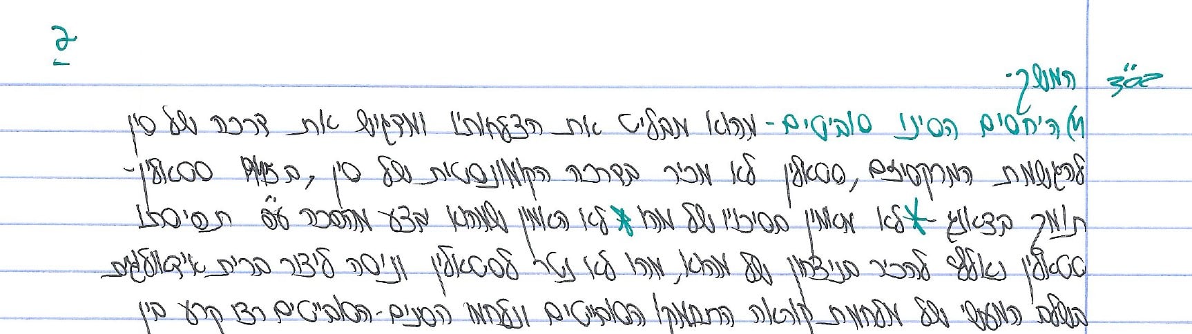
The handwriting in this sample dances across the page with a lyrical rhythm, reminiscent of a composer's flowing notation. Words like "הספורט" and "במקום" intertwine gracefully, showcasing a unique blend of rounded and angular strokes. The gentle curves in letters like "ס" and "ע" create a sense of fluidity, while the more pointed formations of "נ" and "ר" add a touch of structure and direction. The overall impression is one of expressive movement, enhanced by the consistent slant and well-proportioned spacing between words and lines.
This handwriting suggests a personality that is both creative and organized. The balanced mix of curves and angles implies an ability to navigate between emotional expression and logical thinking. The consistent slant indicates a forward-thinking nature, while the comfortable spacing between words reflects a respect for boundaries and a desire for clarity in communication. This individual likely enjoys finding harmony in both their personal and professional lives, appreciating both the beauty of self-expression and the practicality of well-defined structures. The distinctive flair of the writing hints at a vibrant imagination, coupled with a clear and purposeful direction.
While this handwriting is generally legible, the lyrical flow could occasionally lead to some ambiguity in distinguishing certain characters. Paying closer attention to the distinct form of each letter, particularly those that tend to blend together in cursive, would further enhance the overall clarity and readability. Focusing on maintaining a consistent height and width for each character would also enhance uniformity and refine the visual harmony of the script.
Legibility
Expressiveness
Consistency
Overall
Leaderboard for Sunday, 20 April 2025
| 1 | The Lyrical Linguist |
73
|
| 2 | The Romantic Wanderer |
71
|
| 3 | The Whisperer of the Woods |
70
|
| 4 | The Diligent Doodler |
69
|
| 5 | The Rhythmic Penman |
68
|
| 6 | The Minimalist |
67
|
| 7 | The Diligent Documenter |
67
|
| 8 | The Punctual Penpal |
67
|
| 9 | The Precise Biologist |
66
|
| 10 | The Determined Doer |
66
|
| 11 | The Methodical Biologist |
63
|
| 12 | The Casual Communicator |
62
|
| 13 | The Precise Mathematician |
62
|
| 14 | The Determined Learner |
62
|
| 15 | The Hopeful Harvester |
59
|
| 16 | The Casual Communicator |
59
|
| 17 | The Wandering Poet |
58
|
| 18 | The Tamil Tiger |
58
|
| 19 | The Measured Fox |
57
|
| 20 | The Water Whisperer |
57
|
| 21 | The Wandering Quill |
56
|
| 22 | The Huxleyan Hand |
56
|
| 23 | The Diligent Scholar |
52
|
| 24 | The Pragmatic Planner |
51
|
| 25 | The Casual Communicator |
50
|