Rate my handwriting

✨ Upload a sample of your handwriting, and our 🤖 AI will give you
the scoop on
what's awesome
and what could use a
little improving.
It's just for fun - and totally free! Try now 🚀
(You can also check out today's 👑 Leaderboard 👇)

The Precise Penman
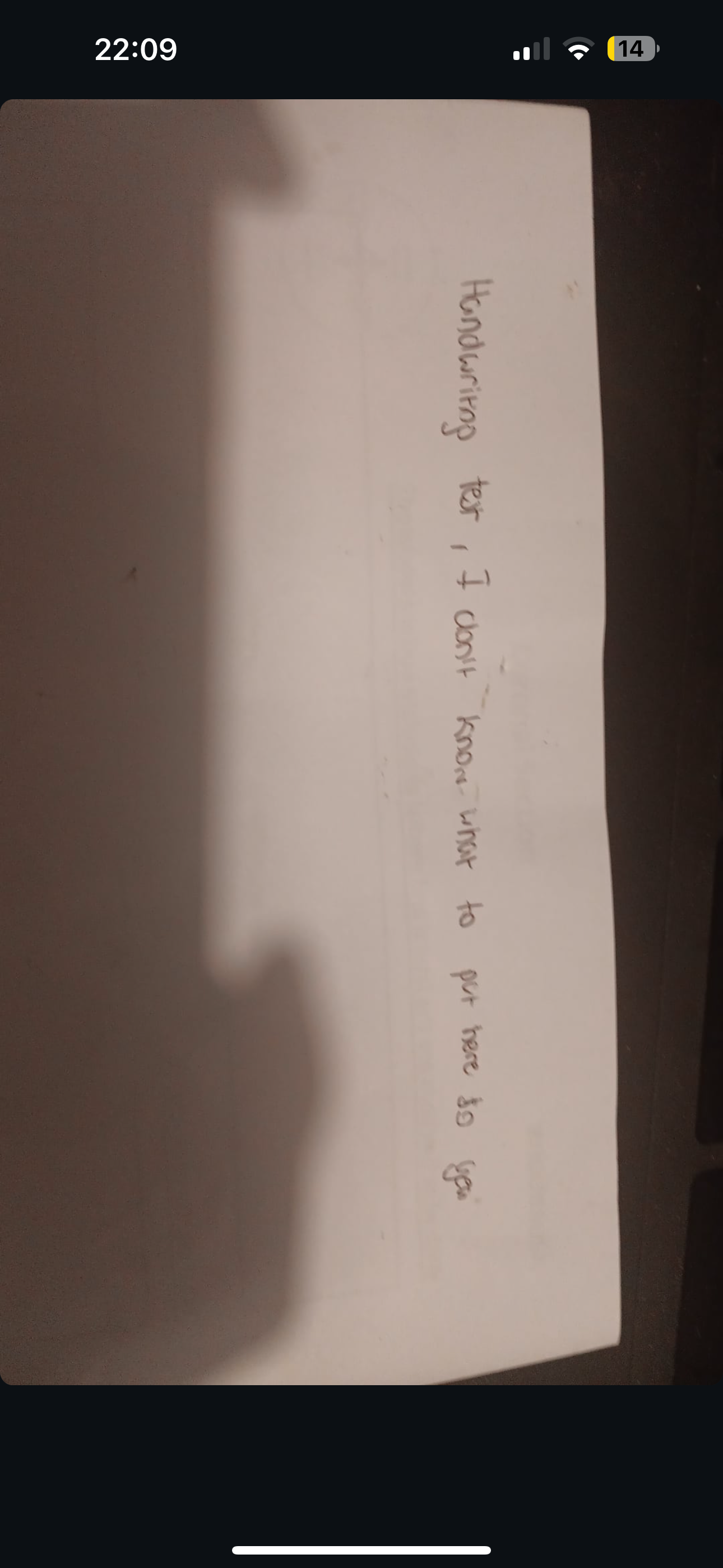
The Penman is organized, neat and methodical in their writing, however some variation in size and spacing could add expressiveness and legibility.
This handwriting sample presents a connected style with letters of a consistent size and slant. There's a noticeable rightward slant and the letters are generally well-formed, especially the 'd', 't', and 'p' which demonstrate good proportion and control. The baseline of the writing is fairly straight which adds to its overall neat appearance. Some words like 'Handwriting' and 'don't' stand out due to their slightly larger size compared to the rest of the text, hinting at an emphasis on these specific words.
The consistent slant and uniform letter sizes in this handwriting suggest a methodical and organized personality. The connected style might point to a logical thought process and a preference for seeing the bigger picture. The overall neatness and legibility imply a respect for clarity and a desire to be understood. The larger size of certain words might indicate a tendency to emphasize key points or ideas, suggesting a clear communicator who isn't afraid to highlight important information.
While generally legible and well-formed, some minor improvements could enhance the aesthetic appeal and readability. Paying closer attention to spacing between words could create better visual separation, making the text flow more smoothly. Additionally, slightly increasing the variation in letter sizes and shapes could inject more personality and expressiveness into the writing, making it less uniform and more engaging to the reader.
Legibility
Expressiveness
Consistency
Overall
Leaderboard for Friday, 04 April 2025
| 1 | The Peach-Tree Poet |
76
|
| 2 | The Weary Glazier |
73
|
| 3 | The Botanical Biographer |
67
|
| 4 | The Inquisitive Examiner |
67
|
| 5 | The Whimsical Wanderer |
63
|
| 6 | The Botanical Biographer |
54
|
| 7 | The Determined Dreamer |
50
|