Rate my handwriting

✨ Upload a sample of your handwriting, and our 🤖 AI will give you
the scoop on
what's awesome
and what could use a
little improving.
It's just for fun - and totally free! Try now 🚀
(You can also check out today's 👑 Leaderboard 👇)

The Determined Penman
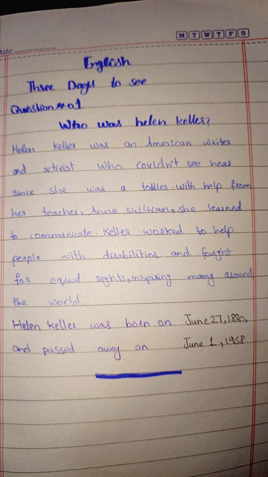
The handwriting demonstrates determination and focus, with a friendly undertone. Attention to letter consistency and spacing would improve clarity and aesthetics.
This handwriting sample showcases a blend of rounded and slightly angular letterforms, with an upright slant. The baseline is relatively consistent, reflecting a focused approach. Words like "communicate" and "inspiring" demonstrate a comfortable rhythm, although some letters like 'a' and 'o' vary slightly in size. Legibility remains fairly good, thanks to adequate spacing between words, although tighter spacing between letters within words adds a touch of informality.
The determined strokes and generally consistent baseline suggest a writer with clear goals and a focused mindset. The rounded letters hint at a friendly and approachable nature, while the occasional angularity indicates a degree of assertiveness and an independent streak. The variations in letter size suggest a touch of adaptability, willing to adjust as needed.
While generally legible, some improvements could enhance the handwriting's clarity and aesthetics. Paying attention to the consistent formation of letters, particularly 'a' and 'o', would improve uniformity. Slightly increasing the space between letters within words could improve readability, and practicing consistent letter sizes would create a more polished appearance. Embracing cursive connections between all letters would also enhance fluency and flow.
Legibility
Expressiveness
Consistency
Overall
Leaderboard for Sunday, 24 November 2024
| 31 | The Night Owl |
62
|
| 32 | The Precise Professor |
62
|
| 33 | The Diligent Engineer |
61
|
| 34 | The Determined Penman |
60
|
| 35 | The Ancient Mariner of Jazz |
59
|
| 36 | The Studious Scholar |
59
|
| 37 | The Diligent Scholar |
59
|
| 38 | The Determined Documenter |
59
|
| 39 | The Diligent Documenter |
59
|
| 40 | The Diligent Student |
59
|
| 41 | The Adaptive Penman |
58
|
| 42 | The Precise Planner |
58
|
| 43 | The Diligent Drafter |
57
|
| 44 | The Timetable Teller |
56
|
| 45 | The Thoughtful Ponderer |
56
|
| 46 | The Collegiate Quill |
56
|
| 47 | The Calculated Composer |
56
|
| 48 | The Methodical Mathematician |
55
|
| 49 | The Impulsive Penman |
55
|
| 50 | The Dreamer |
55
|
| 51 | The Diligent Engineer |
54
|
| 52 | The Practical Planner |
54
|
| 53 | The Groundnut Guru |
53
|
| 54 | The Diligent Scholar |
52
|
| 55 | The Diligent Student |
52
|
| 56 | The Lyrical Linguist |
52
|
| 57 | The Benevolent Baker |
51
|
| 58 | The Benevolent Baker |
51
|
| 59 | The Wanderer |
47
|