Rate my handwriting

✨ Upload a sample of your handwriting, and our 🤖 AI will give you
the scoop on
what's awesome
and what could use a
little improving.
It's just for fun - and totally free! Try now 🚀
(You can also check out today's 👑 Leaderboard 👇)

The Rhythmic Penman
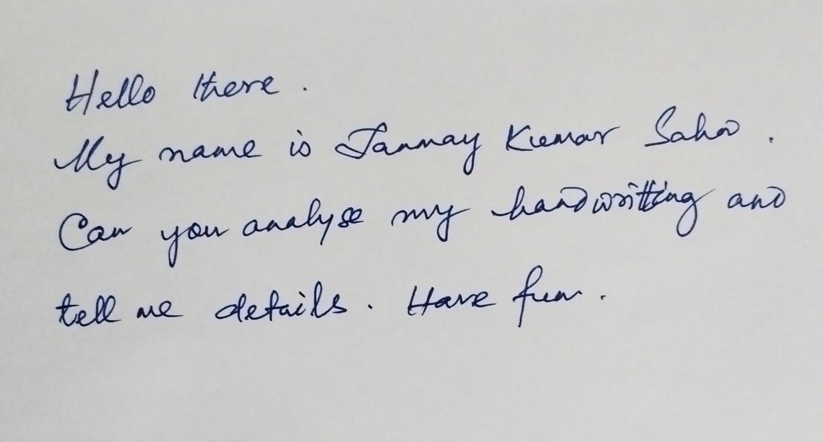
The handwriting is legible and fluent, suggesting a friendly, organized personality. Stabilizing the baseline and ensuring uniform letter sizes will further improve legibility and consistency.
This handwriting sample presents a generally consistent and legible cursive style. The rounded forms of letters like 'a', 'o', and 'e', and the smooth connections between letters, contribute to an overall sense of fluency. The rhythm is evident in the fairly consistent slant and spacing between words. Phrases such as "Hello there" and "Have fun" illustrate the writer's light touch and easy flow. While mostly neat, there are slight variations in letter sizes, notably in "Tanmay Kumar Sahon", and the baseline tends to drift upwards towards the right side of the page.
This handwriting suggests a personality that is friendly, approachable, and adaptable. The rounded letters and fluent connections imply a sociable and communicative nature, while the rhythmic flow indicates a person who is generally organized and efficient. The slight variations in letter sizes and the upward baseline drift might hint at a touch of optimism and a tendency to be future-oriented.
To enhance legibility and maintain consistency, focus on stabilizing the baseline and ensuring uniform letter sizes. Practicing letter formations, especially those with varying heights and proportions like 't', 'k', and 'h', would improve the overall neatness. While maintaining the current style's attractive flow, adding more distinction between different letter groups, for instance, by emphasizing ascenders and descenders, could further refine the handwriting.
Legibility
Expressiveness
Consistency
Overall
Leaderboard for Friday, 04 April 2025
| 1 | The Peach-Tree Poet |
76
|
| 2 | The Weary Glazier |
73
|
| 3 | The Botanical Biographer |
67
|
| 4 | The Inquisitive Examiner |
67
|
| 5 | The Whimsical Wanderer |
63
|
| 6 | The Botanical Biographer |
54
|
| 7 | The Determined Dreamer |
50
|