Rate my handwriting

✨ Upload a sample of your handwriting, and our 🤖 AI will give you
the scoop on
what's awesome
and what could use a
little improving.
It's just for fun - and totally free! Try now 🚀
(You can also check out today's 👑 Leaderboard 👇)
The Upward Flyer
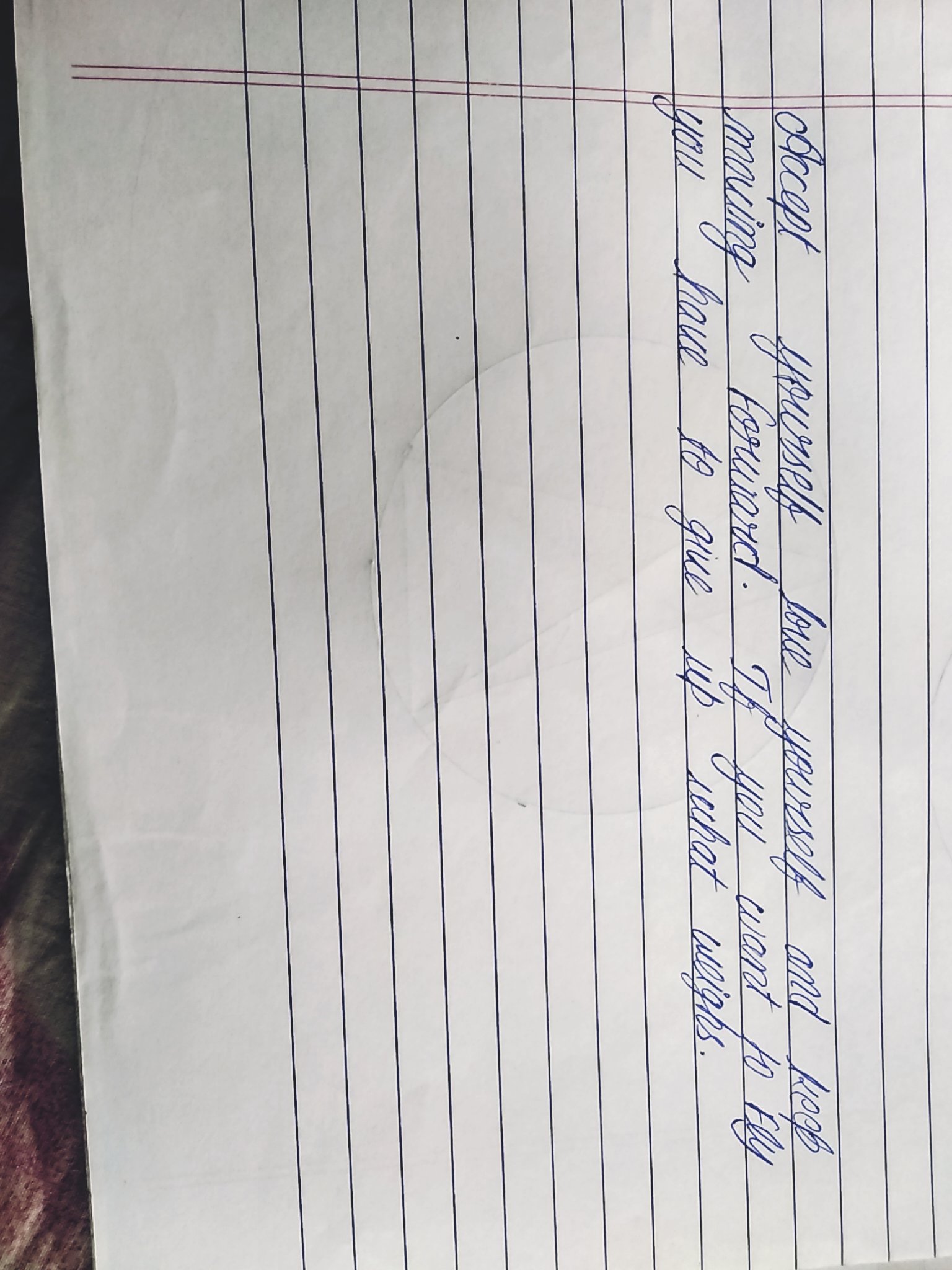
The "Upward Flyer" handwriting shows optimism and balance, but legibility could be improved by reducing overlaps and increasing inter-word spacing.
This handwriting sample showcases a distinctive cursive style, with rounded letters and a consistent rightward slant. The height and width of the letters are fairly uniform, creating a balanced appearance. Words like "yourself" and "forward" illustrate the smooth, interconnected flow of the script. While generally legible, the occasional overlapping of strokes, as seen in "accept", slightly hinders readability.
This handwriting suggests a personality that is optimistic and forward-thinking, as indicated by the consistent rightward slant. The rounded letters hint at a warm and approachable nature, while the uniform size and spacing point to a sense of order and balance. The interconnectedness of the script might suggest a desire for connection and a dislike for abrupt changes. The occasional overlapping strokes could indicate a tendency to get ahead of oneself, a trait often seen in enthusiastic individuals eager to express their thoughts.
To improve legibility, focus on minimizing the overlap between letters, particularly in words like "accept". Ensure ample spacing between words for better clarity. While the rightward slant adds character, a slight reduction could further enhance readability. Experiment with varying the size and shape of letters to inject more expressiveness into the writing. Overall, maintaining the current neatness and consistency while incorporating these minor adjustments would elevate this handwriting to an even higher level of appeal.
Legibility
Expressiveness
Consistency
Overall
Leaderboard for Saturday, 19 April 2025
| 1 | The Punctual Penman |
74
|
| 2 | The Diligent Student |
71
|
| 3 | The Geologist |
68
|
| 4 | The Diligent Drafter |
65
|
| 5 | The Diligent Drafter |
65
|
| 6 | The Diligent Documenter |
60
|
| 7 | The Diligent Biologist |
59
|
| 8 | The Diligent Student |
59
|
| 9 | The Aspirational Author |
58
|
| 10 | The Diligent Student |
52
|