Rate my handwriting

✨ Upload a sample of your handwriting, and our 🤖 AI will give you
the scoop on
what's awesome
and what could use a
little improving.
It's just for fun - and totally free! Try now 🚀
(You can also check out today's 👑 Leaderboard 👇)
The Hasty Hand
This hurried, yet legible, handwriting indicates an energetic, efficient personality with a hint of creativity, and suggests improvements in consistency and neatness would be beneficial.
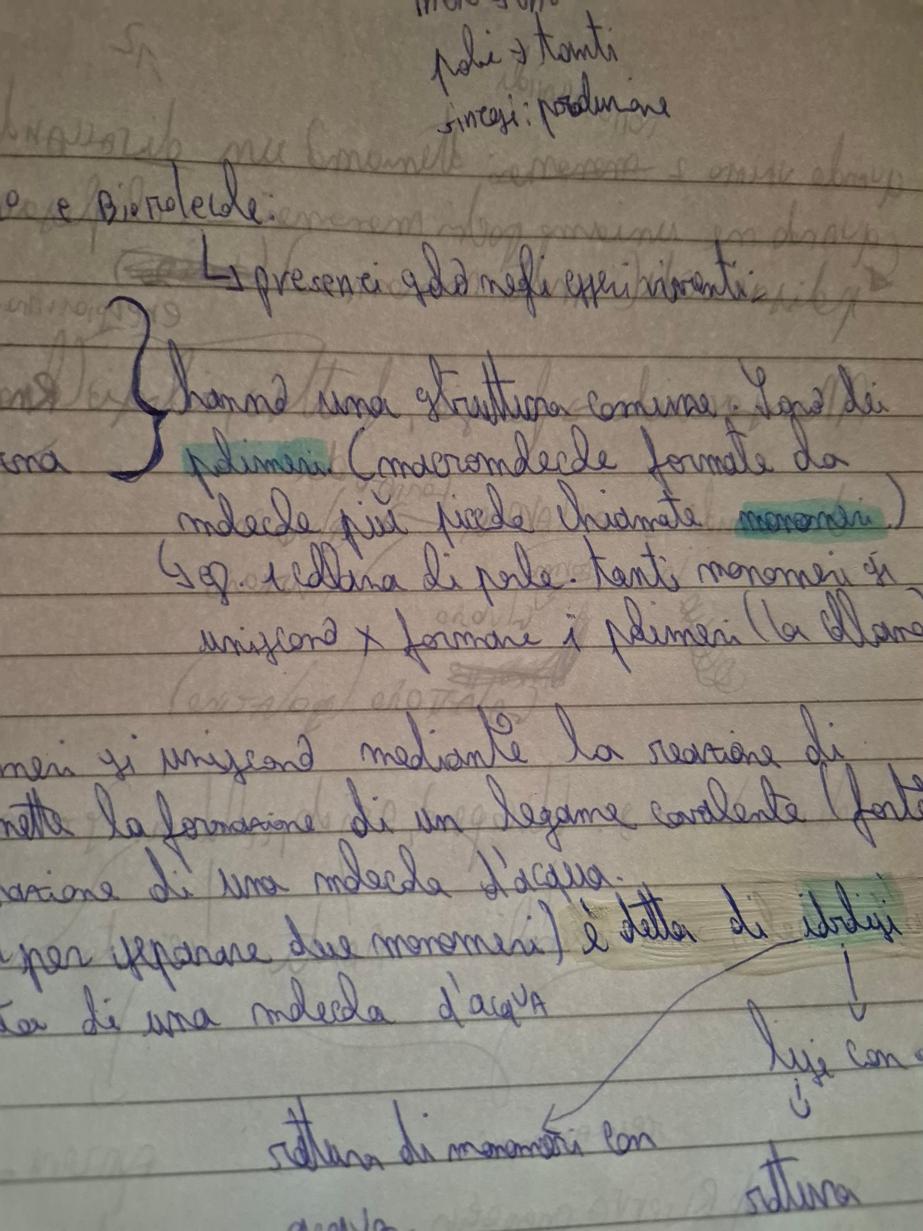
This handwriting is characterized by a rapid, somewhat hurried pace, as seen in the connected letters and occasional flourishes. The letters are generally legible, although the speed of writing occasionally compromises neatness, particularly in words like 'polimeri' and 'monomeri'. There's a rhythm to the flow, with some letters, like 'p' and 'f', showing distinctive loops. The baseline is relatively consistent, indicating a focus on maintaining structure despite the quick pace. While some words, like 'presenciado', maintain proportion, others appear compressed or elongated, likely due to the focus on speed.
This handwriting suggests a personality that is energetic and efficient, possibly prioritizing speed and completion over meticulous detail. The connected letters hint at a quick-thinking mind that enjoys linking ideas and concepts. The occasional flourishes, particularly in the initial 'L' and some 'f's, imply a touch of creativity and a desire for self-expression. The inconsistency in letter proportion suggests a degree of impatience or a tendency to be more focused on the bigger picture than the finer details.
While the speed and connectedness are positive attributes for note-taking or brainstorming, focusing on improving consistency in letter size and spacing would enhance legibility. Slowing down the writing process slightly, especially when forming more complex letters, could improve neatness. Practicing consistent spacing between words would also increase clarity and reduce the impression of rushing. Lastly, ensuring that each letter starts and ends clearly, especially letters like 'a' and 'o', would improve overall readability.
Legibility
Expressiveness
Consistency
Overall
Leaderboard for Friday, 11 April 2025
| 1 | The Precise Penman |
73
|
| 2 | The Methodical Historian |
73
|
| 3 | The Rhythmic Penman |
68
|
| 4 | The Diligent Student |
67
|
| 5 | The Quicksilver Quill |
67
|
| 6 | The Eloquent Expounder |
67
|
| 7 | The Diligent Pupil |
67
|
| 8 | The Playful Provocateur |
67
|
| 9 | The Rounded Writer |
64
|
| 10 | The Determined Repeater |
64
|
| 11 | The Methodical Mind |
64
|
| 12 | The Pragmatic Penman |
64
|
| 13 | The Gentle Storyteller |
64
|
| 14 | The Precise Penman |
63
|
| 15 | The Quick Brown Penman |
63
|
| 16 | The Determined Advocate |
60
|
| 17 | The Determined Dragon |
59
|
| 18 | The Methodical Penman |
59
|
| 19 | The Dreamer |
59
|
| 20 | The Diligent Scholar |
59
|
| 21 | The Casual Communicator |
56
|
| 22 | The Determined Learner |
56
|
| 23 | The Pragmatic Penman |
56
|
| 24 | The Golden-Eyed Child |
55
|
| 25 | The Historian's Hand |
55
|
| 26 | The Thoughtful Penman |
53
|
| 27 | The Pen of Pentamane |
51
|
| 28 | The Conversationalist |
51
|
| 29 | The Earnest Entreaty |
50
|
| 30 | The Diligent Repeater |
50
|