Rate my handwriting

✨ Upload a sample of your handwriting, and our 🤖 AI will give you
the scoop on
what's awesome
and what could use a
little improving.
It's just for fun - and totally free! Try now 🚀
(You can also check out today's 👑 Leaderboard 👇)

The Police Gazette
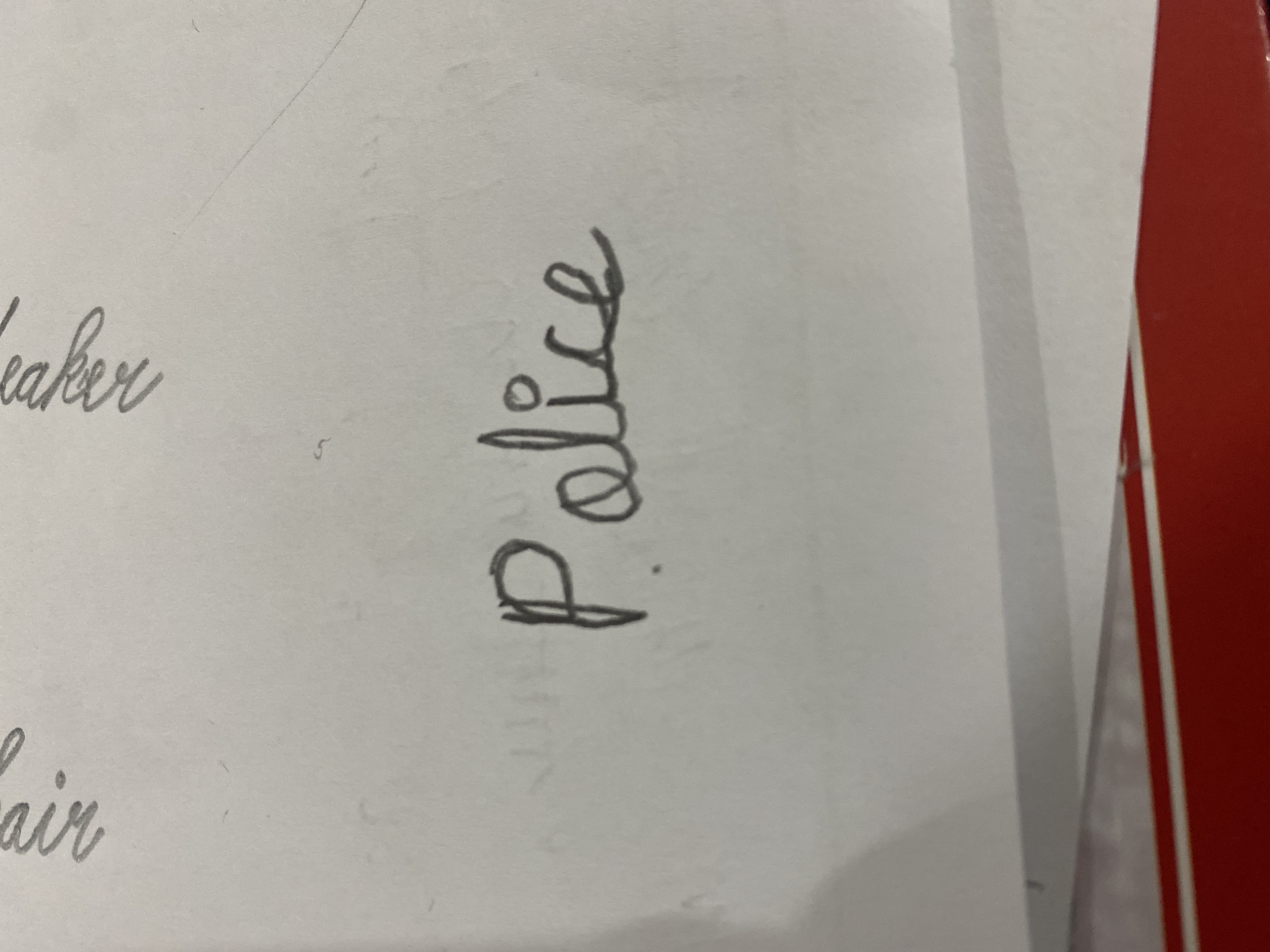
The handwriting shows potential for elegance but lacks consistency. With practice, a more polished and professional style can be achieved.
The word "Police," rendered in a cursive script, presents a fascinating case study. The letters are generally well-formed, exhibiting a degree of fluidity in the strokes, particularly noticeable in the elegant curve of the 'P' and the flowing connection between the 'i' and 'c'. However, there's a slight inconsistency in letter size and spacing, with the 'e' appearing somewhat smaller than the other letters. The overall impression is one of moderate neatness; it's legible but could benefit from more consistent sizing.
This handwriting suggests a personality that is both creative and detail-oriented, but perhaps slightly impatient or prone to occasional carelessness. The flowing style hints at a lively imagination and a flexible mind, capable of adapting to various situations. The inconsistency might reflect a tendency towards impulsiveness or a preference for speed over precision.
To improve, focus on maintaining consistent letter height and spacing. Practice writing the alphabet repeatedly, paying attention to the proportions of each letter. Try using lined paper to aid in maintaining consistent baseline alignment. Experiment with different writing implements to discover what feels most comfortable and produces the best results. This will improve the overall clarity and consistency of your handwriting.
Legibility
Expressiveness
Consistency
Overall
Leaderboard for Sunday, 04 May 2025
| 1 | The Precise Drink Distributor |
78
|
| 2 | The Precise Planter |
73
|
| 3 | The Enthusiastic Architect |
68
|
| 4 | The Conversationalist |
67
|
| 5 | The Diligent Definer |
64
|
| 6 | The Methodical Botanist |
63
|
| 7 | The Rhythmic Penman |
60
|
| 8 | The Kokuro Connoisseur |
60
|
| 9 | The Precise Ponderer |
57
|
| 10 | The Diligent Scholar |
57
|
| 11 | The Impatient Sweetheart |
53
|
| 12 | The Defender |
52
|
| 13 | The Conversationalist |
52
|
| 14 | The Dynamic Drafter |
52
|
| 15 | The Precise Planter |
50
|