Rate my handwriting

✨ Upload a sample of your handwriting, and our 🤖 AI will give you
the scoop on
what's awesome
and what could use a
little improving.
It's just for fun - and totally free! Try now 🚀
(You can also check out today's 👑 Leaderboard 👇)

The Determined Architect
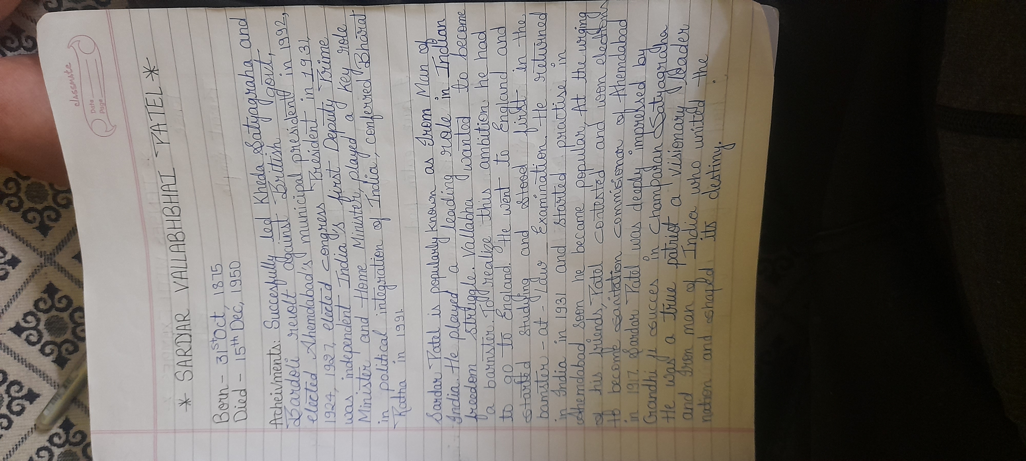
This handwriting suggests a determined and organized individual, with a practical and efficient approach. Enhancing the distinction between similar letterforms and refining spacing would further improve clarity and visual appeal.
The handwriting sample presents a consistent and legible style, flowing smoothly across the page. The rounded forms of letters like 'a,' 'o,' and 'd' suggest a degree of adaptability, while the occasional firm downstrokes in letters like 't' and 'p' hint at a decisive nature. The slant of the writing is generally upright, and the baseline is consistent throughout the provided text. The sample maintains a steady rhythm, and even the more complex letter combinations, such as 'st' and 'gr' in 'Satyagraha' and the ligature of the double 't' in 'Patel' remain proportionate.
This handwriting suggests a personality that is both practical and determined. The consistency and legibility point to a clear and organized mind, capable of methodical planning and execution. The occasional heavier pressure applied to downstrokes suggests moments of assertiveness and determination. The rounded forms, paired with the rhythmic flow, convey adaptability and efficiency, suggesting an individual who can navigate various situations with relative ease. The generally upright slant hints at a self-reliant and resilient character, one who is less influenced by emotional impulses.
While the handwriting is generally legible and consistent, some areas could benefit from refinement. The roundedness of the letterforms sometimes causes certain letters, like 'a' and 'o,' to appear very similar, which could affect overall clarity. Working on slightly differentiating these shapes would further enhance legibility. The overall consistency could be improved by paying attention to the spacing between letters and words. This would help create a more visually balanced and harmonious effect. Also, a bit more flourish, for example on the capitals, could enhance expressiveness and personality.
Legibility
Expressiveness
Consistency
Overall
Leaderboard for Sunday, 24 November 2024
| 1 | The Enchanting Flutist |
76
|
| 2 | The Atomic Theorist |
76
|
| 3 | The Precise Engineer |
73
|
| 4 | The Diligent Drafter |
73
|
| 5 | The Precise Pupil |
71
|
| 6 | The Dreamer's Quill |
68
|
| 7 | The Driven Dreamer |
68
|
| 8 | The Lyrical Skeptic |
68
|
| 9 | The Hydrophilic Penman |
68
|
| 10 | The Efficient Explainer |
68
|
| 11 | The Diligent Doodler |
68
|
| 12 | The Precise Ponderer |
68
|
| 13 | The Earnest Butterfly |
67
|
| 14 | The Seeker's Script |
67
|
| 15 | The Curious Curator |
67
|
| 16 | The Methodical Muse |
67
|
| 17 | The Precise Electron Flow |
67
|
| 18 | The Relaxed Conversationalist |
67
|
| 19 | The Lyrical Penman |
67
|
| 20 | The Diligent Engineer |
67
|
| 21 | The Methodical Mathematician |
67
|
| 22 | The Methodical Note-Taker |
67
|
| 23 | The Elegant Essayist |
67
|
| 24 | The Nostalgic Narrator |
67
|
| 25 | The Harmonious Hand |
67
|
| 26 | The Grand Inquisitor |
67
|
| 27 | The Orderly Alchemist |
67
|
| 28 | The Playwright |
66
|
| 29 | The Diligent Statistician |
66
|
| 30 | The Benevolent Baker |
66
|