Rate my handwriting

✨ Upload a sample of your handwriting, and our 🤖 AI will give you
the scoop on
what's awesome
and what could use a
little improving.
It's just for fun - and totally free! Try now 🚀
(You can also check out today's 👑 Leaderboard 👇)
The Pragmatic Penman
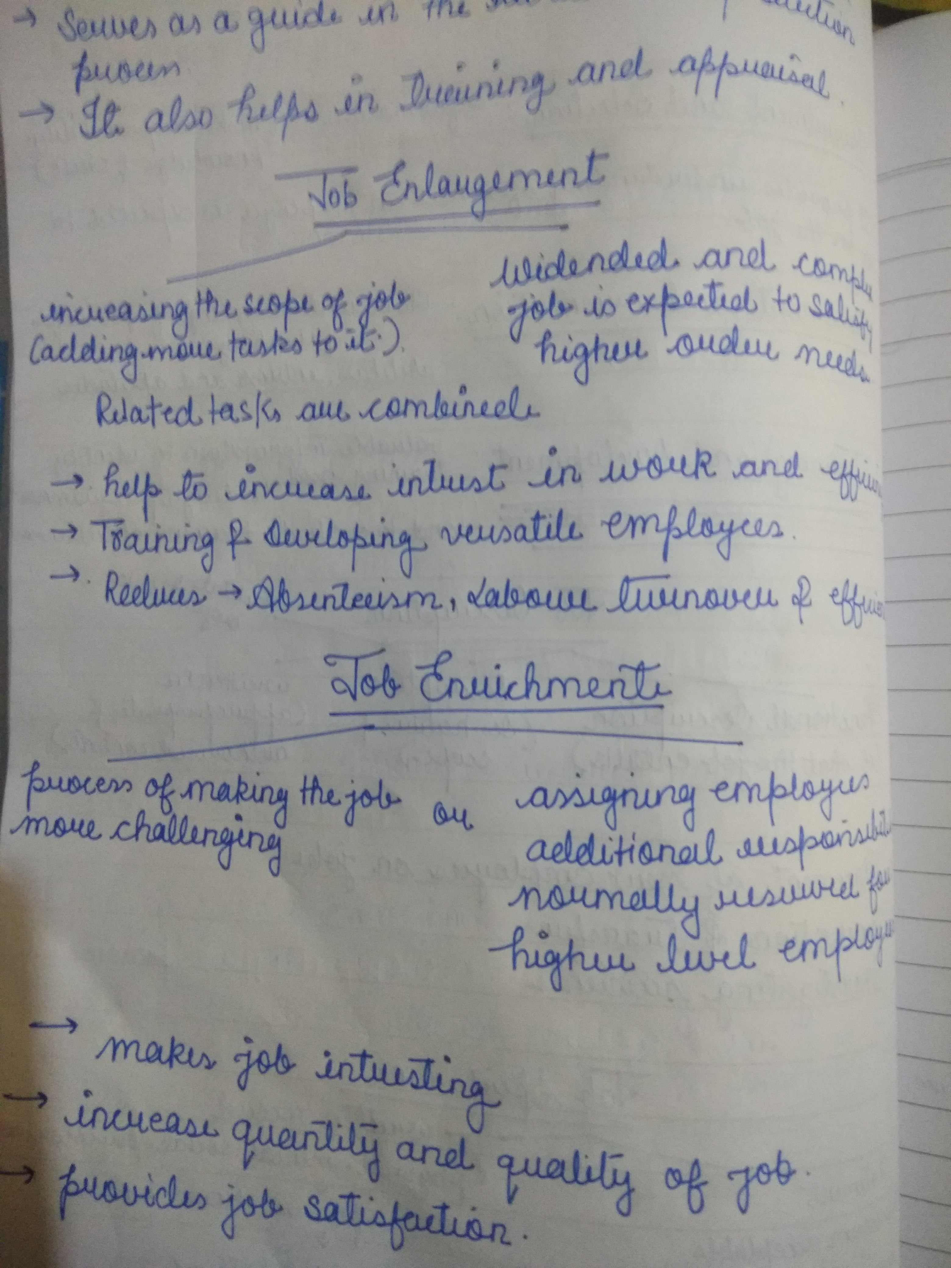
This legible and consistent handwriting suggests a practical and organized personality with a touch of ambition, although some inconsistencies hint at potential impulsivity or difficulty maintaining focus.
This handwriting sample is generally legible and consistent, indicating a practical and efficient approach to writing. The letters are generally well-formed, with occasional flourishes, as seen in the 'J' of 'Job' and the 'S' of 'Serves'. The spacing between words and lines is relatively consistent, although the baseline tends to drift slightly upwards across the page. Some letters, like 'a' and 'u', are sometimes indistinguishable, which could be improved with greater attention to detail. There are also occasional inconsistencies in the slant of the letters, which might point to some inner conflicts or a tendency towards impulsivity.
This handwriting suggests a personality that is both organized and adaptable. The consistent letter formations and spacing imply a methodical and detail-oriented approach to tasks, while the occasional flourishes and upward baseline drift suggest a degree of optimism and ambition. The instances of inconsistent slant, however, may indicate a tendency towards impulsivity or a struggle to maintain focus. The frequent use of bullet points reinforces a desire for efficiency and clear communication. The content, focusing on 'Job Enlargement' and 'Job Enrichment', suggests a professional context, perhaps from someone working in HR or management.
To improve the legibility and overall aesthetic appeal of this handwriting, focusing on consistency in letter formation and slant would be beneficial. Paying closer attention to the distinction between similar letters like 'a' and 'u' would also improve clarity. Practicing consistent spacing between letters and words, and maintaining a straight baseline, would enhance the neatness and professionalism of the writing. Consider adding more distinct ascenders and descenders to letters like 'h', 'l', and 'g' to enhance readability. Finally, slowing down slightly while writing could help improve overall control and consistency.
Legibility
Expressiveness
Consistency
Overall
Leaderboard for Friday, 11 April 2025
| 1 | The Precise Penman |
73
|
| 2 | The Methodical Historian |
73
|
| 3 | The Rhythmic Penman |
68
|
| 4 | The Diligent Student |
67
|
| 5 | The Quicksilver Quill |
67
|
| 6 | The Eloquent Expounder |
67
|
| 7 | The Diligent Pupil |
67
|
| 8 | The Playful Provocateur |
67
|
| 9 | The Rounded Writer |
64
|
| 10 | The Determined Repeater |
64
|
| 11 | The Methodical Mind |
64
|
| 12 | The Pragmatic Penman |
64
|
| 13 | The Gentle Storyteller |
64
|
| 14 | The Precise Penman |
63
|
| 15 | The Quick Brown Penman |
63
|
| 16 | The Determined Advocate |
60
|
| 17 | The Determined Dragon |
59
|
| 18 | The Methodical Penman |
59
|
| 19 | The Dreamer |
59
|
| 20 | The Diligent Scholar |
59
|
| 21 | The Casual Communicator |
56
|
| 22 | The Determined Learner |
56
|
| 23 | The Pragmatic Penman |
56
|
| 24 | The Golden-Eyed Child |
55
|
| 25 | The Historian's Hand |
55
|
| 26 | The Thoughtful Penman |
53
|
| 27 | The Pen of Pentamane |
51
|
| 28 | The Conversationalist |
51
|
| 29 | The Earnest Entreaty |
50
|
| 30 | The Diligent Repeater |
50
|