Rate my handwriting

✨ Upload a sample of your handwriting, and our 🤖 AI will give you
the scoop on
what's awesome
and what could use a
little improving.
It's just for fun - and totally free! Try now 🚀
(You can also check out today's 👑 Leaderboard 👇)
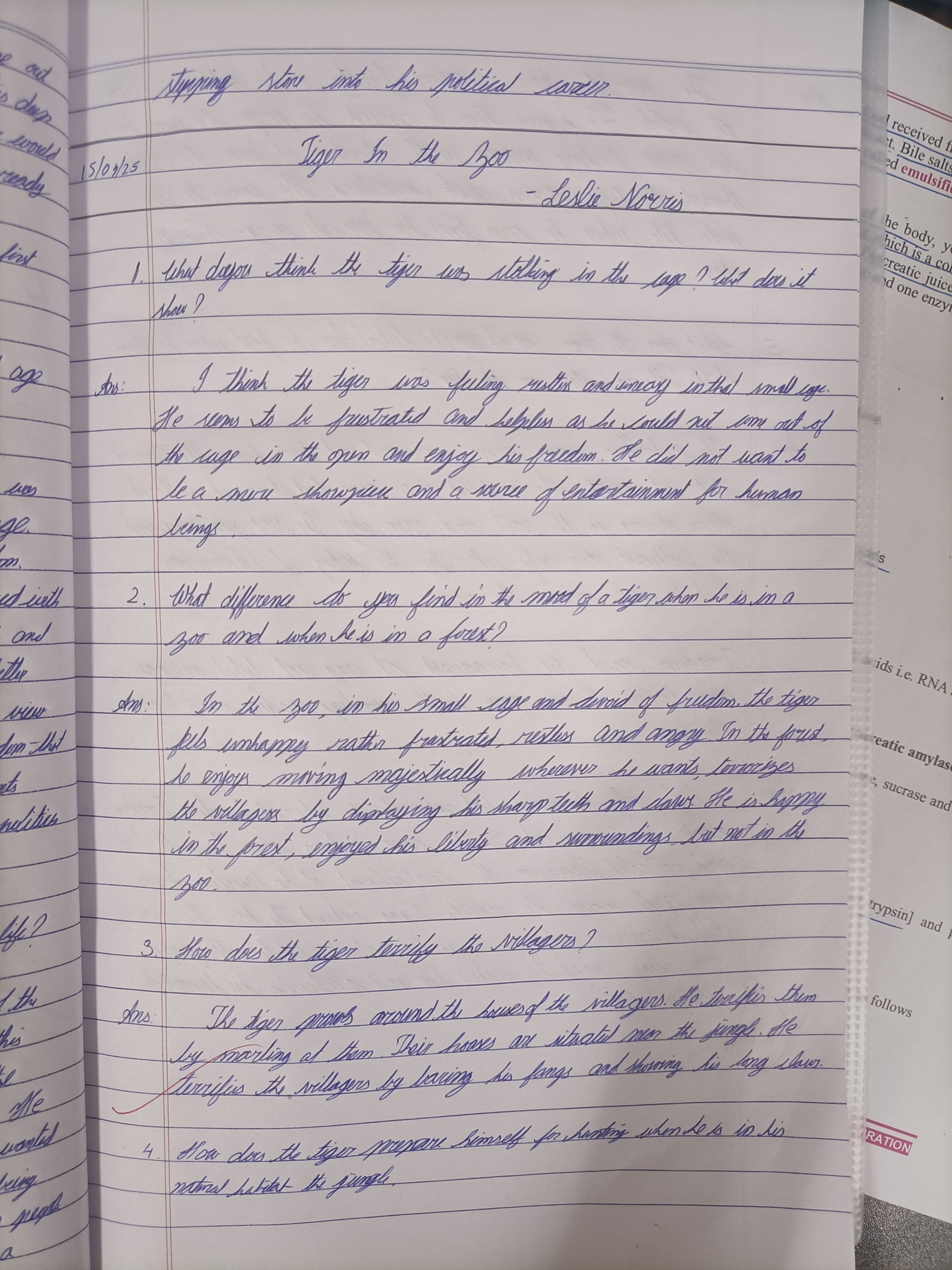
The Caged Tiger
This neat and flowing handwriting suggests a personality that is organized, adaptable, and passionate, but could benefit from slightly more attention to detail and spacing.
The handwriting in this sample is generally neat and legible, with a consistent slant and spacing between words. The letters are well-formed, although there are some inconsistencies in size and shape, particularly with the lowercase 'g' and 'y' as seen in words like 'enjoy', 'cage', and 'displaying'. The ascenders and descenders are of moderate length, and the baseline is relatively straight, indicating a balanced approach. There's a connectedness to the letters, creating a smooth, flowing script that suggests efficient thought processes and a dislike for interruptions.
This handwriting suggests a personality that is both organized and adaptable. The neatness and consistency point to a methodical and detail-oriented nature, while the flowing script hints at an ability to think on one's feet and adjust to changing situations. The rounded forms of some letters, such as the 'o' in 'zoo' and 'source', indicate a degree of empathy and a preference for harmonious relationships. The forceful downstrokes in words like 'tiger' and 'frustrated', combined with the sharp points of the 't' and 'd', might betray a hidden intensity and passion waiting for the right moment to pounce.
To enhance the legibility and aesthetic appeal of this handwriting, attention could be paid to maintaining a more uniform size for all letters, particularly those with loops like 'g', 'y', and 'j'. A touch more spacing between lines would prevent the descenders from occasionally colliding with the ascenders of the lines below. Finally, slowing down the writing process just a bit would allow for greater precision in the formation of letters and result in a more polished overall presentation.
Legibility
Expressiveness
Consistency
Overall
Leaderboard for Saturday, 19 April 2025
| 1 | The Punctual Penman |
74
|
| 2 | The Diligent Student |
71
|
| 3 | The Geologist |
68
|
| 4 | The Diligent Drafter |
65
|
| 5 | The Diligent Drafter |
65
|
| 6 | The Diligent Documenter |
60
|
| 7 | The Diligent Biologist |
59
|
| 8 | The Diligent Student |
59
|
| 9 | The Aspirational Author |
58
|
| 10 | The Diligent Student |
52
|
| 11 | The Determined Advocate |
51
|