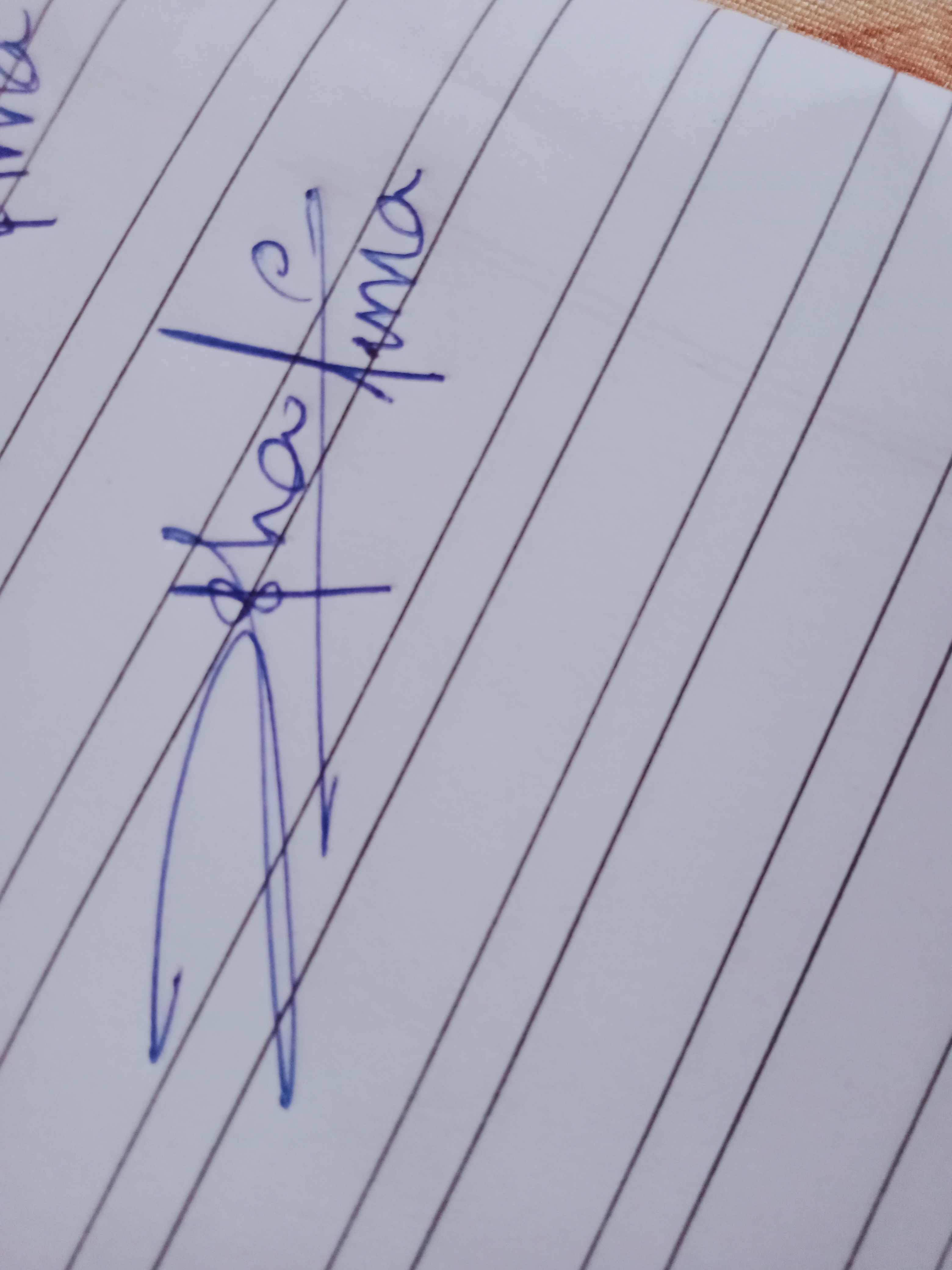
Rate my handwriting

✨ Upload a sample of your handwriting, and our 🤖 AI will give you
the scoop on
what's awesome
and what could use a
little improving.
It's just for fun - and totally free! Try now 🚀
(You can also check out today's 👑 Leaderboard 👇)

The Dynamic Designer
This handwriting reveals a dynamic and creative personality, with a strong sense of self-expression, coupled with a desire for efficiency. However, working on consistency in letter size and spacing would improve clarity and readability.
The handwriting sample showcases a distinctive style, marked by dramatic flourishes and a personalized approach. The unique formation of the "p" in "photos", resembles a stylized musical note, which is indicative of a penchant for artistry and expressiveness. The bold, interconnected strokes suggest a desire for efficiency and fluidity, particularly visible in the long, looping descender of the "h". While there is a consistent slant and baseline throughout the word "photos", the accompanying "Amna" shows some variability in letter size and spacing.
This handwriting suggests an individual who values creativity, efficiency, and expressiveness. The personalized "p" indicates a strong sense of self, while the dramatic flourishes imply a flair for the dramatic and a need for self-expression. The fluctuating letter size and spacing in "Amna" could point to some impatience and spontaneity, hinting at a person who might get carried away by enthusiasm. The connected letters and swift strokes reveal an individual who prioritizes speed and efficiency, while the consistent slant and baseline in "photos" indicates an underlying need for order and structure.
While your handwriting demonstrates style and character, improving legibility could be beneficial. Focusing on maintaining consistent letter sizes, especially in "Amna", and slowing down to ensure adequate spacing between letters and words would improve readability. While the unique "p" adds flair, making the opening loop smaller would prevent potential confusion with other letters. Similarly, emphasizing the dots over the "i" and carefully forming the connecting stroke in "mn" can improve clarity and prevent misinterpretation. Practicing writing individual letters and focusing on uniform letter heights will create a more balanced appearance.
Legibility
Expressiveness
Consistency
Overall
Leaderboard for Friday, 04 April 2025
| 1 | The Peach-Tree Poet |
76
|
| 2 | The Weary Glazier |
73
|
| 3 | The Botanical Biographer |
67
|
| 4 | The Inquisitive Examiner |
67
|
| 5 | The Whimsical Wanderer |
63
|
| 6 | The Botanical Biographer |
54
|
| 7 | The Determined Dreamer |
50
|