Rate my handwriting

✨ Upload a sample of your handwriting, and our 🤖 AI will give you
the scoop on
what's awesome
and what could use a
little improving.
It's just for fun - and totally free! Try now 🚀
(You can also check out today's 👑 Leaderboard 👇)
The Light Penman
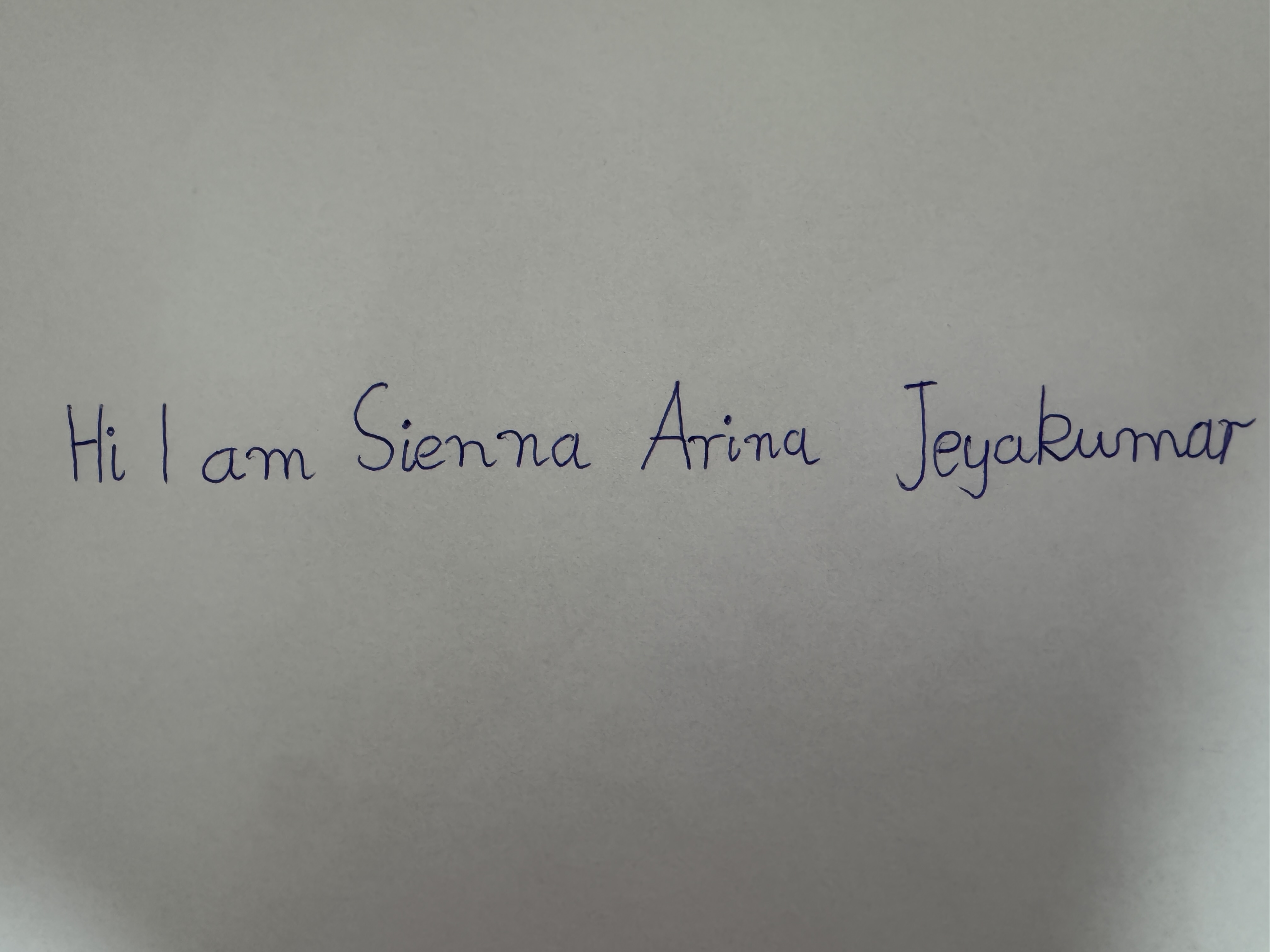
The handwriting is neat, consistent, and slightly right-slanted, suggesting a sensitive, sociable, and optimistic individual.
This handwriting sample presents as generally neat and legible, with a consistent slant and letter size. The rounded letters, such as the 'a' in "am" and the 'i's throughout, create a soft and friendly feel. While the baseline is mostly straight, there are some minor variations, hinting at adaptability. The overall simplicity of the style, as seen in the straightforward letter formations of "Sienna" and "Arina", suggests a direct and uncomplicated nature.
The light pressure used throughout implies sensitivity and a gentle approach. The slightly disconnected letters, as seen between the 'e' and 'y' in "Jeyakumar", suggest a touch of independence and a preference for personal space. The rightward slant indicates optimism and a forward-thinking nature. The roundedness of the letters, combined with the relatively fast pace implied by the connectedness within words, speaks to a sociable and approachable personality.
To enhance legibility and visual appeal, focus on maintaining a consistent baseline and connecting letters within words more deliberately. Practicing joining letters with smoother transitions, especially between the 'e' and 'y' or the 'u' and 'm', can add polish and improve flow. Experimenting with slightly varying letter sizes and shapes, while retaining the overall neatness, could add an element of individuality and creativity.
Legibility
Expressiveness
Consistency
Overall
Leaderboard for Saturday, 19 April 2025
| 1 | The Whisperer of the Woods |
70
|
| 2 | The Diligent Doodler |
69
|
| 3 | The Minimalist |
67
|
| 4 | The Tamil Tiger |
58
|
| 5 | The Diligent Scholar |
52
|