Rate my handwriting

✨ Upload a sample of your handwriting, and our 🤖 AI will give you
the scoop on
what's awesome
and what could use a
little improving.
It's just for fun - and totally free! Try now 🚀
(You can also check out today's 👑 Leaderboard 👇)
The Geographic Gazetteer
The handwriting is generally neat and legible, suggesting a practical and organized individual.
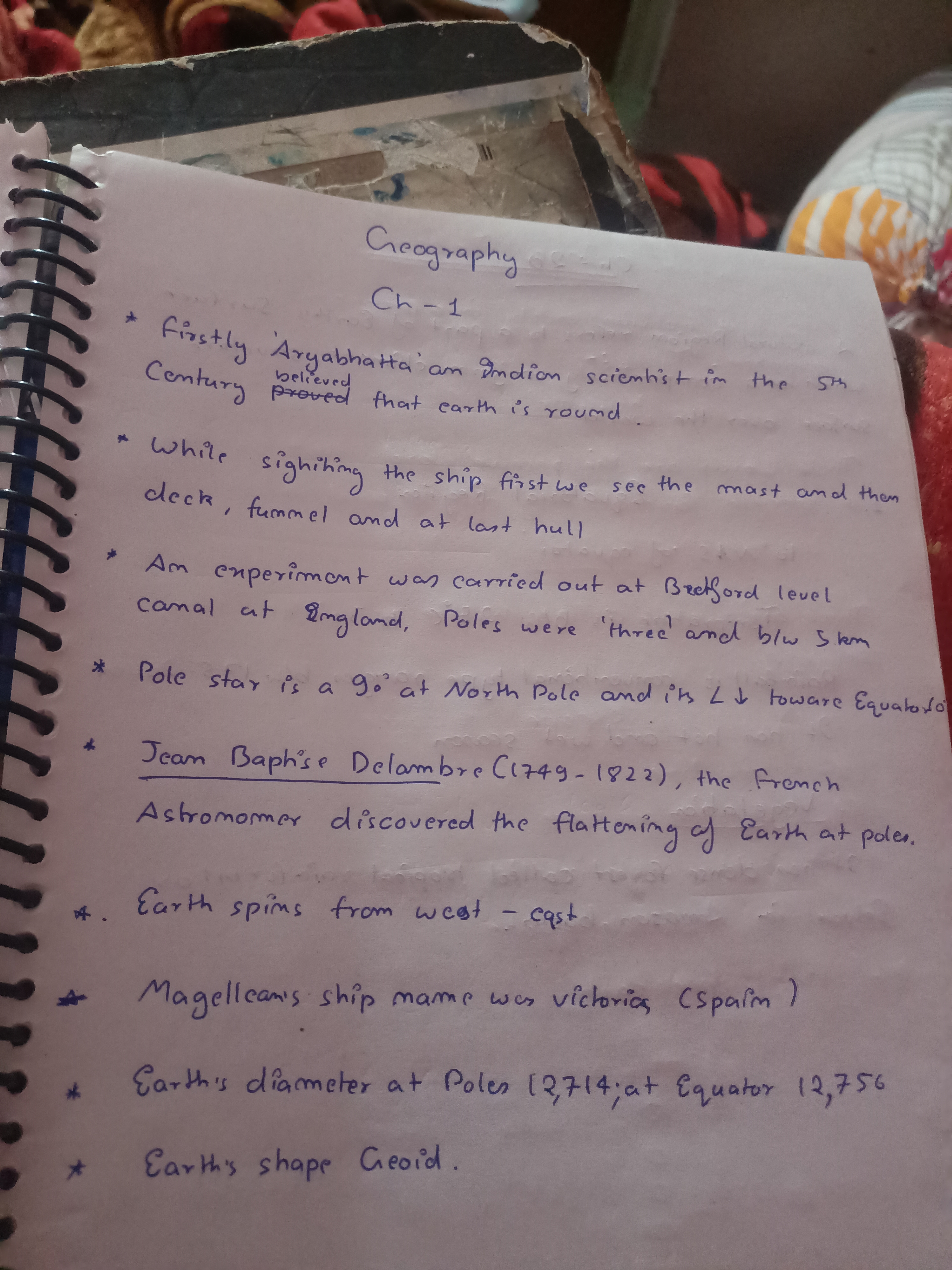
This handwriting sample is generally neat and legible, with a consistent slant and spacing between words. The letters are of a fairly uniform size and shape, although there are some inconsistencies in the formation of certain letters such as 'a' and 'g'. Words like 'Firstly' and 'Geography' demonstrate the careful formation of upper- and lowercase letters. The writer has corrected themselves from 'believed' to 'proved', indicating attention to detail and accuracy.
The consistent, upright slant suggests a generally practical and straightforward personality. The neatness implies a methodical and organized approach to tasks. The rounded letters could suggest a degree of creativity and adaptability. The overall impression is one of someone who is thoughtful and attentive to detail.
To improve legibility, consider ensuring the 'a' and 'g' are always closed. Pay attention to spacing between words, especially when starting new lines to ensure alignment. Overall, the handwriting is functional and legible. Continue to focus on consistency in letter formation and spacing to maintain clarity.
Legibility
Expressiveness
Consistency
Overall
Leaderboard for Saturday, 19 April 2025
| 1 | The Diligent Doodler |
69
|
| 2 | The Minimalist |
67
|
| 3 | The Tamil Tiger |
58
|
| 4 | The Diligent Student |
52
|
| 5 | The Diligent Scholar |
52
|