Rate my handwriting

✨ Upload a sample of your handwriting, and our 🤖 AI will give you
the scoop on
what's awesome
and what could use a
little improving.
It's just for fun - and totally free! Try now 🚀
(You can also check out today's 👑 Leaderboard 👇)

The Playful Penman
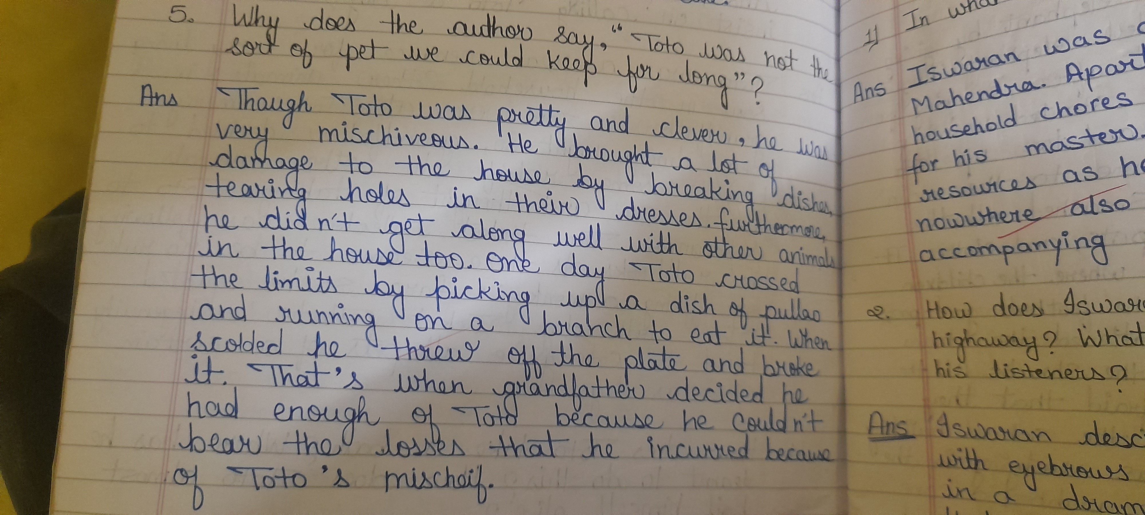
This playful yet legible handwriting suggests a cheerful, adaptable, and creative personality with a good balance of structure and spontaneity.
This handwriting is generally neat and legible, with a consistent slant and spacing between words. The rounded letters, such as the 'o' in 'Toto' and the 'a' in 'damage', suggest a playful and approachable nature. However, the inconsistent size of letters, exemplified by the varying heights of the 'h' in 'he' throughout the sample, hints at a touch of impulsiveness. The occasional flourishes, like the extended crossbar of the 't' in 'That's', add a dash of expressiveness.
This writer likely possesses a cheerful and optimistic disposition. The rounded letters indicate a friendly and sociable personality, while the impulsiveness in letter size suggests a spontaneous and adaptable nature. The expressiveness in certain strokes hints at a creative mind, perhaps with a penchant for storytelling, as evidenced by the detailed narrative about Toto's mischief. The neatness and legibility, despite the playful inconsistencies, indicate a balanced personality that values both structure and freedom.
To improve this handwriting, focusing on consistency in letter size would be beneficial. Practicing writing letters like 'h' and 'l' with uniform height would enhance the overall neatness and create a more polished impression. Additionally, paying attention to the baseline, ensuring that the words don't float excessively above or below the lines, would further enhance legibility. However, the existing playful inconsistencies should not be entirely eradicated, as they contribute to the unique charm and expressiveness of this handwriting.
Legibility
Expressiveness
Consistency
Overall
Leaderboard for Saturday, 19 April 2025
| 1 | The Diligent Student |
71
|
| 2 | The Diligent Doodler |
69
|
| 3 | The Minimalist |
67
|
| 4 | The Tamil Tiger |
58
|
| 5 | The Diligent Student |
52
|
| 6 | The Diligent Scholar |
52
|