Rate my handwriting

✨ Upload a sample of your handwriting, and our 🤖 AI will give you
the scoop on
what's awesome
and what could use a
little improving.
It's just for fun - and totally free! Try now 🚀
(You can also check out today's 👑 Leaderboard 👇)

The Pensive Ponderer
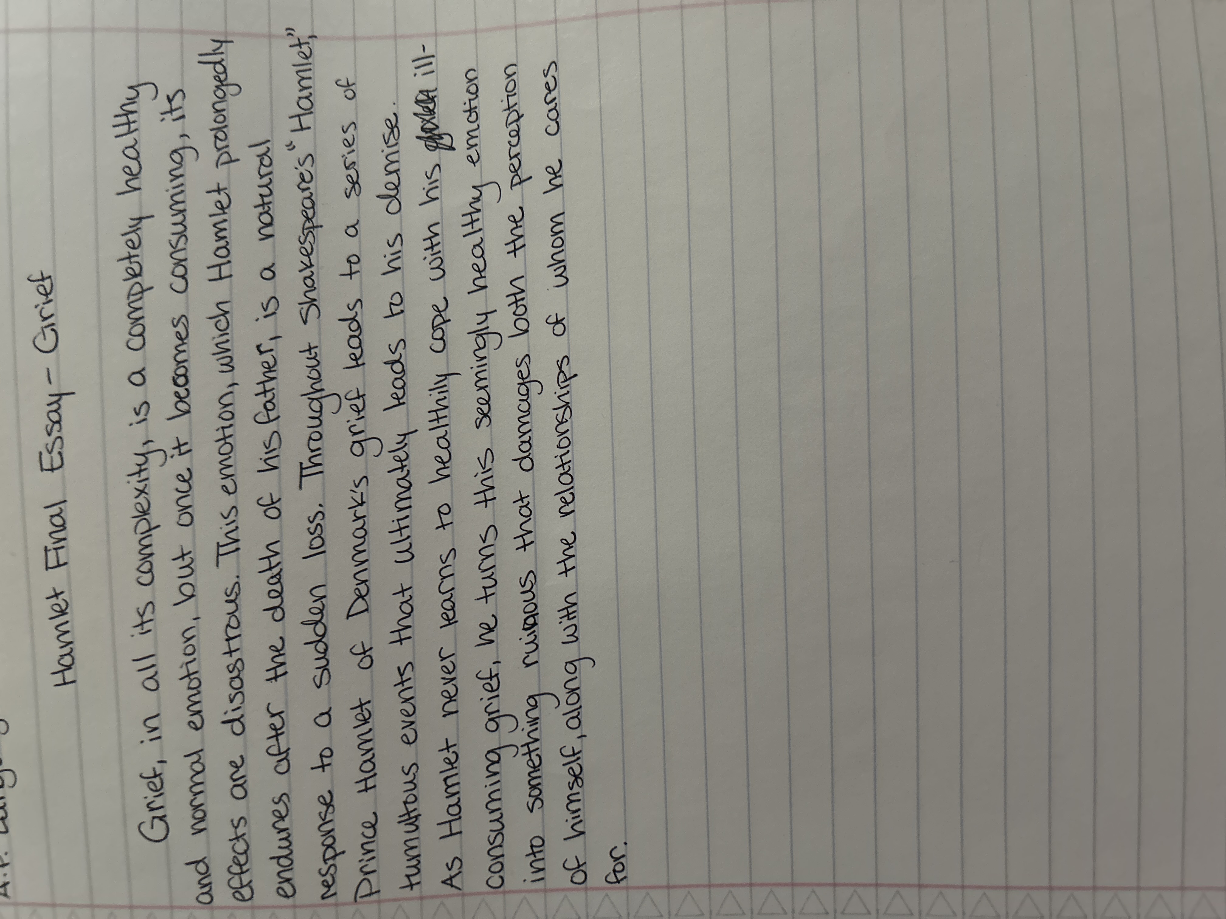
This handwriting suggests a methodical and thoughtful individual with underlying creativity and a tendency to get lost in detail.
This handwriting sample showcases a blend of consistency and expressiveness. The letters are generally uniform in size and slant, as seen in the repeated use of "t," "h," and "e." The baseline is relatively straight, adhering to the ruled lines of the paper, yet occasional flourishes appear in the longer loops of "g," "y," and "f," as in "grief" and "consuming," indicating a degree of individuality. While generally legible, there are instances where the letters become compressed, especially in longer words like "prolongedly," affecting clarity. The writer uses cursive almost exclusively, and the connection between letters is generally smooth, suggesting a good flow of thought.
The consistent slant and spacing suggest a writer who values order and logic, someone methodical and thoughtful in their approach. The expressive flourishes hint at an underlying creativity and emotional depth, indicating an ability to engage deeply with subjects of interest. The occasional lapses in legibility might point to a tendency to get caught up in details, sometimes losing sight of the bigger picture. This is reflected in the chosen vocabulary such as "complexity" and "tumultuous." Overall, the handwriting implies a personality that balances reason with feeling.
To improve this handwriting, the writer could focus on maintaining consistent spacing between letters, especially within longer words. This will enhance legibility and make the text easier to read. Practicing letter formations for compressed letters, particularly those with rounded shapes like "o" and "a," can further refine the overall appearance. Experimenting with varying letter sizes and slants intentionally can add a dynamic element while preserving the underlying neatness. This might improve their handwriting's impact when expressing themselves.
Legibility
Expressiveness
Consistency
Overall