Rate my handwriting

✨ Upload a sample of your handwriting, and our 🤖 AI will give you
the scoop on
what's awesome
and what could use a
little improving.
It's just for fun - and totally free! Try now 🚀
(You can also check out today's 👑 Leaderboard 👇)
The Festive Decorator
This neat and generally consistent handwriting suggests an organized and practical individual with a touch of creativity.
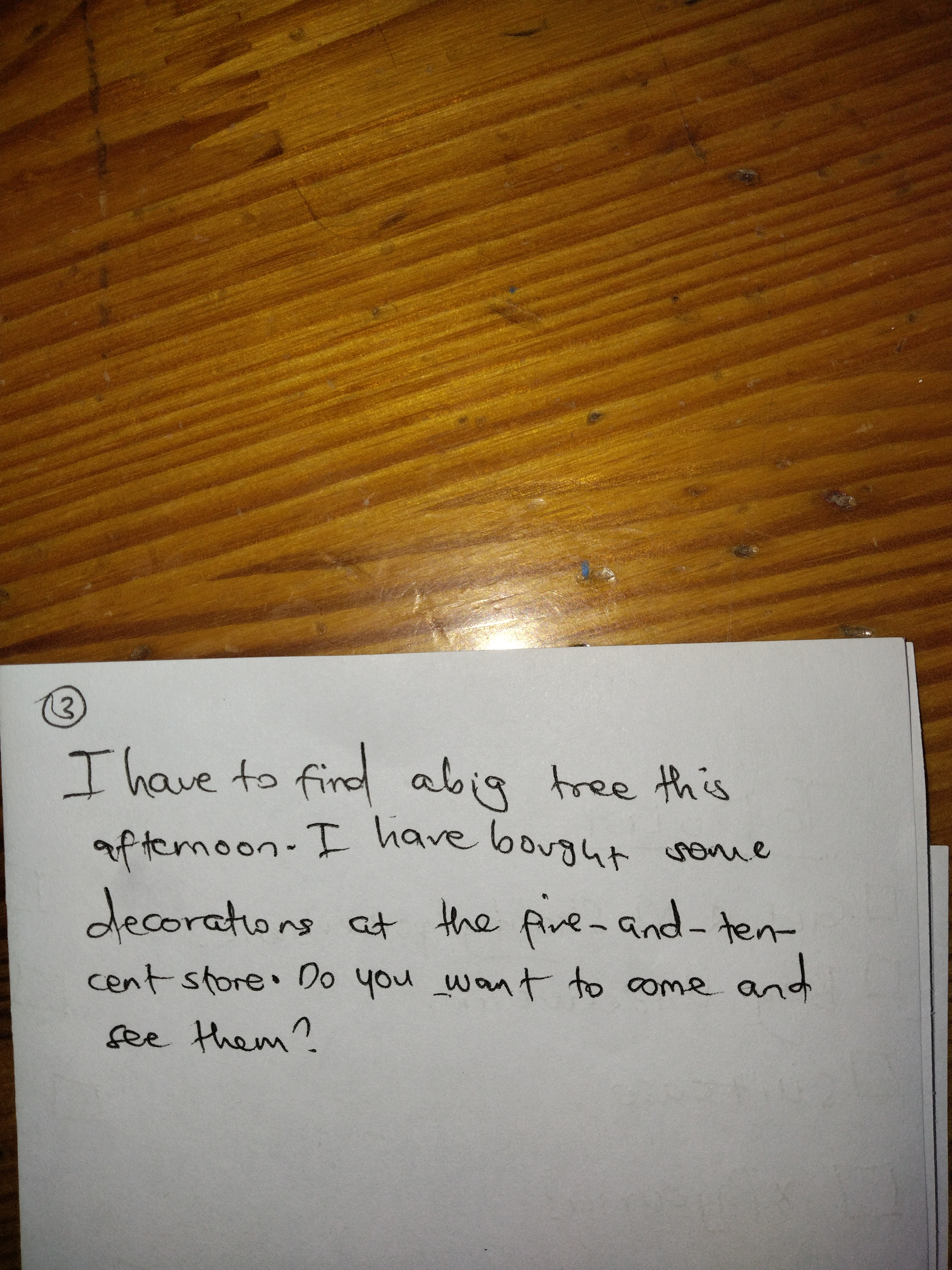
This handwriting is neat and legible, with a consistent slant and spacing between words. The letters are generally well-formed, although some, like the 'a' in 'afternoon' and the 'g' in 'big', show a slight tendency to loop or curve in an unusual way. The overall impression is one of efficiency and a touch of informality, suggested by the slightly simplified forms of certain letters, such as the 't' in 'tree' and the 'h' in 'have'.
The consistent slant and spacing of this handwriting suggest a person who is organized and methodical in their approach to tasks. The slight irregularity in the formation of some letters hints at a creative spark, while the overall neatness implies a certain attention to detail. The slightly simplified letterforms may indicate a preference for practicality and efficiency over elaborate flourishes. Phrases like "five-and-ten-cent store" further suggests an economical and practical mindset, while the invitation "Do you want to come and see them?" implies a friendly and sociable nature.
To improve this handwriting, focus on maintaining consistent letterforms, especially for letters like 'a' and 'g' that show a tendency to vary. Pay attention to the height and proportion of letters, ensuring that they are uniform across the sample. While the simplified letterforms contribute to the overall impression of efficiency, adding a touch more flourish could enhance the visual appeal of the handwriting without sacrificing legibility.
Legibility
Expressiveness
Consistency
Overall
Leaderboard for Sunday, 20 April 2025
| 1 | The Whisperer of the Woods |
70
|
| 2 | The Diligent Doodler |
69
|
| 3 | The Minimalist |
67
|
| 4 | The Tamil Tiger |
58
|
| 5 | The Diligent Scholar |
52
|