Rate my handwriting

✨ Upload a sample of your handwriting, and our 🤖 AI will give you
the scoop on
what's awesome
and what could use a
little improving.
It's just for fun - and totally free! Try now 🚀
(You can also check out today's 👑 Leaderboard 👇)
The Relaxed Fox
This handwriting reveals a relaxed and empathetic individual with a grounded and adaptable nature. Enhancing letter consistency and spacing would improve legibility and presentation.
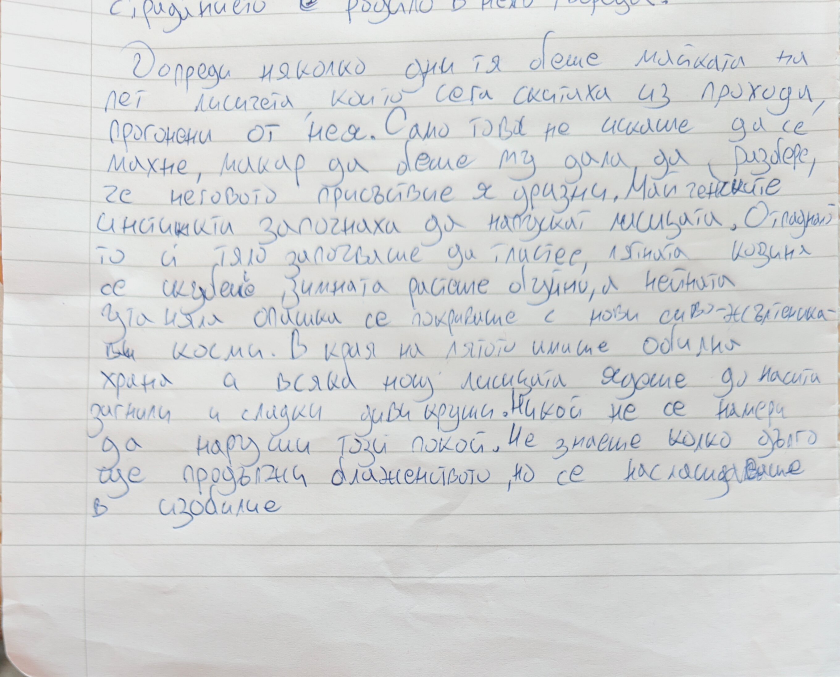
This handwriting sample presents a relaxed and connected style. The letters flow together smoothly, as seen in words like "присъствие" and "започнаха", indicating a certain ease and fluency of thought. The rounded forms of letters like "о" and "а" suggest a gentle nature. The baseline is relatively straight and consistent, which speaks to a grounded personality. The moderate slant to the right indicates a writer who is engaged with the world and open to experiences. There is also a balanced mix of soft curves and sharp points as seen in words such as "лисицита", suggesting a harmonious blend of pragmatism and creativity.
This handwriting suggests a personality that is adaptable and empathetic. The connectedness of the script implies a strong ability to see the big picture and make connections between ideas. The rounded letters hint at a nurturing and compassionate nature, while the rightward slant suggests a proactive approach to life. The relaxed quality of the writing indicates someone who is comfortable in their own skin and not overly concerned with perfection. The balanced mix of curves and angles may point to an ability to be both assertive and diplomatic, suggesting someone who navigates social situations with grace and ease.
While this handwriting is generally legible and pleasant to read, a few minor improvements could enhance its clarity and aesthetic appeal. Paying attention to the size and spacing of letters, especially in words like "продължи", could increase legibility. Ensuring that ascenders and descenders are distinct, particularly in letters like "д" and "г", would further enhance readability. Practicing consistent letter formation, especially for letters like "н", which sometimes varies in shape, would give the writing a more polished appearance.
Legibility
Expressiveness
Consistency
Overall
Leaderboard for Monday, 28 April 2025
| 1 | The Relaxed Fox |
68
|
| 2 | The Impatient Penman |
68
|
| 3 | The Conversationalist |
67
|
| 4 | The Rhythmic Physicist |
67
|
| 5 | The Rhythmic Penman |
67
|
| 6 | The Methodical Chemist |
63
|
| 7 | The Neat Notebook Narrator |
62
|
| 8 | The Equationist |
62
|
| 9 | The Dreamer |
62
|
| 10 | The Casual Penman |
60
|
| 11 | The Light-Hearted Loyalist |
60
|
| 12 | The Casual Communicator |
59
|
| 13 | The Midnight Penman |
59
|
| 14 | The Romantic |
59
|
| 15 | The Conversationalist |
57
|
| 16 | The Determined Penman |
56
|
| 17 | The Considerate Conversationalist |
56
|
| 18 | The Impatient Gamer |
56
|
| 19 | The Jumpy Fox |
55
|
| 20 | The Curious Composer |
53
|
| 21 | The Contemplative Fox |
53
|
| 22 | The Midnight Penman |
53
|
| 23 | The Curious Quill |
52
|
| 24 | The Midnight Thinker |
50
|
| 25 | The Conversationalist |
50
|
| 26 | The Nostalgic Penman |
50
|