Rate my handwriting

✨ Upload a sample of your handwriting, and our 🤖 AI will give you
the scoop on
what's awesome
and what could use a
little improving.
It's just for fun - and totally free! Try now 🚀
(You can also check out today's 👑 Leaderboard 👇)
The Precise Penman
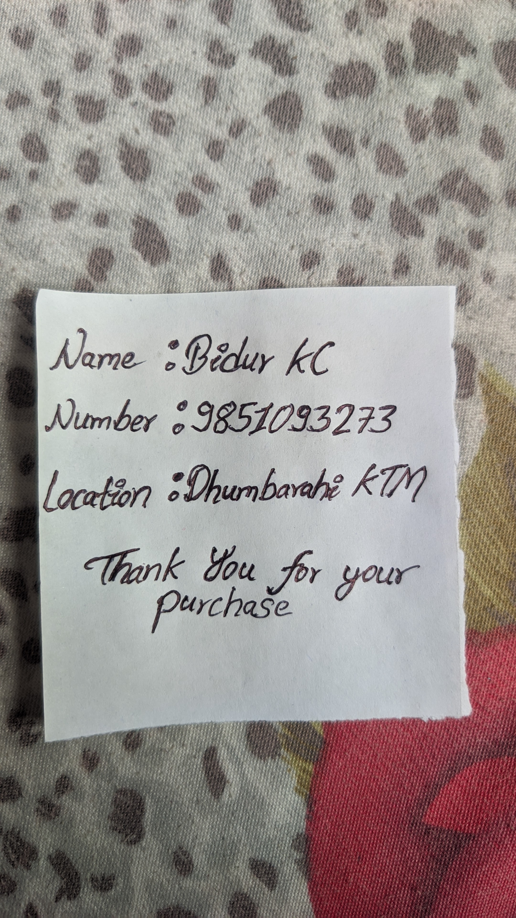
This neat and legible handwriting suggests a personality that values order and clarity, with a touch of expressiveness. Minor improvements in spacing and letter formation would enhance its already impressive quality.
This handwriting sample displays a good level of precision and control. The letters are generally well-formed and consistent in size and shape, as seen in the neatness of the name "Bidur KC" and the phone number. There's a slight rightward slant, suggesting a forward-thinking and expressive nature. The overall appearance is quite legible, although the cursive style introduces some connectedness between letters.
The writer's personality, as suggested by their handwriting, likely includes traits such as organization, attention to detail, and a degree of formality. The consistent letter formations indicate a methodical approach, while the rightward slant hints at a willingness to communicate and engage with others. The clear presentation further reinforces the impression of someone who values clarity and directness in their interactions.
While the handwriting is already quite legible, a few minor improvements could enhance it further. Focusing on maintaining consistent spacing between words, as seen in "Thank You for your Purchase", could improve readability. Additionally, ensuring that the lower loops of letters like 'y' and 'g' are distinct and don't merge with other letters would add to the overall clarity. Practicing writing on lined paper could help regulate letter size and baseline alignment, ultimately contributing to a more polished and professional appearance.
Legibility
Expressiveness
Consistency
Overall
Leaderboard for Friday, 18 April 2025
| 1 | The Punctual Penman |
74
|
| 2 | The Diligent Biologist |
64
|
| 3 | The Diligent Scholar |
60
|
| 4 | The Hopeful Romantic |
60
|
| 5 | The Diligent Pupil |
59
|
| 6 | The Aspirational Author |
58
|
| 7 | The Hopeful Romantic |
57
|
| 8 | The Diligent Biologist |
54
|
| 9 | The Determined Advocate |
51
|