Rate my handwriting

✨ Upload a sample of your handwriting, and our 🤖 AI will give you
the scoop on
what's awesome
and what could use a
little improving.
It's just for fun - and totally free! Try now 🚀
(You can also check out today's 👑 Leaderboard 👇)
The Lyrical Linguist
This expressive and consistent handwriting indicates a personality that values both creativity and structure, with a possible passion for literature and the arts. Minor improvements in baseline consistency and spacing could enhance readability.
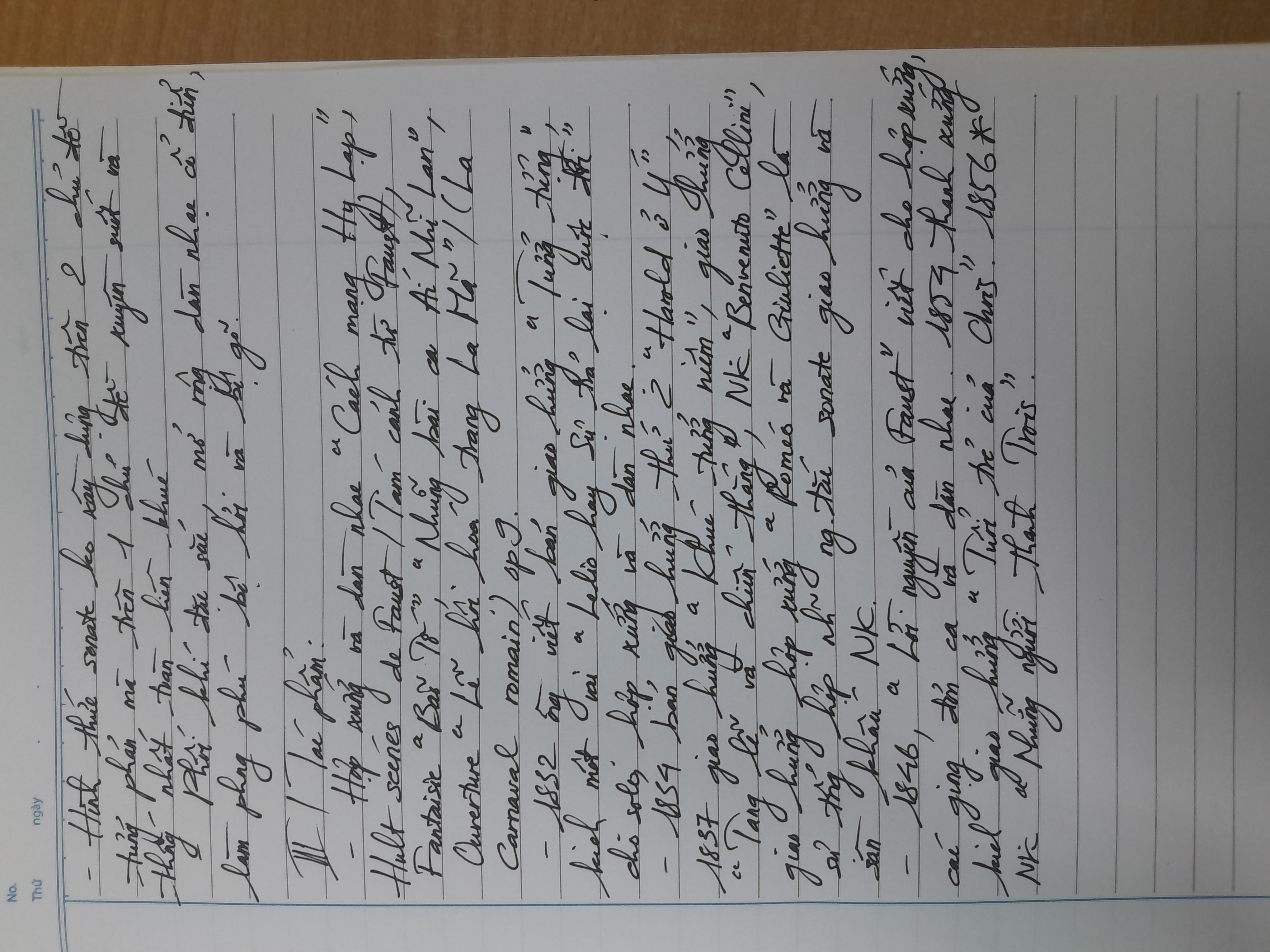
This handwriting sample showcases a distinctive blend of consistency and expressiveness. The script flows smoothly, with rounded forms and elongated ascenders and descenders, as seen in words like "Những" and "Faust". The connections between letters are generally fluid, suggesting a connected thought process. While the overall appearance is neat, there's a dynamic quality to the baseline and letter sizes, adding to the expressiveness. The frequent use of quotation marks and titles, such as "Cách mạng Hy Lạp" and "Carnaval romain", further points towards a lyrical and intellectual nature.
This handwriting suggests a personality that is both artistic and analytical. The fluidity and expressiveness hint at a creative mind, while the consistent slant and letter formations indicate a structured and organized approach. The writer likely enjoys expressing themselves through language and appreciates the nuances of words and phrases. They may be drawn to creative pursuits like writing or music, but also possess a strong sense of logic and order. The emphasis on titles and cultural references, such as "Roméo và Giuliette", could imply a deep appreciation for literature and the arts.
While generally legible and expressive, some minor improvements could enhance the overall impact of this handwriting. Focusing on maintaining a more consistent baseline, as variations are visible across different lines, would create a more polished appearance. Paying closer attention to the spacing between words, especially where crowding occurs, such as between "Roméo" and "và", could improve readability. Additionally, refining the formation of certain letters, like the lowercase "g" which sometimes appears closed, could add to the overall neatness and legibility of the script.
Legibility
Expressiveness
Consistency
Overall
Leaderboard for Wednesday, 16 April 2025
| 1 | The Diligent Documenter |
74
|
| 2 | The Hopeful Correspondent |
73
|
| 3 | The Playful Penman |
71
|
| 4 | The Adaptable Penman |
70
|
| 5 | The Straightforward Storyteller |
67
|
| 6 | The Enigmatic Note-Leaver |
66
|
| 7 | The Diligent Drafter |
64
|
| 8 | The Careful Cynic |
64
|
| 9 | The Earnest Correspondent |
64
|
| 10 | The Methodical Mathematician |
60
|
| 11 | The Caged Tiger |
60
|
| 12 | The Observant Eye |
60
|
| 13 | The Diligent Documenter |
59
|
| 14 | The Determined Dreamer |
59
|
| 15 | The Precise Pragmatist |
58
|
| 16 | The Penman of Pleasantries |
57
|
| 17 | The Determined Dreamer |
57
|
| 18 | The Methodical Composer |
57
|
| 19 | The Diligent Grammarian |
56
|
| 20 | The Conversationalist |
56
|
| 21 | The Methodical Botanist |
55
|
| 22 | The Casual Communicator |
54
|
| 23 | The Upbeat Optimist |
53
|
| 24 | The Earnest Exam-Taker |
51
|
| 25 | The Earnest Correspondent |
50
|
| 26 | The Casual Greeter |
50
|
| 27 | The Diligent Student |
50
|