Rate my handwriting

✨ Upload a sample of your handwriting, and our 🤖 AI will give you
the scoop on
what's awesome
and what could use a
little improving.
It's just for fun - and totally free! Try now 🚀
(You can also check out today's 👑 Leaderboard 👇)

The Determined Penman
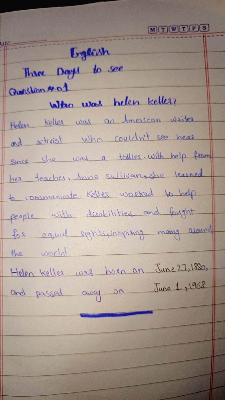
The handwriting demonstrates determination and focus, with a friendly undertone. Attention to letter consistency and spacing would improve clarity and aesthetics.
This handwriting sample showcases a blend of rounded and slightly angular letterforms, with an upright slant. The baseline is relatively consistent, reflecting a focused approach. Words like "communicate" and "inspiring" demonstrate a comfortable rhythm, although some letters like 'a' and 'o' vary slightly in size. Legibility remains fairly good, thanks to adequate spacing between words, although tighter spacing between letters within words adds a touch of informality.
The determined strokes and generally consistent baseline suggest a writer with clear goals and a focused mindset. The rounded letters hint at a friendly and approachable nature, while the occasional angularity indicates a degree of assertiveness and an independent streak. The variations in letter size suggest a touch of adaptability, willing to adjust as needed.
While generally legible, some improvements could enhance the handwriting's clarity and aesthetics. Paying attention to the consistent formation of letters, particularly 'a' and 'o', would improve uniformity. Slightly increasing the space between letters within words could improve readability, and practicing consistent letter sizes would create a more polished appearance. Embracing cursive connections between all letters would also enhance fluency and flow.
Legibility
Expressiveness
Consistency
Overall
Leaderboard for Friday, 11 April 2025
| 1 | The Precise Penman |
73
|
| 2 | The Methodical Historian |
73
|
| 3 | The Rhythmic Penman |
68
|
| 4 | The Diligent Student |
67
|
| 5 | The Quicksilver Quill |
67
|
| 6 | The Eloquent Expounder |
67
|
| 7 | The Diligent Pupil |
67
|
| 8 | The Playful Provocateur |
67
|
| 9 | The Rounded Writer |
64
|
| 10 | The Determined Repeater |
64
|
| 11 | The Methodical Mind |
64
|
| 12 | The Pragmatic Penman |
64
|
| 13 | The Gentle Storyteller |
64
|
| 14 | The Precise Penman |
63
|
| 15 | The Quick Brown Penman |
63
|
| 16 | The Determined Advocate |
60
|
| 17 | The Determined Dragon |
59
|
| 18 | The Methodical Penman |
59
|
| 19 | The Dreamer |
59
|
| 20 | The Diligent Scholar |
59
|
| 21 | The Casual Communicator |
56
|
| 22 | The Determined Learner |
56
|
| 23 | The Pragmatic Penman |
56
|
| 24 | The Golden-Eyed Child |
55
|
| 25 | The Historian's Hand |
55
|
| 26 | The Thoughtful Penman |
53
|
| 27 | The Pen of Pentamane |
51
|
| 28 | The Conversationalist |
51
|
| 29 | The Earnest Entreaty |
50
|
| 30 | The Diligent Repeater |
50
|