Rate my handwriting

✨ Upload a sample of your handwriting, and our 🤖 AI will give you
the scoop on
what's awesome
and what could use a
little improving.
It's just for fun - and totally free! Try now 🚀
(You can also check out today's 👑 Leaderboard 👇)

The Police Gazette
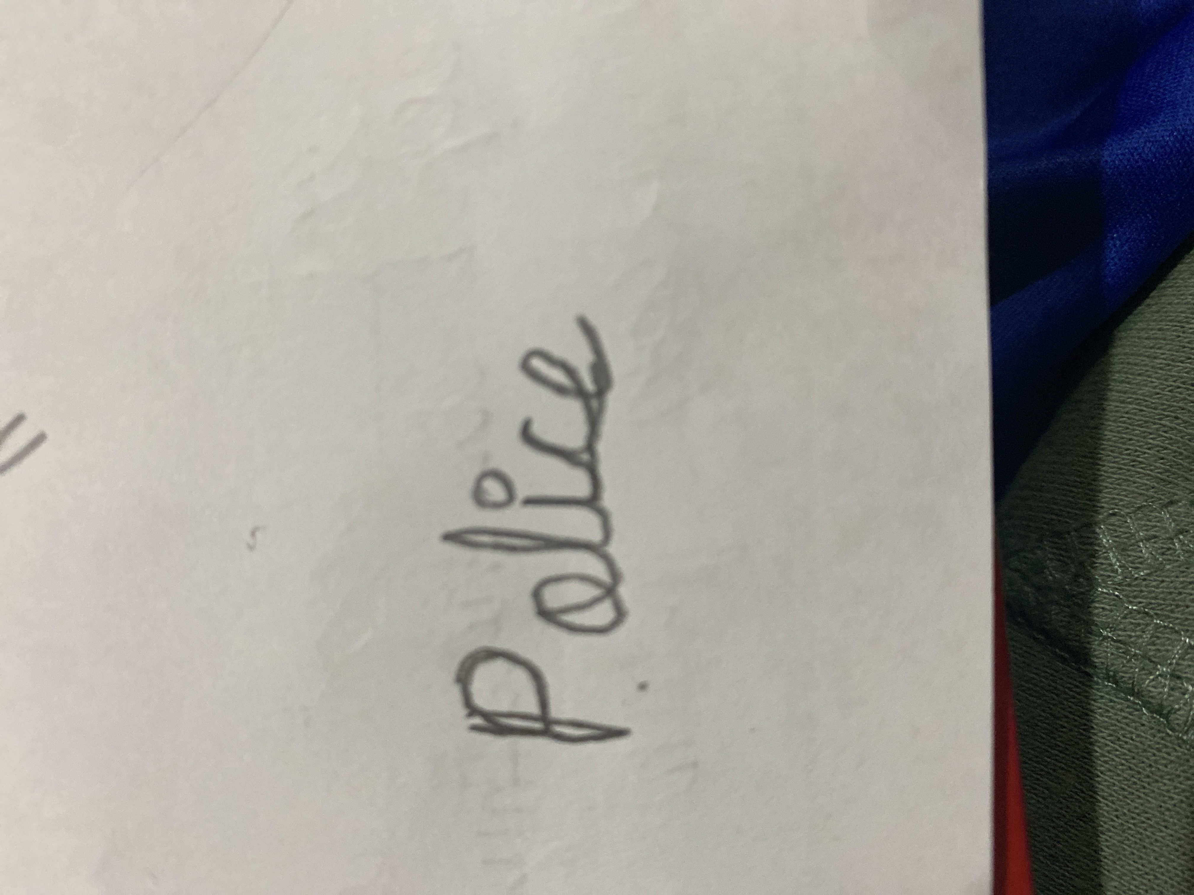
The handwriting shows a blend of creative energy and spontaneity, yet lacks consistency. With dedicated practice, significant improvements are achievable.
The word "Police" is written in a cursive style, with a slightly slanted orientation. The letters are interconnected, demonstrating a certain level of fluency. However, there is a noticeable lack of consistency in letter size and spacing. For instance, the letter 'P' is significantly larger than the rest, while the spacing between 'o' and 'l' is tighter than the rest. The overall neatness is moderate; the writing isn't messy but could benefit from more attention to detail.
This handwriting style suggests a personality that is expressive and somewhat spontaneous. The inconsistent letter sizes might indicate a certain impulsiveness, while the interconnected letters suggest a creative and fluid mind. The slant indicates a degree of enthusiasm and possibly extroversion, although more samples would be needed for a definitive assessment.
To improve, focus on maintaining consistent letter sizes and spacing. Practice writing the alphabet several times, paying close attention to proportions and the distance between each letter. Using lined paper can aid in maintaining uniformity. Try practicing with different pen types and grips to find what is most comfortable and conducive to consistent strokes. Regular practice will improve consistency and fluency, making your handwriting easier to read and more aesthetically pleasing.
Legibility
Expressiveness
Consistency
Overall
Leaderboard for Sunday, 20 April 2025
| 1 | The Whisperer of the Woods |
70
|
| 2 | The Diligent Doodler |
69
|
| 3 | The Minimalist |
67
|
| 4 | The Tamil Tiger |
58
|
| 5 | The Diligent Scholar |
52
|