Rate my handwriting

✨ Upload a sample of your handwriting, and our 🤖 AI will give you
the scoop on
what's awesome
and what could use a
little improving.
It's just for fun - and totally free! Try now 🚀
(You can also check out today's 👑 Leaderboard 👇)
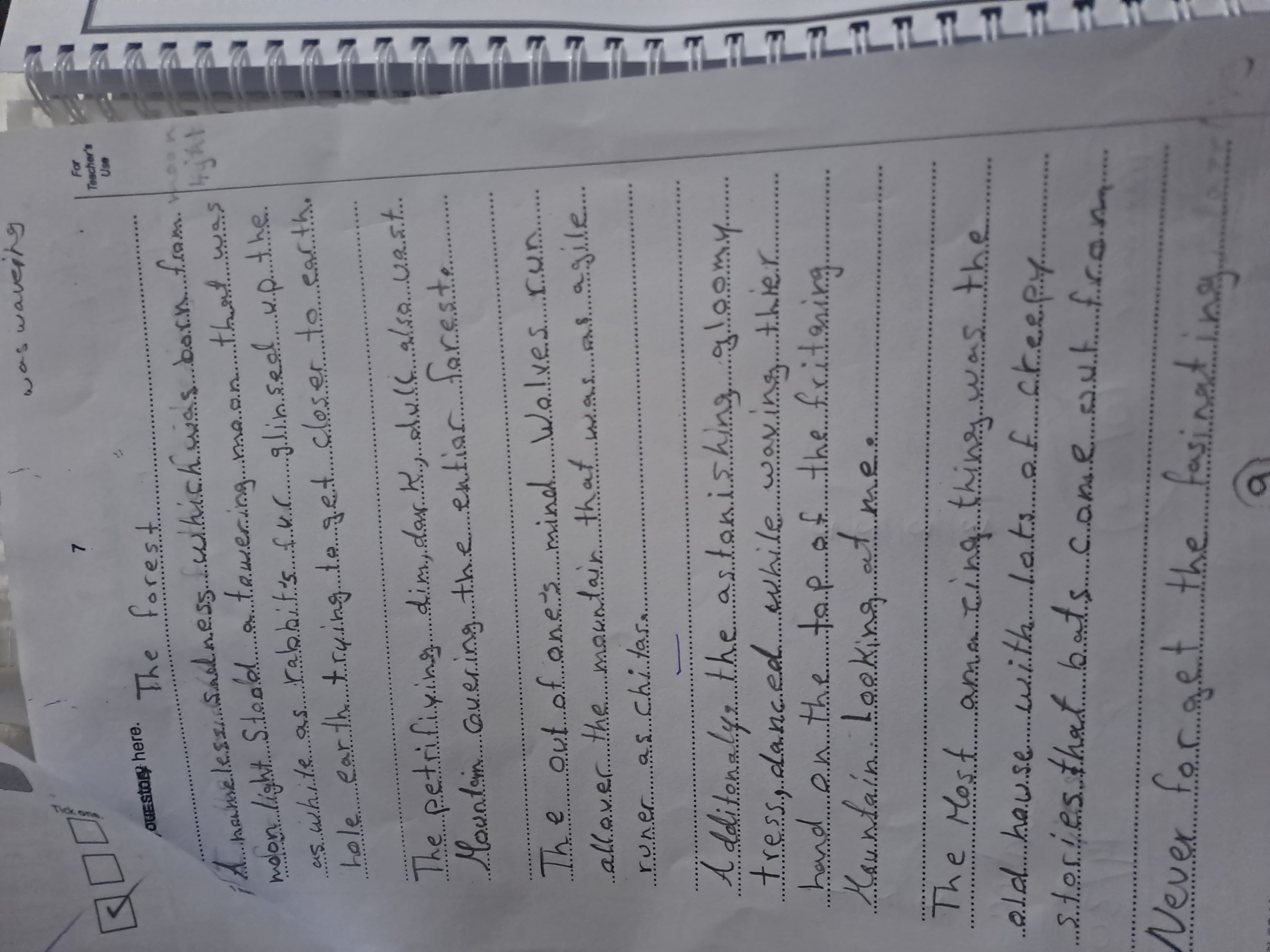
The Towering Moon
This sample presents generally readable handwriting, suggesting a creative and expressive individual, with some areas for improvement in consistency and neatness.
This handwriting sample presents a mixed bag of characteristics. The overall impression is one of readable, if somewhat unrefined, script. The letterforms, while generally consistent in height and slant, occasionally exhibit variations, particularly noticeable in the rounded letters like 'a' and 'o'. The spacing between words is sometimes inconsistent, affecting the visual flow, as seen in the phrase 'towering maan'. Interestingly, certain words, such as 'petrifying' and 'astonishing', demonstrate more controlled execution.
This handwriting suggests a personality that is both creative and a little impetuous. The inconsistent forms hint at a free spirit, someone who values expression over strict adherence to rules. The occasional lapses in neatness might indicate a tendency towards impatience or a preference for the big picture over meticulous detail. The relatively consistent slant and legible letterforms suggest a person who is generally organized and able to communicate their thoughts effectively.
To enhance legibility and overall aesthetics, focus on maintaining consistent spacing between words. Additionally, paying closer attention to the formation of rounded letters would improve the overall neatness and consistency of the script. Consider practicing basic letterforms to refine their shape and uniformity. Finally, adding some variation in letter size and slant might enhance expressiveness and visual interest, creating a more dynamic handwriting style.
Legibility
Expressiveness
Consistency
Overall
Leaderboard for Saturday, 19 April 2025
| 1 | The Whisperer of the Woods |
70
|
| 2 | The Diligent Doodler |
69
|
| 3 | The Minimalist |
67
|
| 4 | The Tamil Tiger |
58
|
| 5 | The Diligent Scholar |
52
|