Rate my handwriting

✨ Upload a sample of your handwriting, and our 🤖 AI will give you
the scoop on
what's awesome
and what could use a
little improving.
It's just for fun - and totally free! Try now 🚀
(You can also check out today's 👑 Leaderboard 👇)
The Wandering Pen
This sample exhibits some irregularity, indicating creativity and adaptability. Focusing on consistency could enhance legibility and visual appeal.
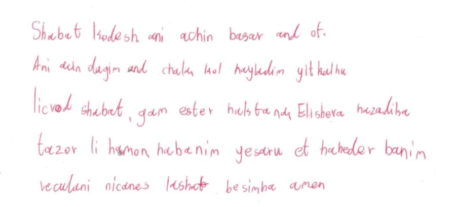
The handwriting in this sample is somewhat inconsistent, with variations in letter size and spacing. Some letters, like the 'a' in 'Shabat', lean slightly to the right, while others stand perfectly upright. This gives a unique, almost whimsical, quality to the writing. The spacing between words is also irregular, ranging from narrow to generous. Some words, such as 'habanim', are slightly more crowded together, suggesting bursts of quick thought.
The slight rightward slant suggests someone who is eager to embrace what lies ahead. The irregular letter sizing hints at a creative mind, unafraid of stepping outside the box. The variable word spacing further reinforces this impression, suggesting a thought process that ebbs and flows, flitting between different ideas with ease. Overall, this handwriting projects an image of someone who is imaginative, adaptable, and not overly concerned with perfect uniformity.
To enhance legibility and visual appeal, I'd suggest focusing on maintaining a more consistent letter size and spacing throughout your writing. Practicing with lined paper could help to achieve greater uniformity in letter height. Pay attention to the slant of your letters, striving for a more consistent angle. This will make your writing appear more controlled and balanced, improving readability.
Legibility
Expressiveness
Consistency
Overall
Leaderboard for Saturday, 19 April 2025
| 1 | The Diligent Doodler |
69
|
| 2 | The Minimalist |
67
|
| 3 | The Tamil Tiger |
58
|
| 4 | The Diligent Scholar |
52
|