Rate my handwriting

✨ Upload a sample of your handwriting, and our 🤖 AI will give you
the scoop on
what's awesome
and what could use a
little improving.
It's just for fun - and totally free! Try now 🚀
(You can also check out today's 👑 Leaderboard 👇)
The Methodical Explainer
This handwriting suggests a methodical and detail-oriented individual who values clarity and precision. With minor tweaks to spacing and letter height, this handwriting could be even more visually appealing.
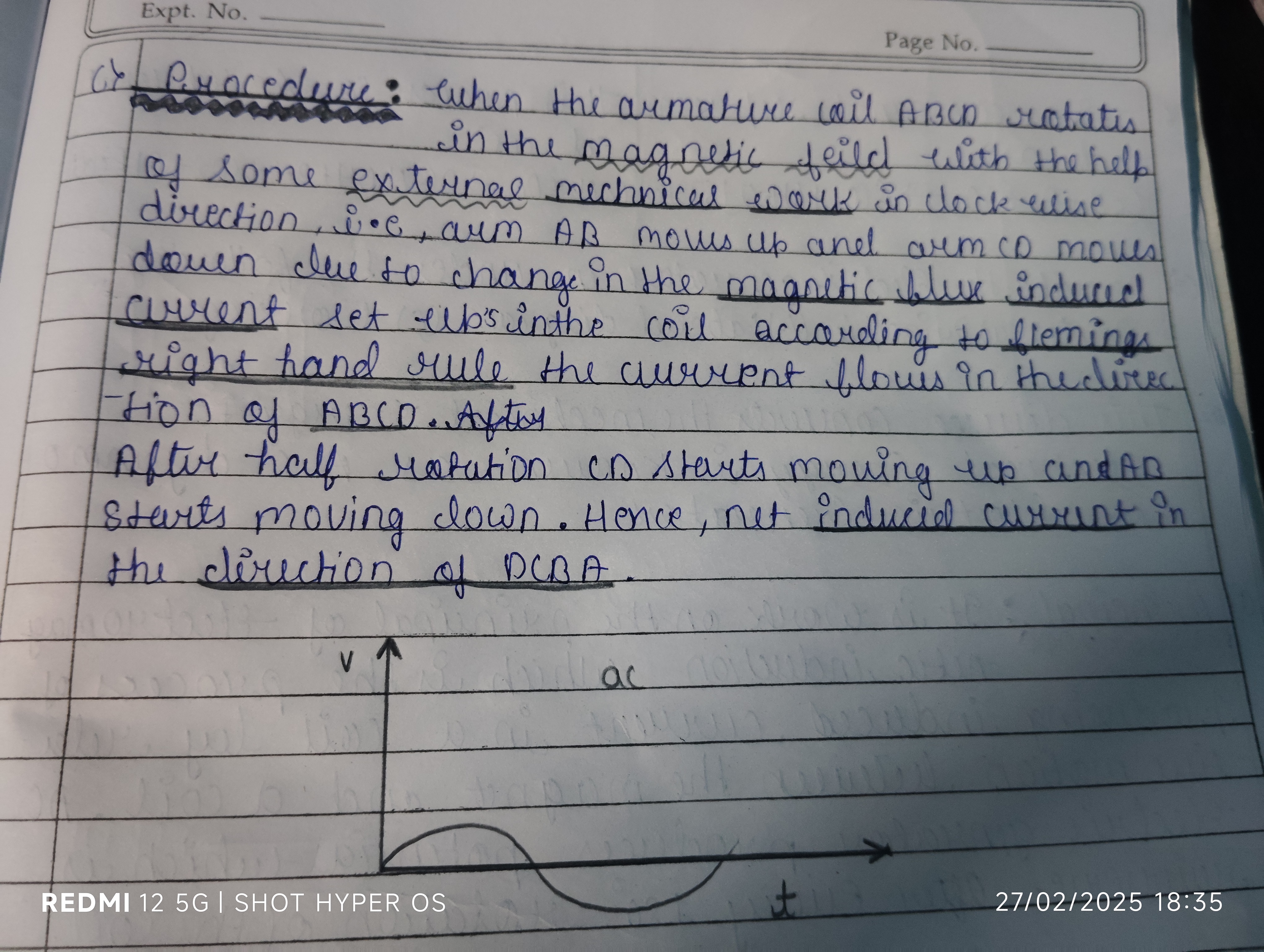
This handwriting sample showcases a blend of consistency and practicality. The letters are generally uniform in size and shape, as seen in the repeated formations of "a", "c", and "d". The slant is mostly consistent, leaning slightly to the right, which indicates a straightforward and logical approach. The spacing between words and letters is regular, contributing to overall legibility, though certain words like "external" and "mechanical" demonstrate some compression. While maintaining clarity, there's a lack of embellishment or flair, suggesting a focus on efficiency over aesthetics. The way the "t's" are crossed directly through the stem is also a mark of practicality.
This style suggests a personality that is methodical and detail-oriented. The writer likely values clarity and precision in their communication, preferring directness over ambiguity. The consistent slant and spacing indicate a preference for order and structure, potentially reflecting a planned and organized approach to tasks. While not overly expressive, the handwriting's legibility suggests a desire to be understood and a respect for the reader's time. The slight rightward slant hints at a responsiveness to external influences.
While already quite legible, some minor improvements could enhance the aesthetic appeal and further improve clarity. Varying the slant slightly would inject more personality and dynamism. Paying closer attention to the spacing between letters within words, especially in longer words like "mechanical", would improve visual balance. Finally, adding a bit more height to the lowercase letters, such as "a" and "o", would increase readability and create a more open feel.
Legibility
Expressiveness
Consistency
Overall
Leaderboard for Friday, 11 April 2025
| 1 | The Precise Penman |
73
|
| 2 | The Methodical Historian |
73
|
| 3 | The Rhythmic Penman |
68
|
| 4 | The Diligent Student |
67
|
| 5 | The Quicksilver Quill |
67
|
| 6 | The Eloquent Expounder |
67
|
| 7 | The Diligent Pupil |
67
|
| 8 | The Playful Provocateur |
67
|
| 9 | The Rounded Writer |
64
|
| 10 | The Determined Repeater |
64
|
| 11 | The Methodical Mind |
64
|
| 12 | The Pragmatic Penman |
64
|
| 13 | The Gentle Storyteller |
64
|
| 14 | The Precise Penman |
63
|
| 15 | The Quick Brown Penman |
63
|
| 16 | The Determined Advocate |
60
|
| 17 | The Determined Dragon |
59
|
| 18 | The Methodical Penman |
59
|
| 19 | The Dreamer |
59
|
| 20 | The Diligent Scholar |
59
|
| 21 | The Casual Communicator |
56
|
| 22 | The Determined Learner |
56
|
| 23 | The Pragmatic Penman |
56
|
| 24 | The Golden-Eyed Child |
55
|
| 25 | The Historian's Hand |
55
|
| 26 | The Thoughtful Penman |
53
|
| 27 | The Pen of Pentamane |
51
|
| 28 | The Conversationalist |
51
|
| 29 | The Earnest Entreaty |
50
|
| 30 | The Diligent Repeater |
50
|