Rate my handwriting

✨ Upload a sample of your handwriting, and our 🤖 AI will give you
the scoop on
what's awesome
and what could use a
little improving.
It's just for fun - and totally free! Try now 🚀
(You can also check out today's 👑 Leaderboard 👇)

The Expressive Professor
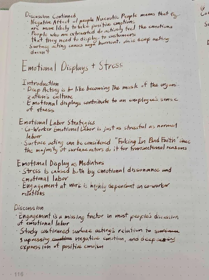
This handwriting displays a thoughtful and expressive style, blending cursive and print with a unique rhythm, though slight improvements in spacing and consistency would enhance legibility.
This handwriting sample showcases a blend of cursive and print, with a unique rhythm and flow. The rounded forms of letters like 'a,' 'o,' and 'd' combined with the elongated ascenders in 'h' and 'l' suggest a writer who is both grounded and aspirational. The occasional breaks in the cursive flow, particularly evident in words like 'emotional' and 'acting,' hint at a thoughtful and deliberate approach to communication. While generally legible, the writing occasionally exhibits crowding, especially in phrases like 'Falcing In Bad Faith,' which slightly diminishes its neatness.
This writer likely possesses a sharp intellect, evident in the complex vocabulary and conceptual nature of the content. The dynamic baseline and varied letter sizes suggest a flexible and adaptable personality. The combination of cursive and print indicates an individual who values both tradition and efficiency. A tendency towards expressiveness is revealed through the occasional embellishments and flourishes in letterforms, while the slightly rightward slant implies an optimistic outlook and a willingness to engage with the world. This style of writing suggests a person who is comfortable with abstract thought and theoretical concepts.
To enhance legibility and overall neatness, focusing on maintaining consistent letter spacing and avoiding overcrowding would be beneficial. Practicing connecting strokes more smoothly, particularly in commonly used letter combinations, could further improve fluency. Additionally, paying attention to the baseline and ensuring that it remains relatively straight would contribute to a more polished appearance. These minor adjustments would allow the natural expressiveness of the handwriting to shine even brighter, without compromising clarity.
Legibility
Expressiveness
Consistency
Overall
Leaderboard for Friday, 04 April 2025
| 1 | The Peach-Tree Poet |
76
|
| 2 | The Precise Ponderer |
74
|
| 3 | The Weary Glazier |
73
|
| 4 | The Botanical Biographer |
67
|
| 5 | The Inquisitive Examiner |
67
|
| 6 | The Whimsical Wanderer |
63
|
| 7 | The Botanical Biographer |
54
|
| 8 | The Determined Dreamer |
50
|