Rate my handwriting

✨ Upload a sample of your handwriting, and our 🤖 AI will give you
the scoop on
what's awesome
and what could use a
little improving.
It's just for fun - and totally free! Try now 🚀
(You can also check out today's 👑 Leaderboard 👇)

The Playful Penman
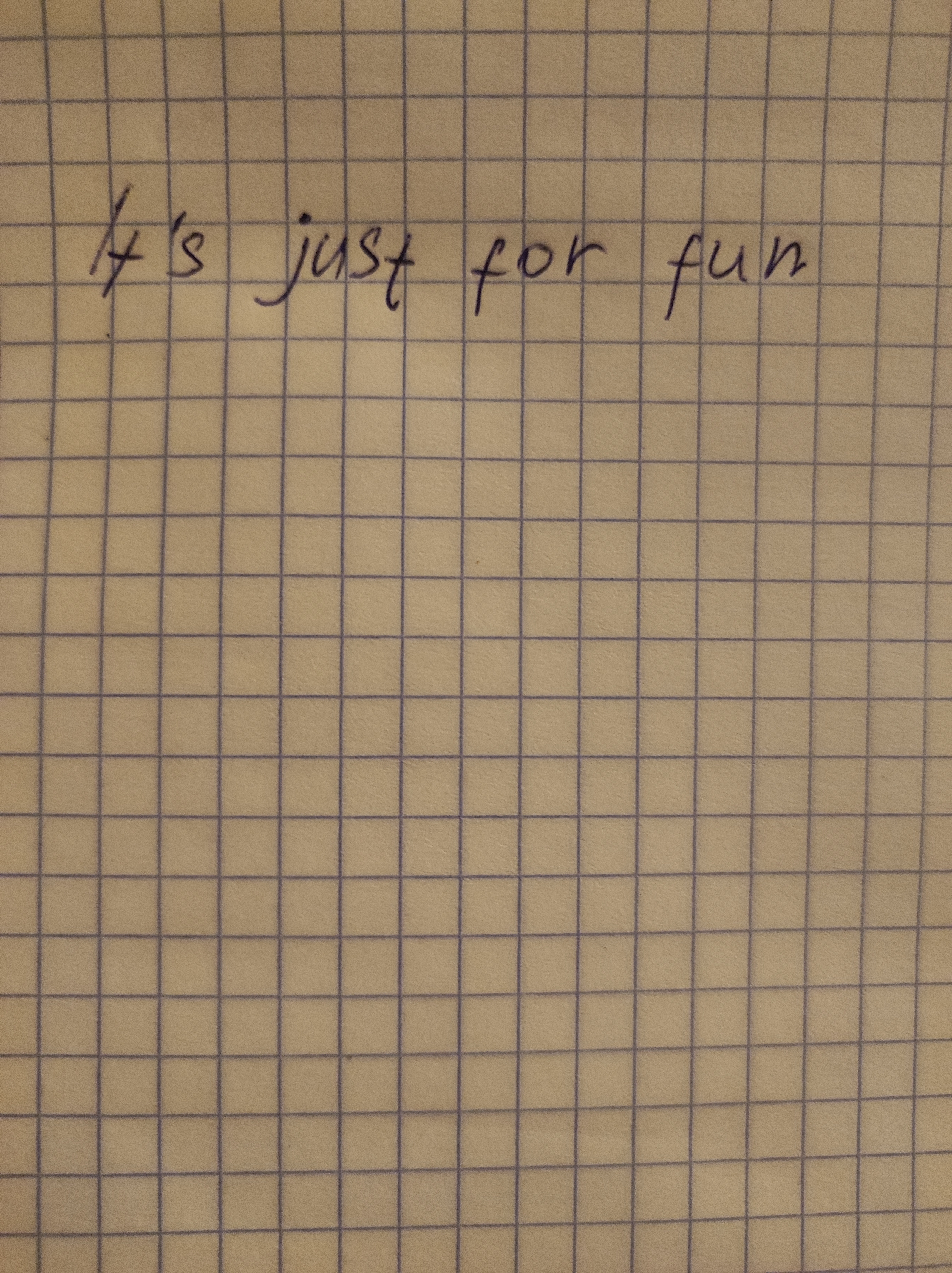
This playful, legible handwriting suggests a warm and approachable personality, someone who embraces life's simple joys. With a few tweaks, it could be even more polished.
This handwriting sample, with its simple declaration "It's just for fun", speaks volumes about its creator. The letters are generally well-formed, with a slight rightward slant suggesting an open and forthcoming personality. The 'f' in both 'for' and 'fun' exhibit a distinctive looped descender, conveying a touch of whimsy and playfulness, while the 'j' in 'just' stands tall and proud, indicating a dash of confidence. The consistency in letter size and spacing is noteworthy, with only minor variations like the slightly larger 'I', suggesting an adaptable and flexible nature.
The relaxed and unhurried flow of this script indicates someone who is generally easy-going and enjoys the simple pleasures in life. The rounded letters, especially the 'u' in 'just' and 'fun', suggest a warm and approachable personality. This person likely prioritizes experiences over material possessions, finding joy in the moment, much like the sentiment expressed in the sample itself.
While legible and pleasing to the eye, a few minor adjustments could elevate this handwriting. The baseline could be straighter, giving the text a more polished look. Paying attention to the 's', which seems a bit compressed, and the cross of the 't', which could be a little higher and more consistent, would enhance its overall neatness. Practicing these elements will bring greater consistency and visual harmony to the script.
Legibility
Expressiveness
Consistency
Overall
Leaderboard for Wednesday, 27 November 2024
| 91 | The Sleepy Penman |
50
|
| 92 | The Sleepy Bear |
50
|
| 93 | The Quick Fox |
50
|
| 94 | The Eager Emporium |
50
|
| 95 | The Swift Strategist |
50
|
| 96 | The Village Voice |
49
|
| 97 | The Dreamer |
48
|
| 98 | The Quick Brown Fox |
47
|
| 99 | The Exhausted Penman |
47
|
| 100 | The Desk Etcher |
37
|