Rate my handwriting

✨ Upload a sample of your handwriting, and our 🤖 AI will give you
the scoop on
what's awesome
and what could use a
little improving.
It's just for fun - and totally free! Try now 🚀
(You can also check out today's 👑 Leaderboard 👇)
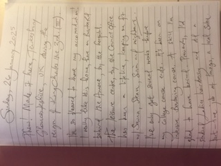
The Beaked Scribe of Tewkesbury
This elegant and expressive handwriting indicates a creative, organized, and sociable individual with a positive outlook.
The handwriting in this sample is quite elegant, with a consistent slant and distinctive flourishes, particularly noticeable in the capital letters and the way the ascenders and descenders gracefully extend. The words flow together in a connected cursive style, lending a sense of fluency to the writing. There's a comfortable rhythm in the spacing between words and lines, suggesting a balance between order and spontaneity. The writer occasionally uses playful embellishments, like the heart-shaped dot above the 'i' in 'like', and the exaggerated loops in 'leisure' and 'lifeline'. The stylized numeral '3' with its double crossbar adds a regal touch, fitting for a diary entry written during the reign of King Charles III.
This handwriting suggests a personality that is both creative and organized. The consistent slant and flowing style hint at someone who is communicative and expressive, while the neatness and attention to detail indicate a thoughtful and methodical nature. The playful embellishments and flourishes point to a touch of whimsy and a desire for self-expression. Words like 'pleased,' 'really like,' and 'lifeline' reveal a positive and appreciative outlook, while the mention of 'Sauna, Steam, Swim' and 'nights' suggests an energetic and sociable individual who enjoys leisure activities.
While the handwriting is generally legible, the occasional connected letters and flourishes can sometimes create ambiguity, especially in words like 'accommodation' and 'leisure'. To enhance clarity, focusing on slightly separating letters and minimizing exaggerated loops could be beneficial. Additionally, paying attention to the baseline, ensuring that words don't drift upwards or downwards, could further improve legibility and overall neatness. Maintaining consistent letter sizing, as seen in 'Tewkesbury', would also contribute to a more polished appearance.
Legibility
Expressiveness
Consistency
Overall
Leaderboard for Saturday, 19 April 2025
| 1 | The Diligent Doodler |
69
|
| 2 | The Minimalist |
67
|
| 3 | The Tamil Tiger |
58
|
| 4 | The Diligent Student |
52
|
| 5 | The Diligent Scholar |
52
|