Rate my handwriting

✨ Upload a sample of your handwriting, and our 🤖 AI will give you
the scoop on
what's awesome
and what could use a
little improving.
It's just for fun - and totally free! Try now 🚀
(You can also check out today's 👑 Leaderboard 👇)
The Curator's Quill
A neat and legible style, suggesting a personality that values order, precision, and efficiency.
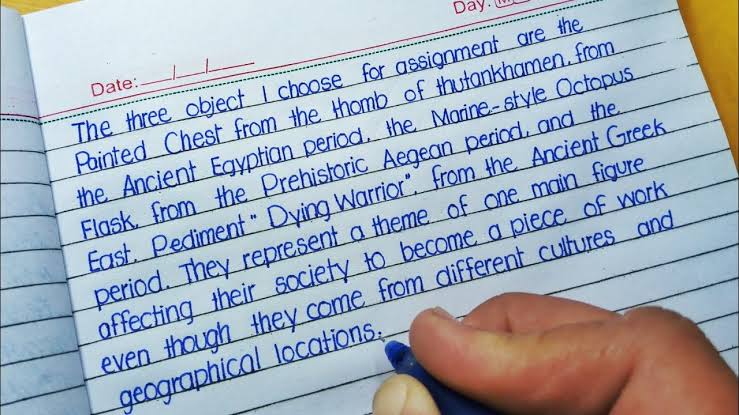
This handwriting sample showcases a style that is neat and generally legible, with a consistent slant and uniform letter size. Words like "thutankhamen" and "geographical" demonstrate a comfortable flow, though some letters, such as "a" and "o," appear slightly compressed. The baseline is generally adhered to, indicating focus and organization. The overall impression is one of disciplined control with a hint of individual flair in the subtle variations in letterforms.
The writer's personality, as suggested by this sample, is likely one of orderliness and attention to detail. The consistent slant implies a steady hand and a logical mind. The neatness suggests a desire for clarity and precision. The slightly compressed letters may indicate a tendency towards efficiency, wanting to convey information concisely. The choice of topic suggests a curious and analytical mind, interested in exploring different cultures and historical periods. There's a subtle hint of introversion, indicated by the reserved, uniform style, which prefers clarity over flamboyance.
While generally legible, some minor improvements could enhance this handwriting further. Opening up the spacing within letters like "a" and "o" could increase readability. Exploring variations in letter height or slant could add expressiveness. Finally, experimenting with different pen pressures might reveal a hidden artistic flair. These small adjustments could bring more dynamism to an already proficient hand.
Legibility
Expressiveness
Consistency
Overall
Leaderboard for Sunday, 20 April 2025
| 1 | The Whisperer of the Woods |
70
|
| 2 | The Diligent Doodler |
69
|
| 3 | The Minimalist |
67
|
| 4 | The Tamil Tiger |
58
|
| 5 | The Diligent Scholar |
52
|