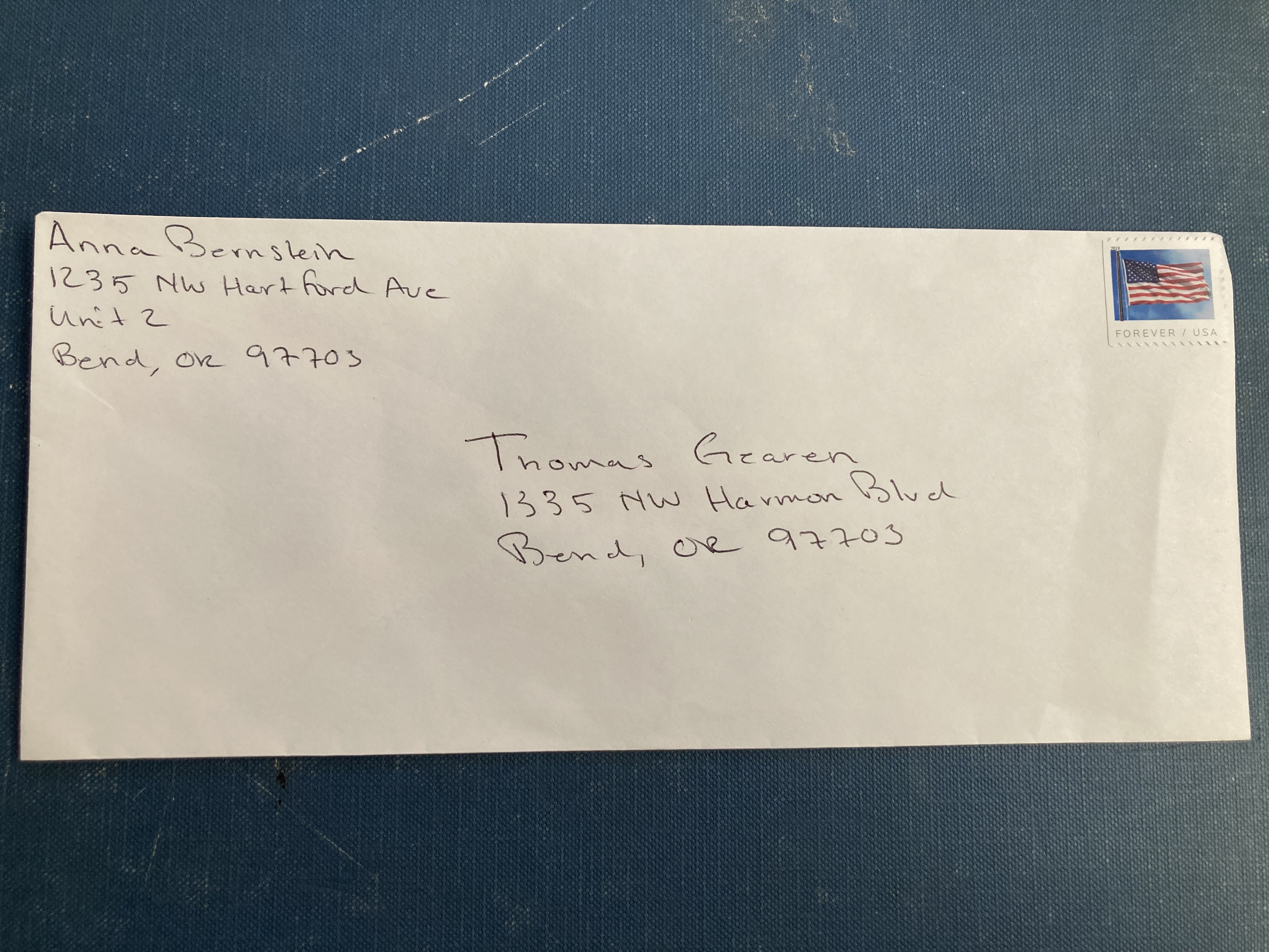
Rate my handwriting

✨ Upload a sample of your handwriting, and our 🤖 AI will give you
the scoop on
what's awesome
and what could use a
little improving.
It's just for fun - and totally free! Try now 🚀
(You can also check out today's 👑 Leaderboard 👇)

The Methodical Penman
This handwriting indicates a methodical and detail-oriented individual with a penchant for neatness and a subtle dash of creativity. With a few minor tweaks, this already legible and consistent handwriting could be even more impactful.
This handwriting sample is generally legible and consistent, suggesting a methodical and detail-oriented approach. The letters are mostly upright and evenly spaced, with a slight rightward slant, as seen in the consistent formation of the "n" and "m" in both "Anna Bernstein" and "Thomas Gearen." While not overly flamboyant, there's a quiet confidence in the even pressure applied throughout. Fluency is evident in the connected letters within words, such as "Hartford" and "Harmon." There's a balance between practicality and neatness, with certain flourishes like the initial "A" in "Anna" and "T" in "Thomas" adding a touch of personality.
The neatness and consistency in this handwriting suggest a person who values order and precision. The slight rightward slant indicates a willingness to engage with others, while the consistent letter formations point to a grounded and reliable personality. The even pressure implies a sense of calm and control, hinting at someone who is not easily ruffled. The small embellishments, such as the loops in the "B" of "Bernstein" and "G" of "Gearen," indicate a touch of creativity and a desire for self-expression, but always within the bounds of convention.
While this handwriting is generally easy to read, increasing the contrast between the ascenders (like "h" and "l") and descenders (like "g" and "y") could enhance legibility. Additionally, paying attention to the overall baseline, ensuring it remains relatively straight rather than drifting up or down across the page, as it does in "Bend, OR," could further enhance neatness and improve the visual impact. Practicing consistent letter sizes and spacing, particularly between words, would enhance clarity. Remember, the goal isn't perfection but refinement. Your current style already conveys reliability and a touch of understated flair.
Legibility
Expressiveness
Consistency
Overall
Leaderboard for Sunday, 20 April 2025
| 1 | The Whisperer of the Woods |
70
|
| 2 | The Diligent Doodler |
69
|
| 3 | The Minimalist |
67
|
| 4 | The Tamil Tiger |
58
|
| 5 | The Diligent Scholar |
52
|