Rate my handwriting

✨ Upload a sample of your handwriting, and our 🤖 AI will give you
the scoop on
what's awesome
and what could use a
little improving.
It's just for fun - and totally free! Try now 🚀
(You can also check out today's 👑 Leaderboard 👇)

The Water Bearer
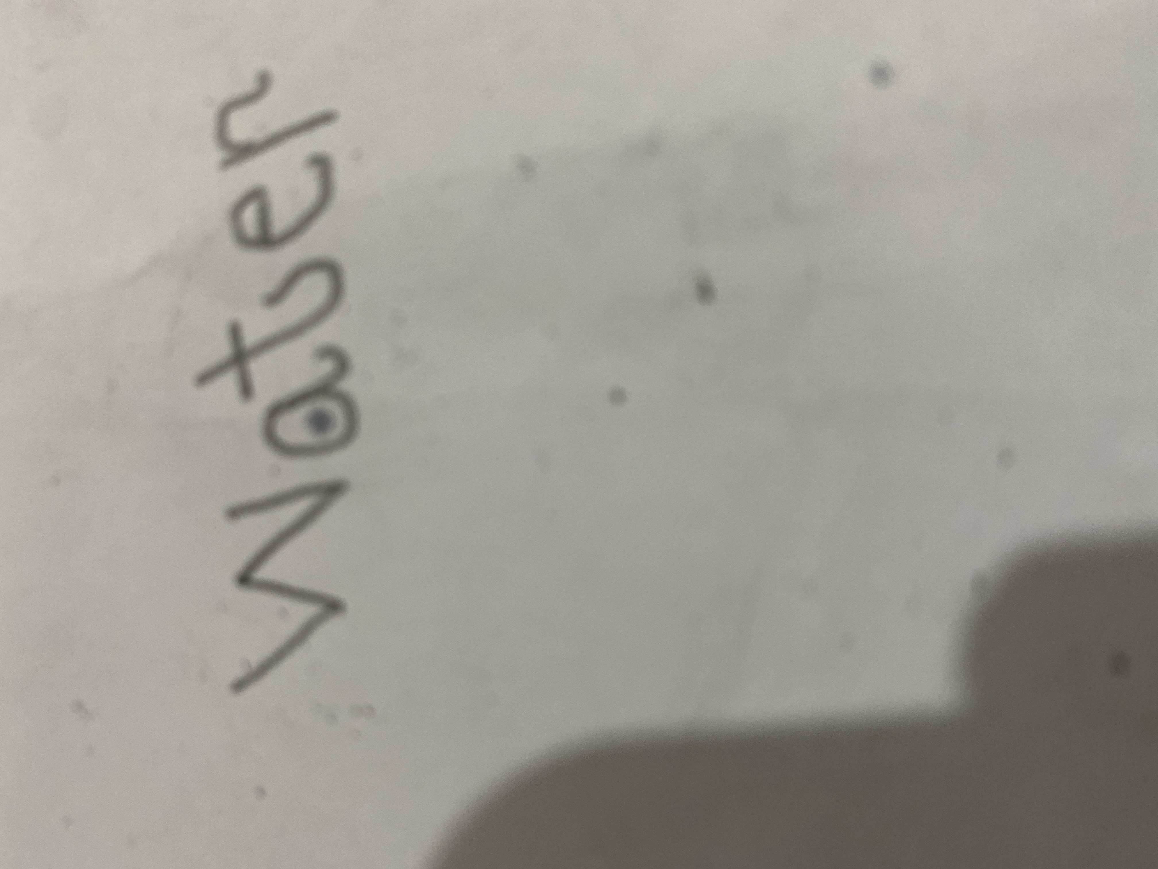
The simple, childlike handwriting suggests a practical, honest, and straightforward person who may struggle with focus and be a little sensitive at times. There is room for improvement by practicing letter formation, consistency, and adding a bit of personality to the writing.
The word "water" is written in a simple, almost childlike script. The letters are generally well-formed, with the "w" being a particularly graceful curve. However, there is a slight inconsistency in the size and spacing of the letters, with the "a" being much smaller than the other letters and the spacing between the "t" and "e" being quite large. The overall slant of the word is also slightly inconsistent, leaning slightly to the right in some places and then straightening out in others. The handwriting is quite legible, although the lack of flourish or any individual character does leave it a little bland.
The simple, straightforward style of the handwriting suggests a person who is practical and down-to-earth. They are likely to be honest and straightforward in their dealings with others, and they may have a tendency to be a little blunt. The slight inconsistency in the handwriting could indicate a person who is somewhat impulsive and may struggle with focus at times. They are also likely to be a little sensitive and easily hurt, especially when they feel misunderstood.
If you'd like to improve your handwriting, consider practicing your letter formation, especially the "a". Try to be more consistent with the size and spacing of your letters. Experiment with different slants and see which one feels most natural to you. And finally, don't be afraid to add a little bit of your own personality to your handwriting!
Legibility
Expressiveness
Consistency
Overall