Rate my handwriting

✨ Upload a sample of your handwriting, and our 🤖 AI will give you
the scoop on
what's awesome
and what could use a
little improving.
It's just for fun - and totally free! Try now 🚀
(You can also check out today's 👑 Leaderboard 👇)
The Fluid Penman
This handwriting shows an adaptable, communicative person with a grounded and optimistic nature. A few tweaks could elevate the overall clarity and polish of this naturally appealing style.
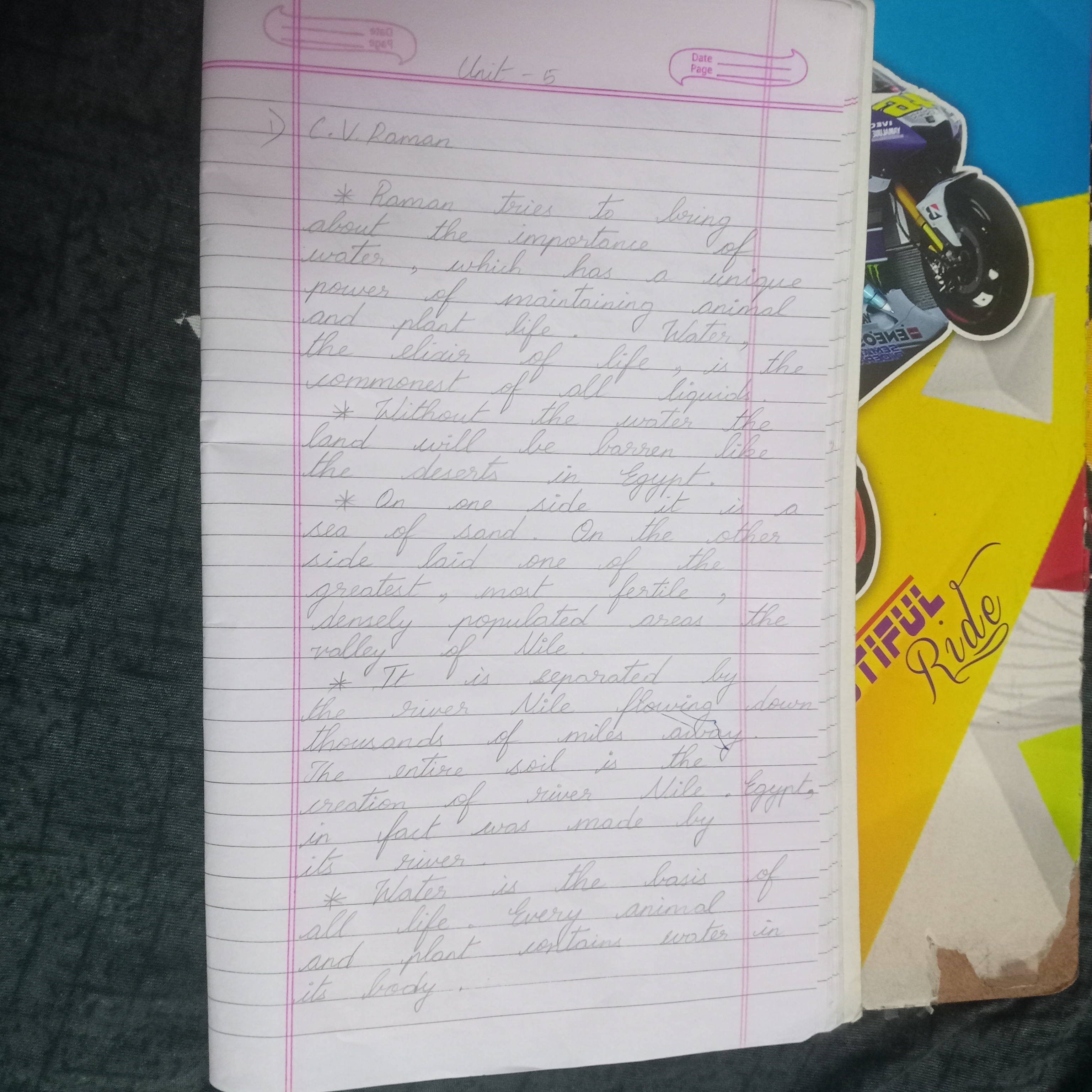
This handwriting sample exhibits a comfortable familiarity with cursive script, flowing smoothly across the page with a gentle rhythm, much like the "river Nile flowing down thousands of miles away." While the overall size and slant of the letters remain fairly consistent, there's a charming lack of rigid uniformity. The baseline is generally straight, keeping the words from straying too far from their designated lines, though the occasional upward lilt, especially in words like "importance," hints at an underlying optimism. The rounded forms of letters like 'a' and 'o', and the occasional flourish in letters like 'f' and 'g' inject a touch of personality, indicating an individual who isn't afraid to let their unique style shine through.
The easy flow of this handwriting suggests an adaptable and communicative personality. The generally consistent size and slant imply a grounded and practical nature, while the slight variations and occasional upward trends indicate an optimistic outlook and a willingness to embrace new experiences, much like Raman's exploration of the "importance of water." The rounded letterforms add a touch of warmth and approachability, suggesting someone who values connection and enjoys engaging with others. The legibility of the script implies clarity of thought and a desire to be understood.
To enhance this already pleasing handwriting, focusing on maintaining consistent letter spacing and height could further improve readability. Paying attention to the formation of certain letters, such as ensuring the 't' crossings are distinct and the 'i' dots are consistently placed, would add a touch of polish. Practicing loops and curves, especially in ascenders and descenders, could also enhance the overall fluidity and expressiveness of the writing, adding a touch of elegance to its already natural charm.
Legibility
Expressiveness
Consistency
Overall
Leaderboard for Sunday, 20 April 2025
| 1 | The Whisperer of the Woods |
70
|
| 2 | The Diligent Doodler |
69
|
| 3 | The Minimalist |
67
|
| 4 | The Tamil Tiger |
58
|
| 5 | The Diligent Scholar |
52
|