Rate my handwriting

✨ Upload a sample of your handwriting, and our 🤖 AI will give you
the scoop on
what's awesome
and what could use a
little improving.
It's just for fun - and totally free! Try now 🚀
(You can also check out today's 👑 Leaderboard 👇)

The Practical Penman
This handwriting shows a preference for efficiency and clear communication, balanced with a touch of individual flair.
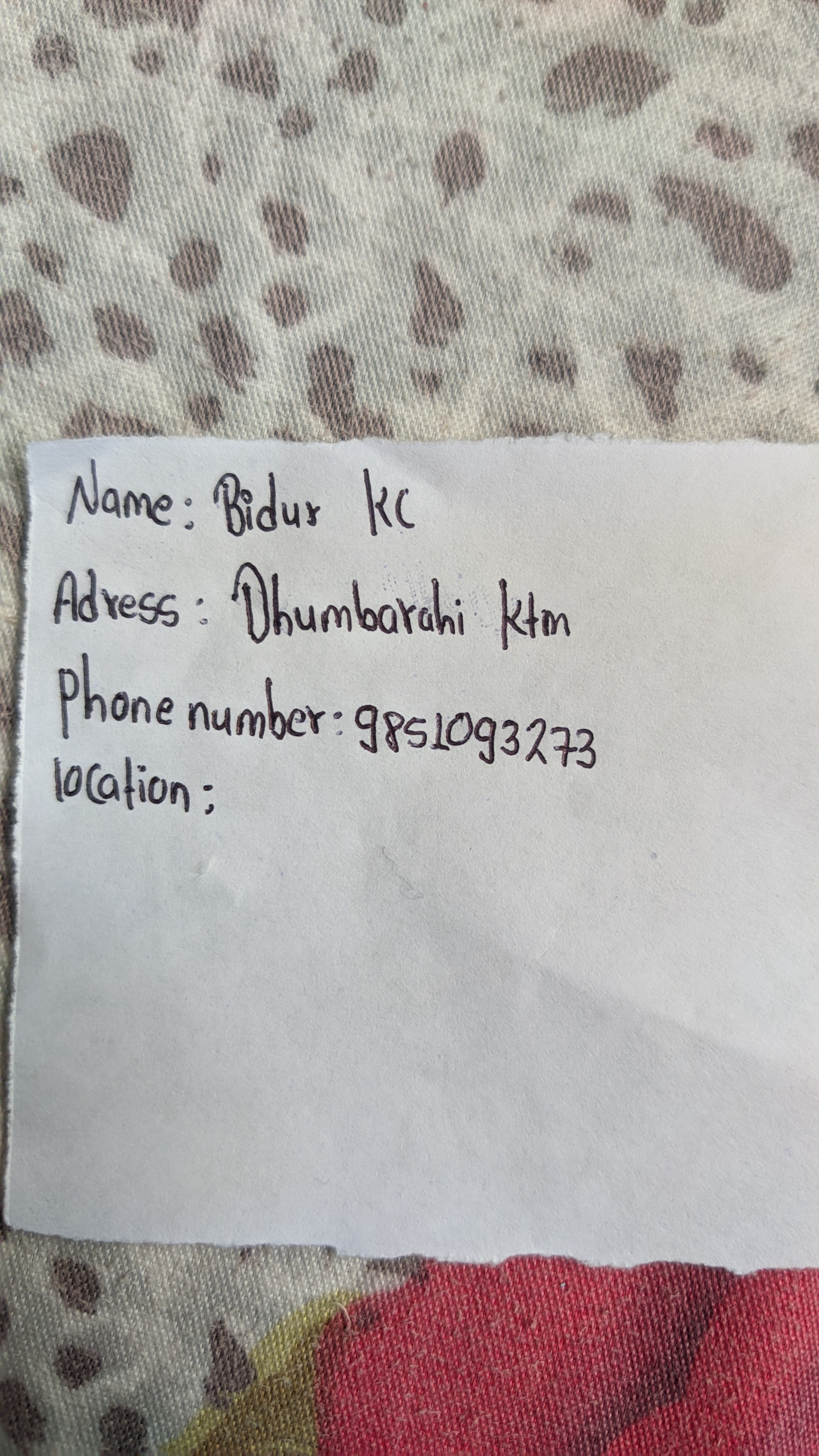
This handwriting sample presents a generally legible and practical style. The letters are connected, suggesting a joined-up approach, as seen in words like "Dhumharahi". The overall slant is fairly upright, indicating a balanced and straightforward approach. The size and spacing of the letters are relatively consistent, though there's a slight variation noticeable in the formation of certain letters like 'K' and 'C' in "KC". The baseline is mostly straight, reflecting a structured and organized mind. There is some evidence of individual flair in the formation of letters like 'B' and 'D', which prevents the script from becoming overly monotonous.
The practical nature of this handwriting implies a personality that values efficiency and directness. The writer likely prefers a clear and concise communication style, getting straight to the point without unnecessary embellishments. The consistent slant suggests emotional stability and a steady hand, while the joined-up writing points to a logical and connected thought process. The individual flourishes in certain letters hint at a touch of creativity and a desire for self-expression, despite the overall emphasis on practicality.
While legible, some improvements could enhance the clarity and aesthetics of this handwriting. Paying attention to the consistency in letter size and spacing would be beneficial. The slightly varied size of certain letters, as seen in the "Address" field, could be addressed through practice. Additionally, maintaining an even baseline across all words would improve overall neatness. Focusing on the formation of individual letters, especially 'K' and 'C', would contribute to greater precision and elegance in the writing.
Legibility
Expressiveness
Consistency
Overall
Leaderboard for Tuesday, 29 April 2025
| 1 | The Flourishing Penman |
82
|
| 2 | The Calligrapher's Quill |
82
|
| 3 | The Graceful Galloper |
77
|
| 4 | The Grandiloquent Gourmet |
76
|
| 5 | The Hopeful Romantic |
75
|
| 6 | The Romantic Calligrapher |
72
|
| 7 | The Methodical Merchant |
71
|
| 8 | The Lyrical Linguist |
70
|
| 9 | The Culinary Connoisseur |
70
|
| 10 | The Flourishing Penman |
68
|
| 11 | The Rhythmic Penman |
68
|
| 12 | The Diligent Documenter |
68
|
| 13 | The Methodical Note-Taker |
67
|
| 14 | The Diligent Naturalist |
67
|
| 15 | The Rhythmic Penman |
67
|
| 16 | The Diligent Documenter |
66
|
| 17 | The Lyrical Linguist |
65
|
| 18 | The Tunnel Visionary |
65
|
| 19 | The Romantic Calligrapher |
64
|
| 20 | The Diligent Naturalist |
64
|
| 21 | The Sweetheart |
63
|
| 22 | The Culinary Connoisseur |
63
|
| 23 | The Energetic Enigma |
61
|
| 24 | The Diligent Grammarian |
60
|
| 25 | The Flourishing Penman |
60
|
| 26 | The Precise Penman |
59
|
| 27 | The Methodical Penman |
59
|
| 28 | The Expressive Storyteller |
59
|
| 29 | The Diligent Documenter |
59
|
| 30 | The Hopeful Heart |
57
|