Rate my handwriting

✨ Upload a sample of your handwriting, and our 🤖 AI will give you
the scoop on
what's awesome
and what could use a
little improving.
It's just for fun - and totally free! Try now 🚀
(You can also check out today's 👑 Leaderboard 👇)
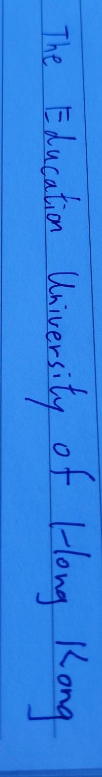
The Educator
This neat and legible handwriting suggests a methodical and organized individual who values clarity and precision. Minor improvements to spacing and letter formation would further enhance its overall appearance.
This handwriting sample is characterized by its vertical alignment and connected letters. The words "Education" and "University" are written with a consistent slant and flow, suggesting a certain level of comfort and confidence in writing. The letters are generally well-formed, although some, like the "o" in "of", appear slightly compressed. The overall impression is one of neatness and legibility, despite the slightly cramped appearance of some letters.
The consistent slant and connected letters in this handwriting suggest a methodical and organized individual. The vertical alignment and neatness indicate a preference for structure and order. The slight compression of some letters may imply a tendency towards efficiency and practicality. The overall impression is one of someone who values clarity and precision in their communication.
To enhance this already legible handwriting, focus on maintaining consistent spacing between letters and words. The words "Iowa" and "Long" appear slightly cramped, so giving each letter a little more breathing room would improve overall readability. Additionally, paying attention to the size and shape of rounded letters, such as "o" and "a", would further refine the handwriting and give it a more polished look.
Legibility
Expressiveness
Consistency
Overall
Leaderboard for Saturday, 19 April 2025
| 1 | The Diligent Doodler |
69
|
| 2 | The Minimalist |
67
|
| 3 | The Tamil Tiger |
58
|
| 4 | The Diligent Scholar |
52
|