Rate my handwriting

✨ Upload a sample of your handwriting, and our 🤖 AI will give you
the scoop on
what's awesome
and what could use a
little improving.
It's just for fun - and totally free! Try now 🚀
(You can also check out today's 👑 Leaderboard 👇)

The Botanical Bud
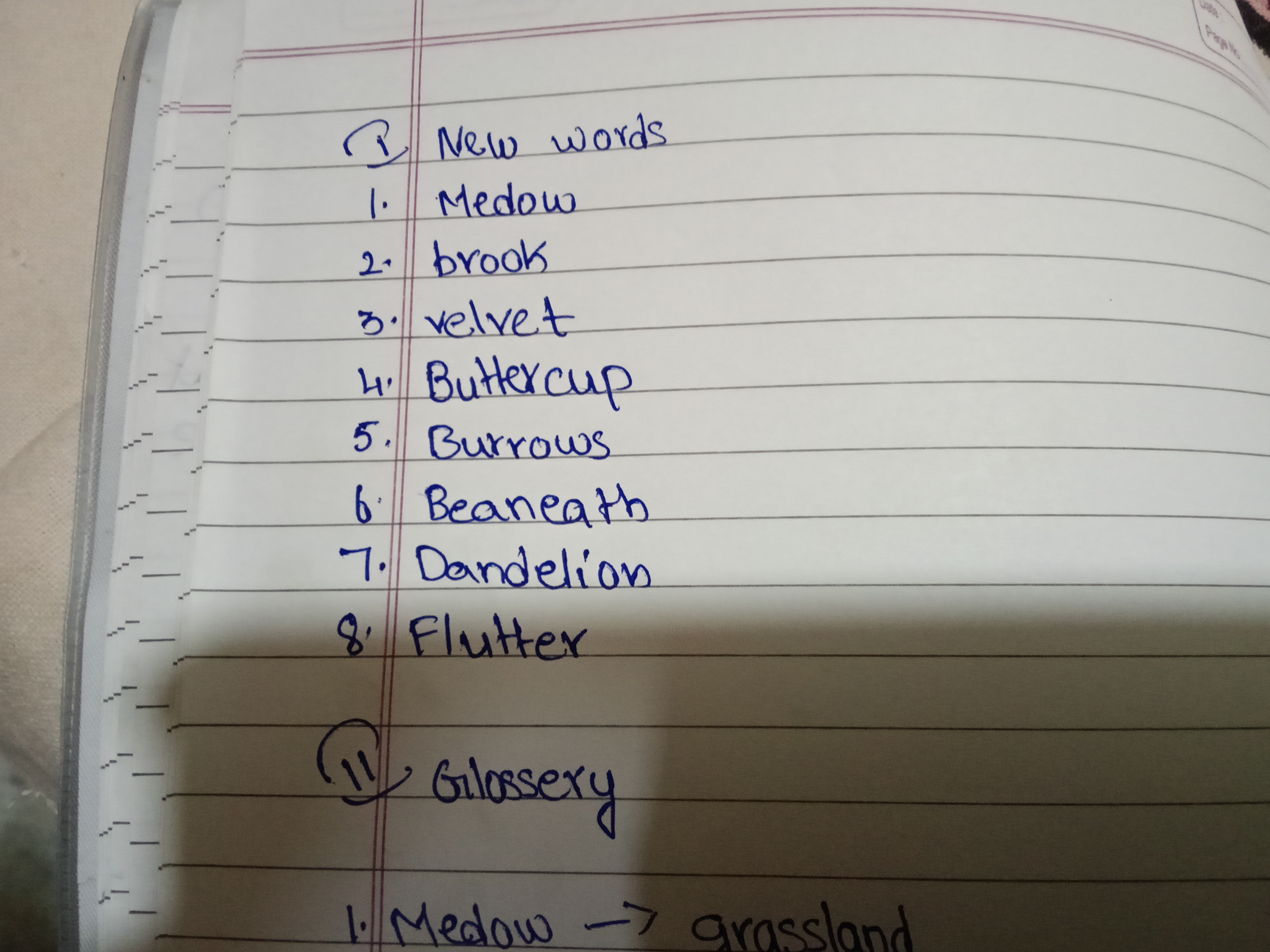
This neat and simple handwriting suggests a methodical and friendly nature with a touch of youthful enthusiasm. Focusing on consistent letter sizes and introducing a subtle slant could enhance its visual appeal.
This handwriting sample presents a charmingly simple and unpretentious style. The script, predominantly printed rather than cursive, exudes a sense of straightforwardness and clarity. Words like "Meadow", "Buttercup", and "Dandelion" evoke a connection to nature, a groundedness reflected in the handwriting's consistent baseline and even spacing between letters. The slight variations in letter size and occasional irregularities, as seen in the lowercase 'r' in "Burrows", hint at a flexible approach to life.
The neatness and legibility suggest an organized and methodical mind, while the rounded forms of letters like 'o' and 'd' point to a friendly and approachable nature. The consistency in letter formation and the controlled, measured strokes indicate a steady hand and a calm demeanor. The simplified, almost childlike quality of the script, along with the playful smiley face preceding "Glossary", hints at a youthful enthusiasm and an optimistic outlook.
While generally legible, a few minor improvements could enhance the overall aesthetics and clarity. Focusing on consistent letter sizes, particularly in words like "Dandelion", could bring greater uniformity. Experimenting with a slightly more dynamic slant could add a touch of personality and visual interest. Overall, the current style conveys an impression of sincerity and practicality, while a little experimentation could inject an element of individuality.
Legibility
Expressiveness
Consistency
Overall
Leaderboard for Friday, 04 April 2025
| 1 | The Peach-Tree Poet |
76
|
| 2 | The Weary Glazier |
73
|
| 3 | The Botanical Biographer |
67
|
| 4 | The Inquisitive Examiner |
67
|
| 5 | The Whimsical Wanderer |
63
|
| 6 | The Botanical Biographer |
54
|
| 7 | The Determined Dreamer |
50
|