Rate my handwriting

✨ Upload a sample of your handwriting, and our 🤖 AI will give you
the scoop on
what's awesome
and what could use a
little improving.
It's just for fun - and totally free! Try now 🚀
(You can also check out today's 👑 Leaderboard 👇)
The Precise Penman
The handwriting is generally legible and consistent, reflecting a personality that values precision and clear communication.
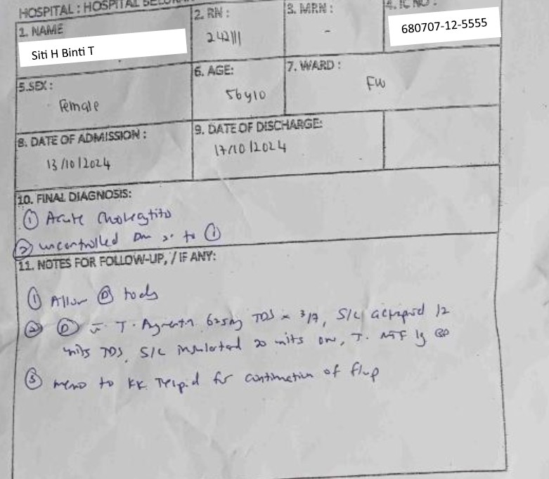
This handwriting sample showcases a blend of consistency and legibility. The letters are generally well-formed, with notable examples like the 'S' in 'Siti' and the 'H' in 'Hospital'. While there's a slight rightward slant, it doesn't compromise readability. The consistency in letter size and spacing contributes to the overall neatness. Some abbreviations are used, such as 'om' and 'mits', indicating a focus on efficiency.
This handwriting suggests a personality that values clarity and precision. The consistent letter formations and controlled slant point to a methodical and organized approach. The occasional abbreviations suggest a practical nature and a preference for directness. The overall legibility hints at a desire for clear communication and a respect for the reader's time.
To enhance this already legible handwriting, focusing on maintaining consistent letter height and spacing could be beneficial. The ascenders and descenders could be slightly more pronounced to add a touch of elegance. Additionally, paying attention to the baseline and ensuring that words flow smoothly along it will improve overall visual appeal.
Legibility
Expressiveness
Consistency
Overall
Leaderboard for Saturday, 19 April 2025
| 1 | The Diligent Doodler |
69
|
| 2 | The Minimalist |
67
|
| 3 | The Tamil Tiger |
58
|
| 4 | The Diligent Scholar |
52
|